
VERNACULAR LETTERFORM - My Typographic explorations are a platform for understanding the basics of letterform and composition and the tools and techniques used to create and modify them. Understanding structure and grids and then being able to work around them was the main focus. Sensitivity towards typography, understanding typographic concepts and terminology as well as a certain history of writing was also touched upon through these explorations.
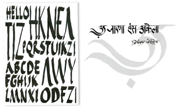
RUSTICA and CALLIGRAPHY - My typographic explorations are a platform for understanding the basics of letterform and composition and the tools and techniques used to create and modify them. Understanding structure and grids and then being able to work around them was the main focus. Sensitivity towards typography, understanding typographic concepts and terminology as well as a certain history of writing was also touched upon through these explorations.
COMPOSITION : Grids and Margins, Hierarchy - My typographic explorations are a platform for understanding the basics of letterform and composition and the tools and techniques used to create and modify them. Understanding structure and grids and then being able to work around them was the main focus. Sensitivity towards typography, understanding typographic concepts and terminology as well as a certain history of writing was also touched upon through these explorations.
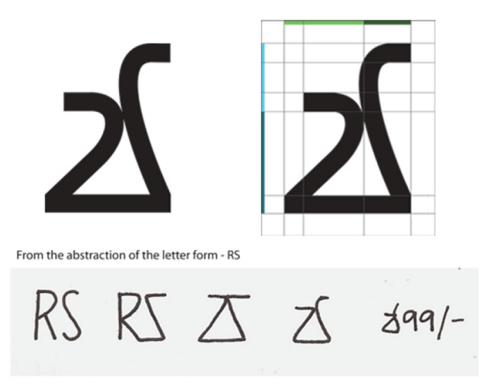
RUPEE SYMBOL 1 - Attempting to derive a letterform from the 'RS' put for the Indian Rupee.
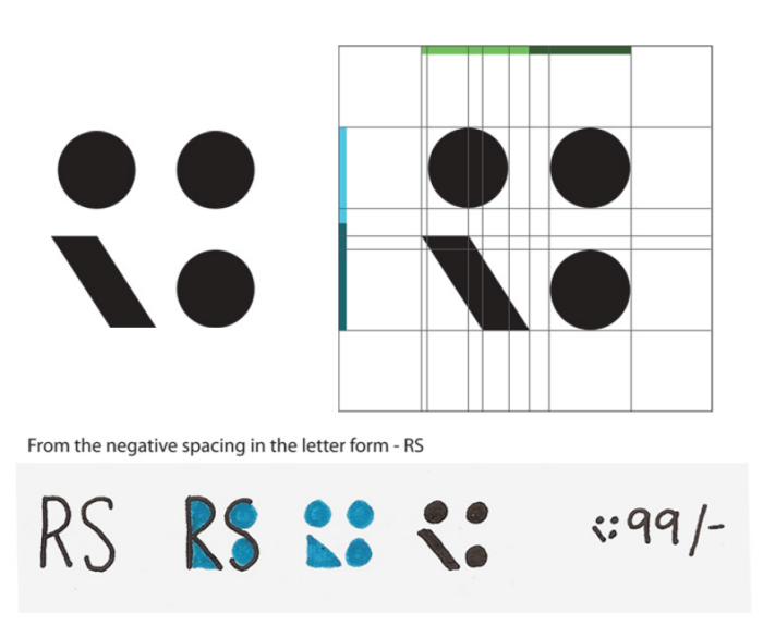
RUPEE SYMBOL 2 - Attempting to derive a letterform from the 'RS' put for the Indian Rupee.
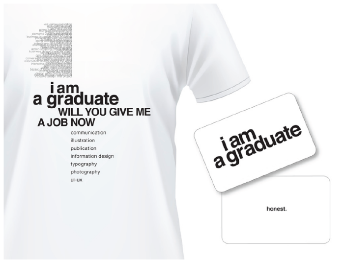
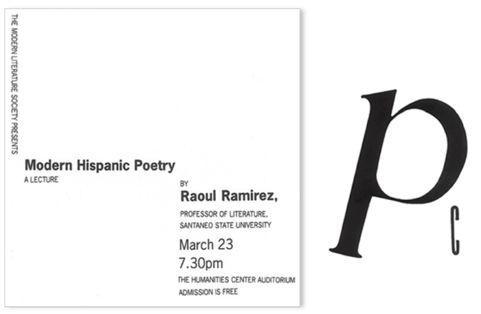
TYPOGRAPHIC UNIT : Exploration - Using Helvetica to set the quote and applying it to a product.
The focus was on understanding type setting to create an aesthetic and well-structured unit.
gLike
TYPOGRAPHY