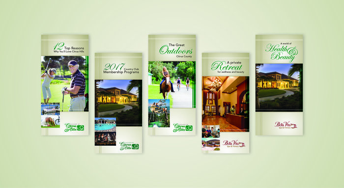
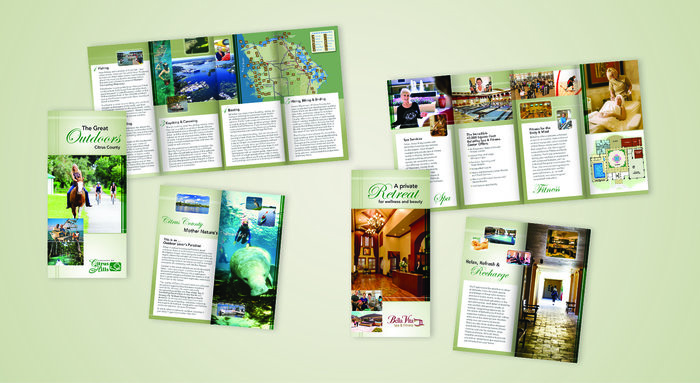
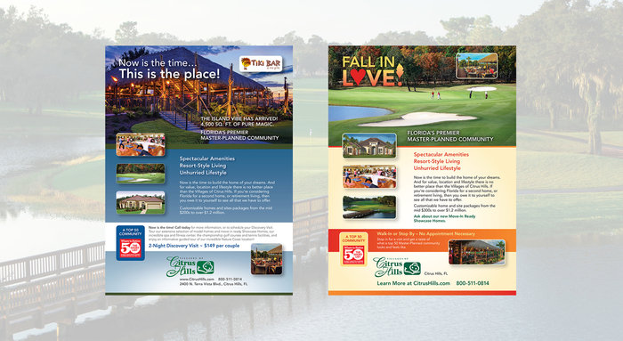
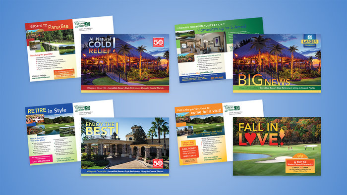
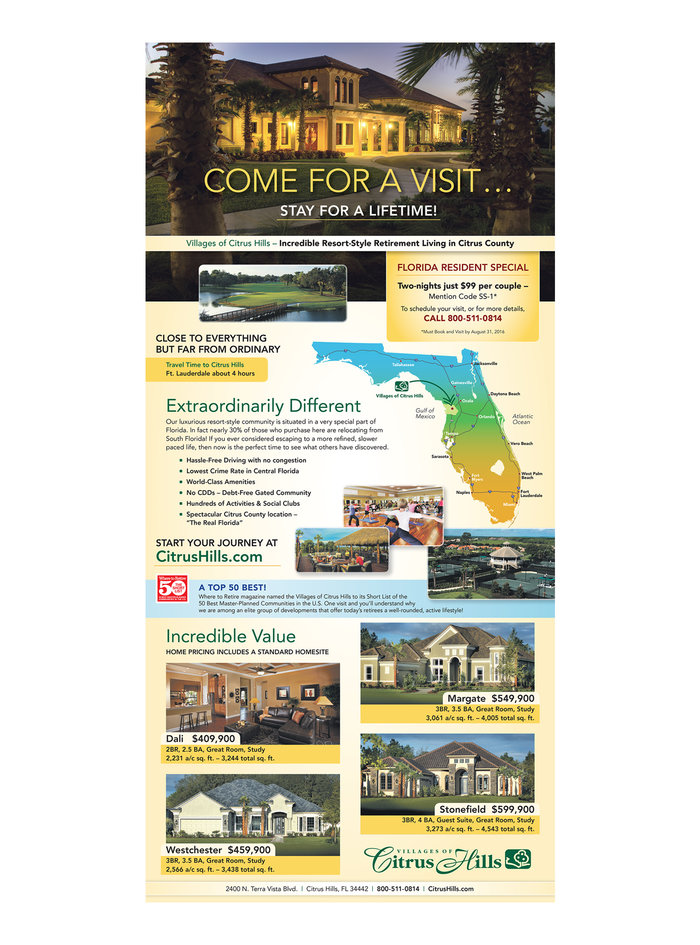
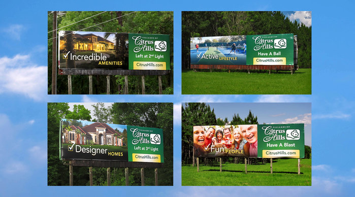
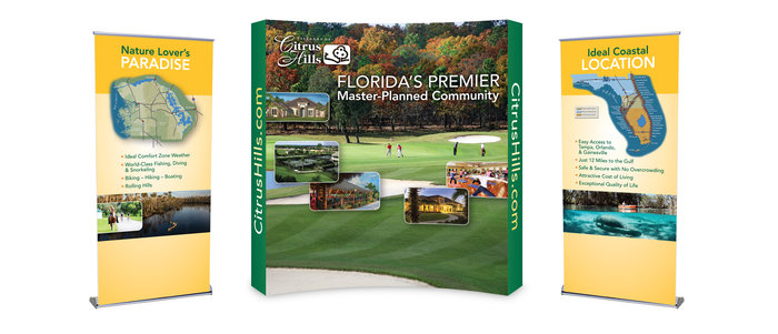
This brochure unveiled the new brand established for Citrus Hills. The original brochure was 9x12 and wove house plans into the interior page design. To offer more flexibility, the size was reduced to fit within a standard sized booklet envelope, and a pocket with business card slits was added to house letter size inserts of floor plans. The goal was to offer prospective buyers with a consolidated package while saving Citrus Hills money in printing costs.
A brochure template fitting within #10 envelopes was recommended which offered flexibility to customize each brochure to varying amounts of client supplied content and photography. It was critical for this design to be immediately recognizable as part of the Citrus Hills brand family – sisters to the community brochure.
Typefaces and photo treatment stayed true to the branding standards of previously produced marketing pieces for these full page ads. Color palettes were adapted to incorporate a more Floridian/vibrant color palette in several placements. This template has flexibility to be easily updated with new imagery and content updates.
These 9x6 postcards incorporated vibrant Floridian colors and more dynamic headline treatments to capture the viewers attention. Even though the basic design template is the same, the color palette and type emphasis was varied enough so as to give each postcard a unique look. Color palettes were customized to complement the client supplied hero and support photography for each mailer.
This full page ad was placed in Sun Sentinel. The color palette was bright and vibrant so as to reproduce well in newsprint and to stand out from the competition. The overall design remains consistent with previously designed marketing material.
A billboard template was designed using client supplied messaging and photography highlighting the amenities available at the Villages of Citrus Hills. The recommended layout enabled viewers to quickly process the headline and property location from the highway. Each billboard varied in dimension so it was critical for the layout to offer flexibility and easy legibility at each size. Usage of a rich color palette and dynamic headline treatment helped to separate and differentiate information.
Each element visually tells a story about the amenities and lifestyle at the VOCH and uses color, typeface treatment and layout to offer the most visual impact. Both display and retractable banner designs ensured important content did not fall too far below eye level with obstructions placed in front of the booth.
gLike