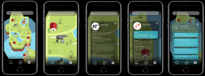
Animation of prototype - In this animation (it's a video!) you can see how the Interaction design (icon design / graphic design) will behave during usage. The choice was made to only develop the main functions (red routes) and first figure out, through User Tests, what works and what doesn't. The outcomes of these test will then be translated into a more elaborate prototype and/or product.

Icon design - Goal is to create icons which show subtle differences between animal species enough, but are simple, restrained and fit to one icon-family at the same time

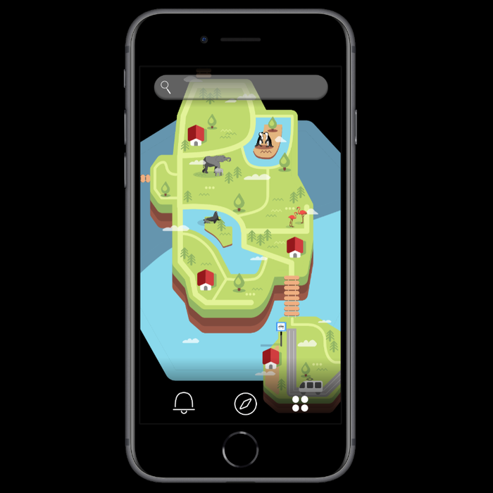
Screenshot final design. I am responsible for all the design and prototyping work

Prototype screenshot - some of the main screenshot within the the UI design. The main aim was: 'it is all about the map'. we want the app to be a simple map with added and up to date information. That is for instance the reason all windows are placed on top of the map. This way the map can be selected easily

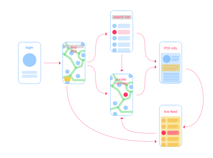
UX Wireframe - as a result of UX design and research. This is a living document. Through every iteration the wireframe will be updated and improved

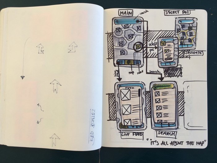
Initial sketches UI design - some scribbles (There are a lot more) to figure out what UI design would fit the requirements best
gLike