For further Project information please downloaded this PDF
View PDF
View PDF

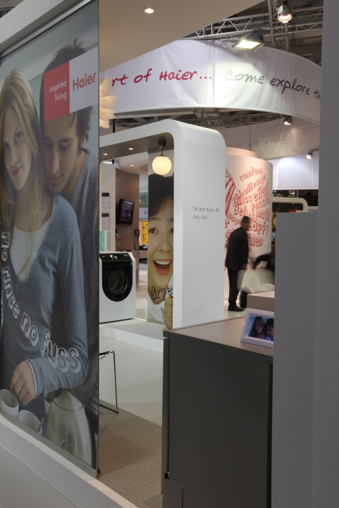
Main walkway route branded canopy around the perimeter

The brand messaging exuded character, personality and joy

Main branded signage canopy with corresponding installations and customer engagement stories at low level

The clean template and hot pink brand colour created a distinctive brand message when exhibited. This approach was reproduced through a kit of parts that allowed the stand to be reproduced at any scale and across different configurations

Axonometric indicating the distribution of the product display, brand communication tools and consultancy space and its integration with the brand canopy

Proposed Consult space

Final implemented consultancy area

The walkway routes centered on the Haier 'heart'. An expression of its commitment to people and the environment it served as a platform for the exchange of ideas based on customer needs

The stands needed to show adaptability, dependent on if the focus was a brand-building exercise or a sales show.

Installed product display, bookmarked by a 'slice of life' installation which visitors were encouraged to interact with

Convergence of brand messaging centred on the personable, fun aspects of life in which technology plays a role

Entry onto the stand created multiple opportunities for rich immersive experiences that would maximize dwell time on stand

Entry into the Haier 'heart', quite literally the heart of the brand

The heart, made up from 'product innovation' stories that had been submitted by consumers. The stand and its core components were reusable indicting Haier's commitment to sustainable solutions

Scaled consultancy areas for store-in-store proposals

Graphic communication style was designed to be reportage-like presenting the personable nature of the brand

Extensive material research was done to produce the same multi-layered canopy in different materials to accommodate differences in construction technology within different regions

A 'slice of life' installation indicating how the brand's lifestyle message was brought to life

Part of stand design for IFA Germany, one of the first large-scale installations to be delivered in Europe

The dynamic use of imagery, text and colour provided a welcome contrast to the white stand

At the IFA stand in Germany, visitors could contribute to the Haier 'heart' through digital interactives or distributed cards


gLike