
gLike
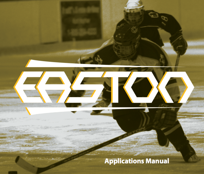
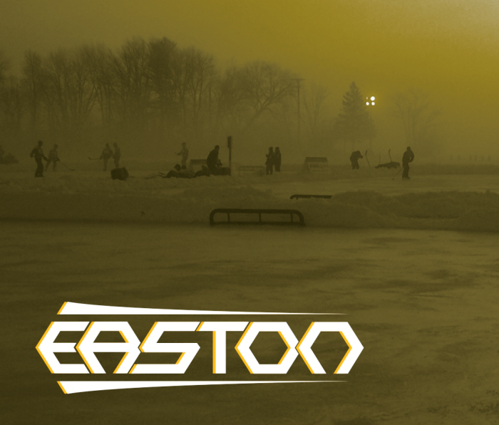
Easton Hockey (Not adopted)
The design behind this logo is based off Easton's archery founding, and its desire to advance the sport with the latest technology and research. I chose to add the swooshes to give the logo an arrow like shape that refers to the background of the company. The hexagonal custom typeface is based off chemical compound diagrams and the eludes to the advancement that Easton does for the sport.