
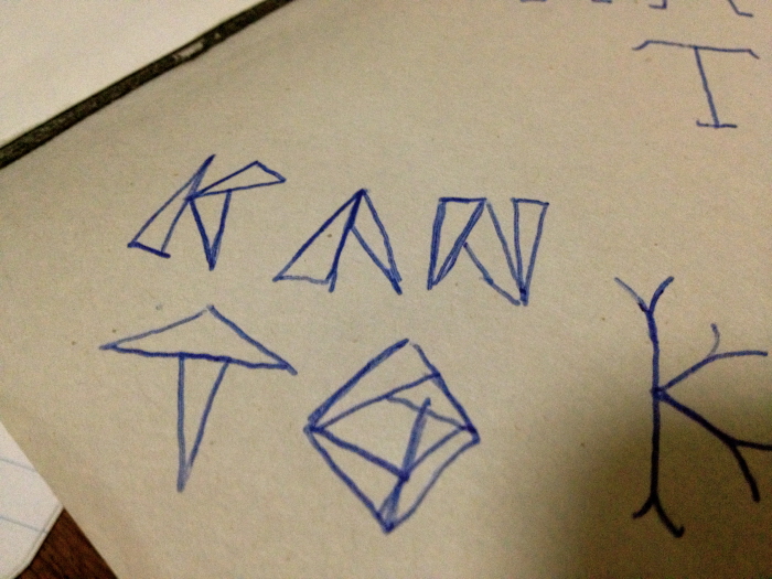
By forming letters of geometric shapes and keeping strictly to triangles it creates a simple expression. By not keeping too strict to any vertical lines the CAPS font gets a creative spark to it, like an architect just drew it with a ruler on a blank sheet of paper.
By adding the small colored triangles alternately pale turquoise and pale red it creates a certain rythm which balances the letters.
I like how the light letter frames and pale colors works towards a unified and structured font.
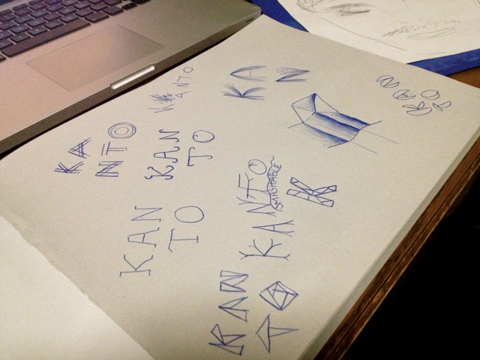
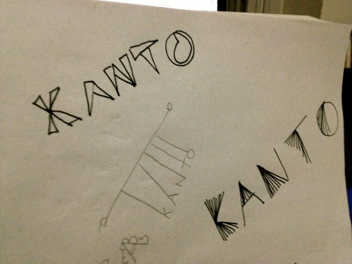
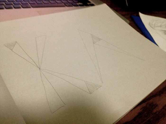
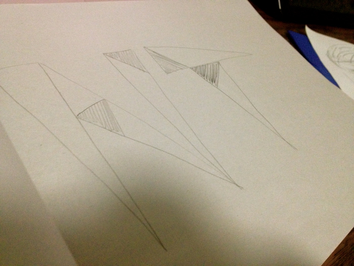
Underneath my sketches and ideas are displayed to capture my journey from multiple ideas to complete font.
gLike
Font