
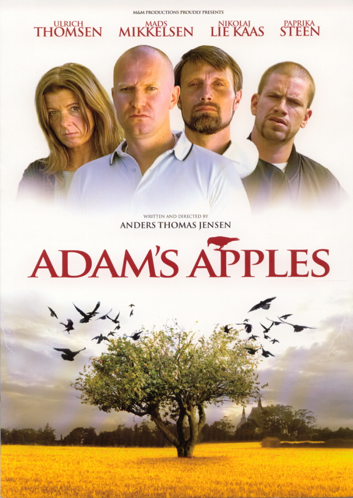
I stated by sketching and creating a layout for the content. I got my inspiration for the content from the poster in the image below.
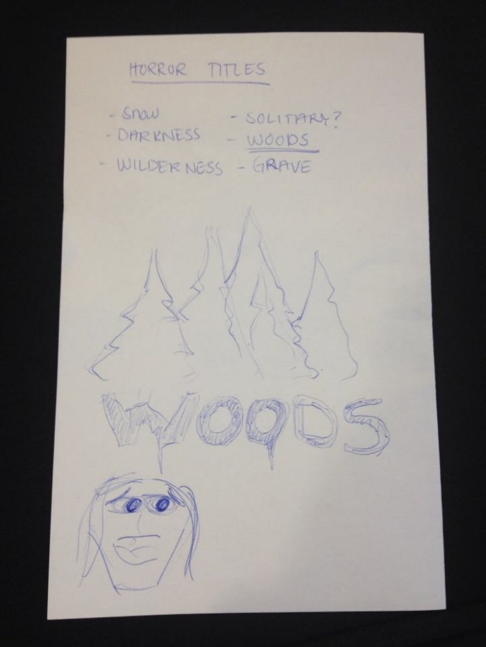
I wanted to make a poster for a horror movie so I started brainstorming on names for the movie making sketches for the final choice: Woods.
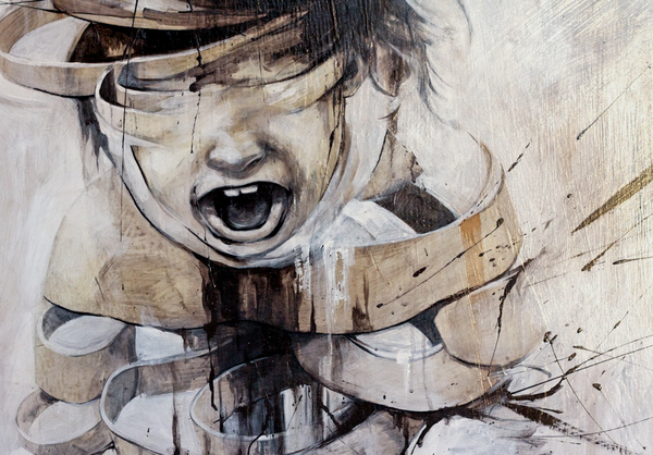
I found this photo on ww.behance.com and tweaked and changed it so it would blend into the background on my poster. Also I liked how only the texture of the child screaming leaves something for the imagination.
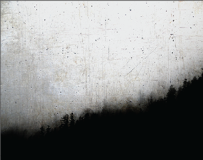
Scanning www.behance.com for images of a dark forrest I found this image. After pulling and stretching it I got exactly the distorted dark woods effect I wanted for my poster. Also I liked how the image seemed textured which works to create contrast to the child screaming thus creating a sense of depth in the poster.
I had trouble deciding wether it should be in red...
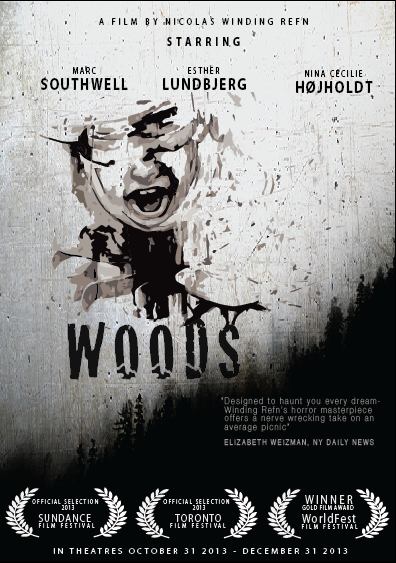
... or all in black!
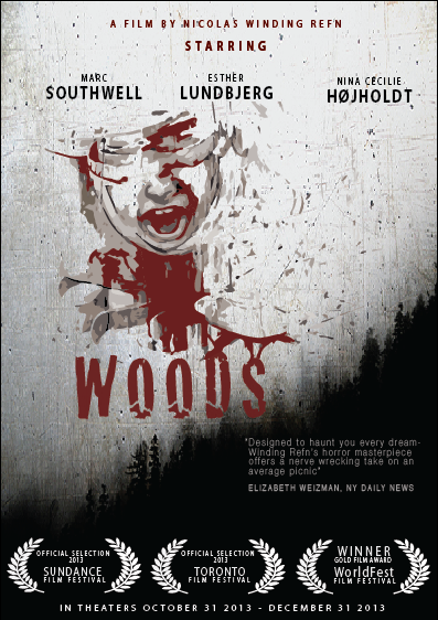
After having some feedback from my group (3) about the color they suggested that I blended the red and black. So I tried first coloring the 'director' and 'starring' red but it still seemed like the red and black was too separated.
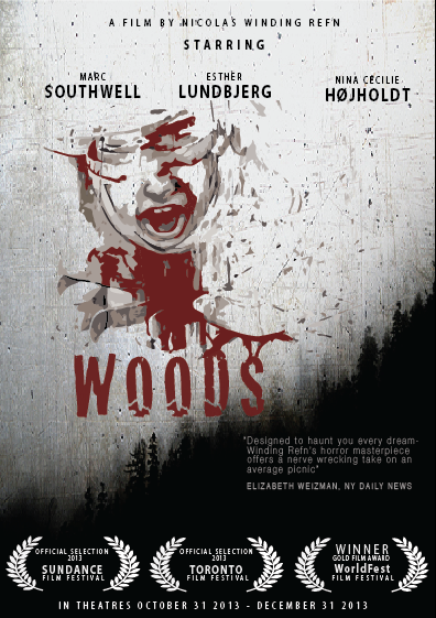
Therefore I decided to change the colors in the image changing from black into red. This is my final suggestion for the poster. Also creating a sense of poster by adding Sundance laurels, actors and a date for when the movie will be in the theaters. Using the font type 'Cracked' creates a separate logo feel to the movie title which I reinforce by connecting the title to the image of the child screaming both by the red color and by actual merging of lines.
The dark forrest in the bottom right corner and the heavy red/ black/ dark dramatic picture of the screaming child are balancing out each other creating a harmonic poster.
View PDF
View PDF
gLike
Poster Project