
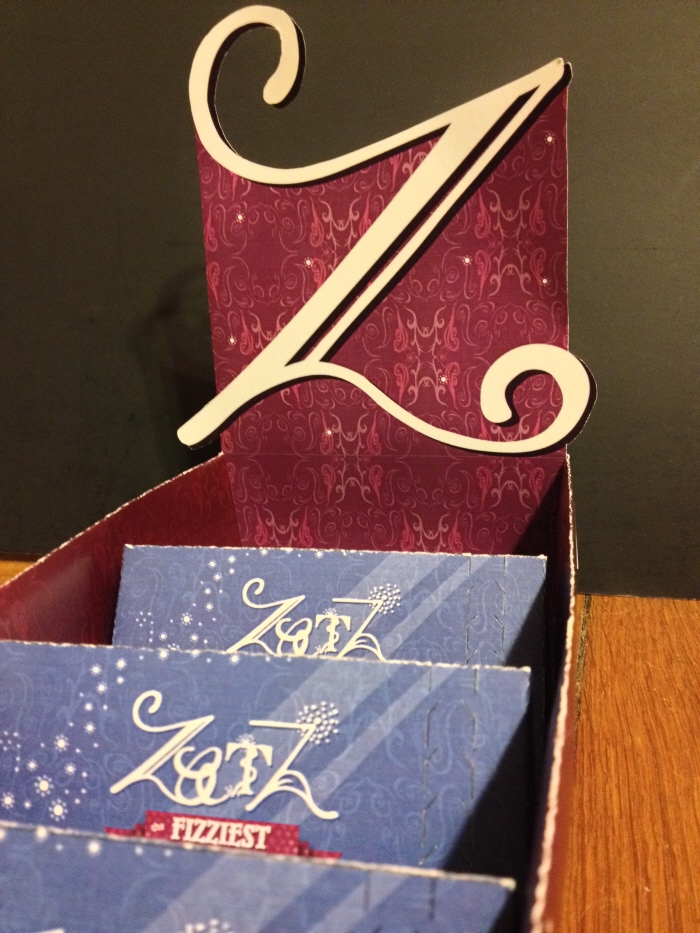
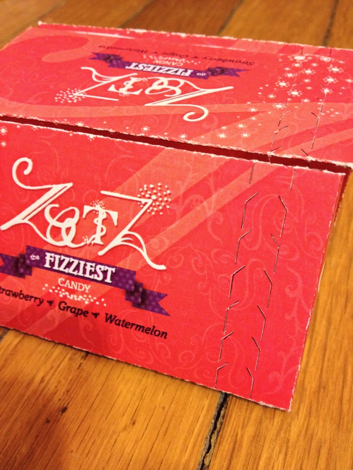
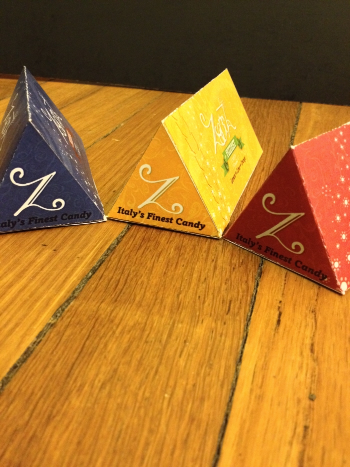
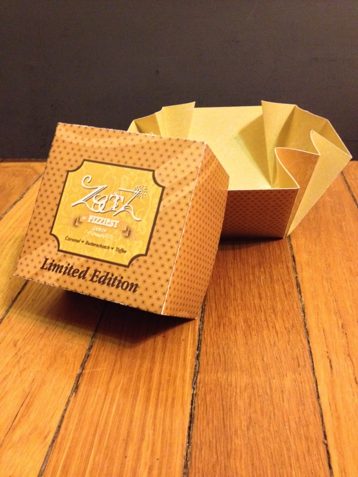
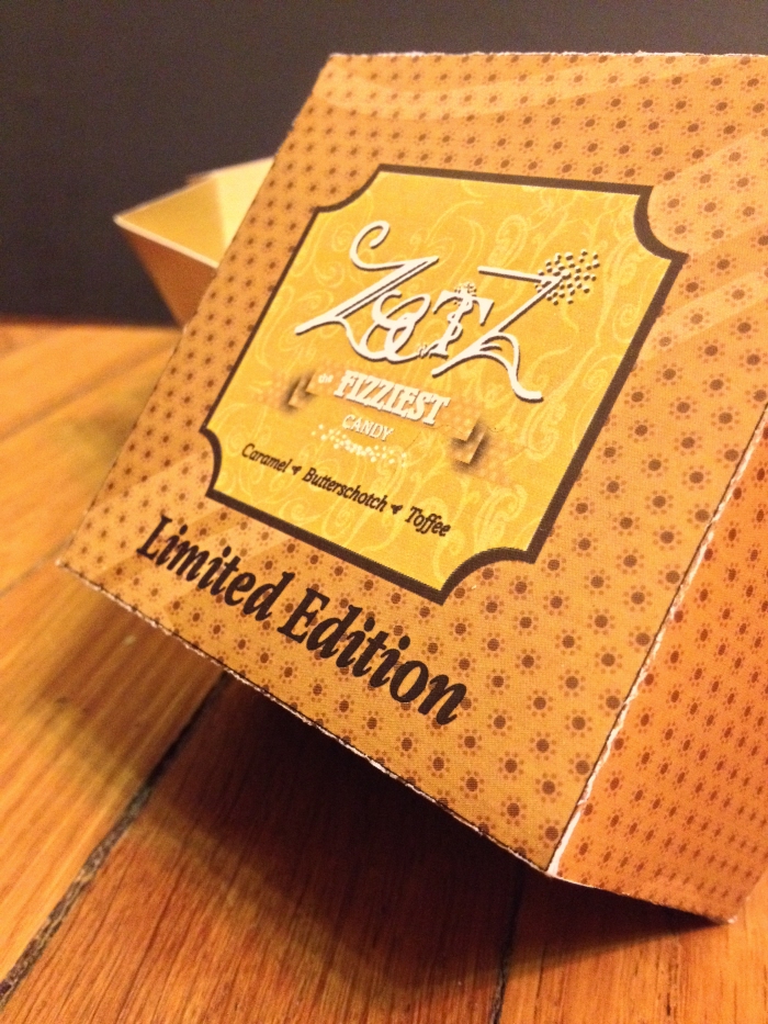
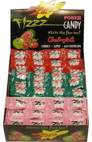
The task given to me was to successfully design a new brand strategy for an existing company and to help refine design skills and craft related to the field of packaging design. I chose to redesign Zotz candy because the design was outdated, simple, and didn't attract customers. I chose to target the candy for the older generations and make it seem more upscale. Zotz is a hard candy with a fizzy center and was manufactured in Italy so I based the design off of wine and champagne labels. I created the new patterns and type from pen and ink drawings and cleaned them up in Illustrator for a handmade feel to the packaging. The color palette correlates to the flavors in each package. Also the new packaging is a more modern take of candy packaging compared to the single wrapper as seen in the old design.
With these changes I turned Zotz candy from an outdated candy to a new, fresh and modern candy.