
Visit Beautiful: Milwauke - Intended to be an ongoing series, this was for a class project requiring that a poster be made similar to WPA posters of the 30s and 40s. All colors are sampled from real WPA posters.
View PDF
View PDF
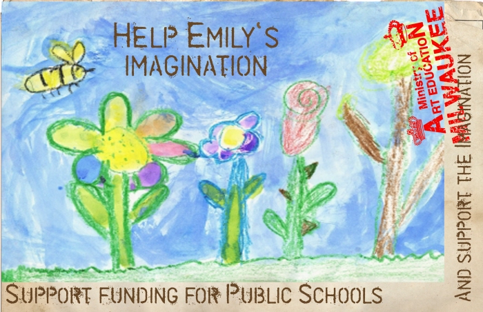
Public School Funding - Made for a class that asked to provide a poster design for a social cause. This poster would have been 100% post-consumer, with organic ink. Child's drawing was provided by my niece.
Wisconsin PTA Award of Excellence Winner 2010
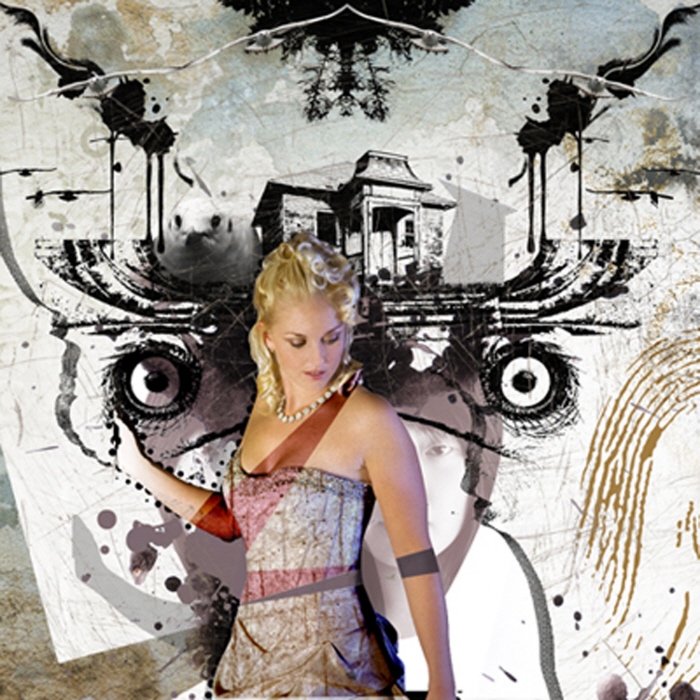
Untitled - Part of a basic Photoshop class, I used the interests and the style of the model to inspire the images.
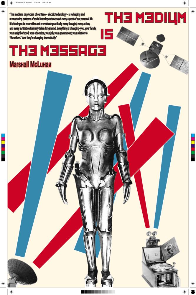
The Medium is the Message - Using the text, students were to design a poster using the ideas to make symbolize the text. Here I made the "message" in the form of signals missing and getting mixed. The crop and registration marks were intentional to give a more industrial feel. The title is meant to be switched, depending on how it is read.
View PDF
View PDF
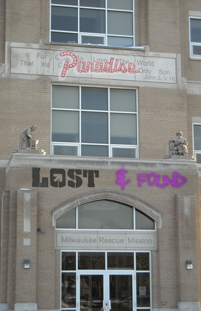
Paradise Lost (& found) - Using a play on words, I used a photo I took of the MRM, to impose graffiti-style wording. Paradise Lost because of the plight of those who live there and Lost & Found because of how society tends to forget about things once they are out of sight.
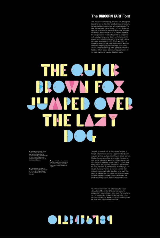
Unicorn Fart Font (working name) - Design for a great and interesting typography class, primitive shapes were to be used to form letters and numbers to help study the letter forms themselves. I used the circle (half circle), rectangle, and triangle with primary colors. The idea came from a basic block set for kids.
View PDF
View PDF
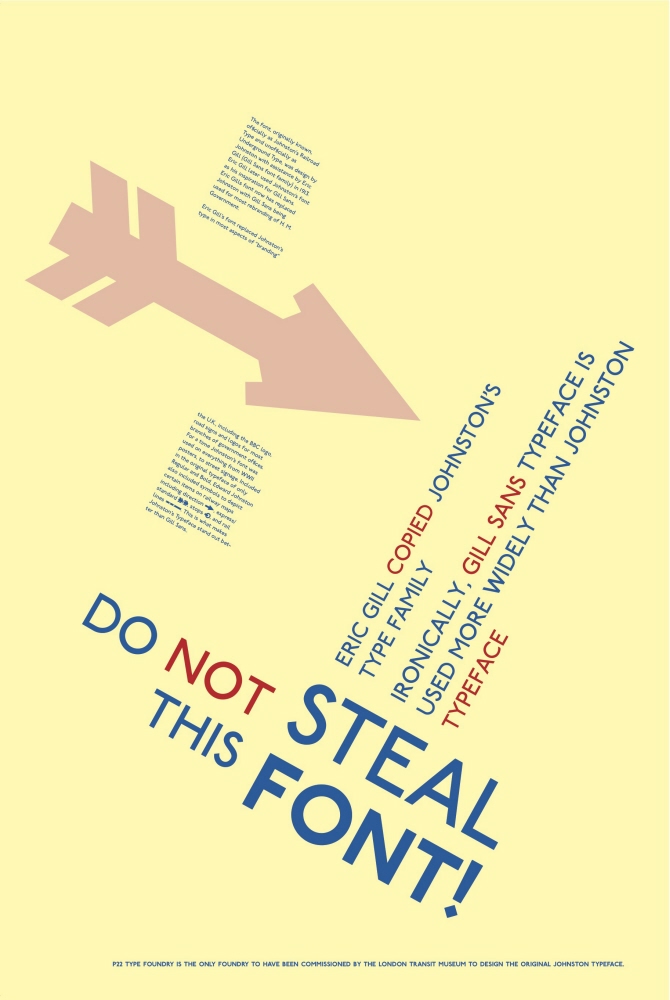
Steal this Font! - A poster based off a report on a typographer. Basically, Eric Gill (Gill Sans) worked with Edward Johnston to design the Johnston typeface, then went on his own to make Gill Sans which was essentially copied from Johnston's Typeface.
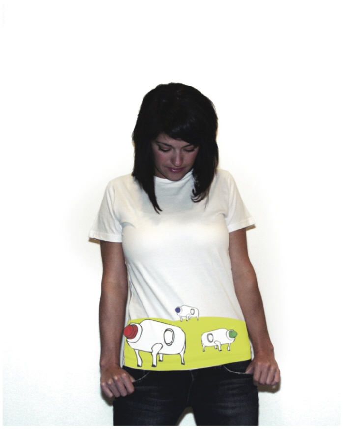
Dairy-Aire Fresh - Using the guidelines of a Suburban setting, this design was based on the current issue of the time, raw milk. Making the cows appear as milk jugs, it could be both interpreted as humorous and/or social awareness. The wearer and the viewer were able to come with their own conclusions.
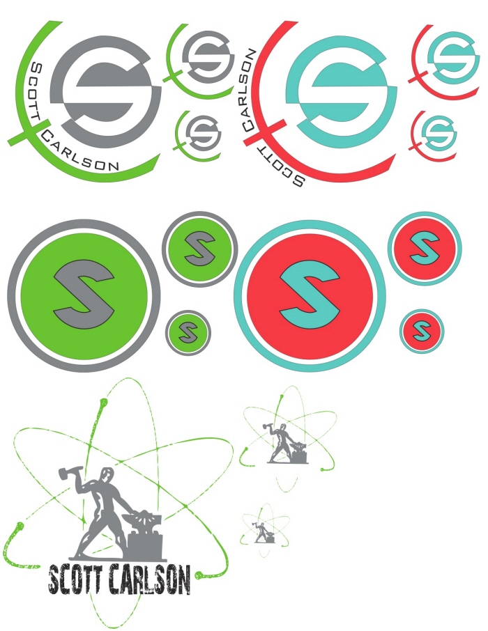
Personal Logos (working) - These were preliminary ideas for a personal logo. The first was to resemble a target of sorts, the second, a retro-Superman-ish style, and the third is a melding of my knowledge of Industrial and Graphic design.
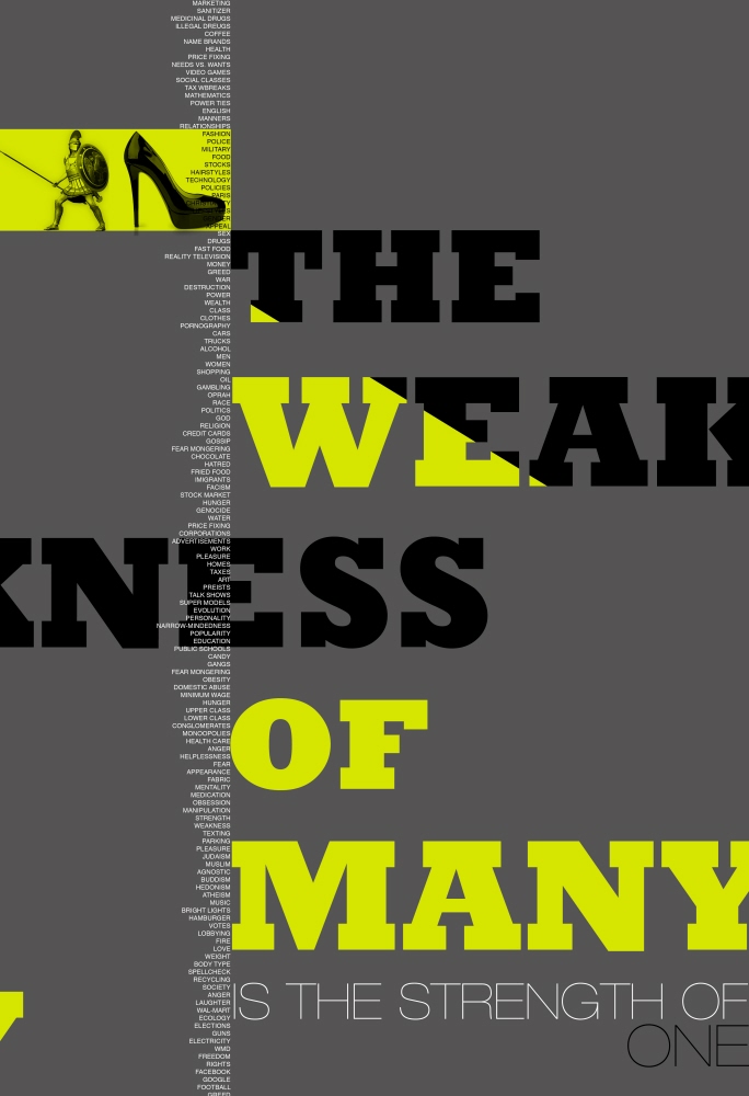
Achilies Heel - I made a poster to show mankind's weaknesses. The idea was to use a metaphor, find images to express it, then evoke an emotion. This evokes an emotion because the small type has a list of all our weaknesses, taken from a survey done by me.
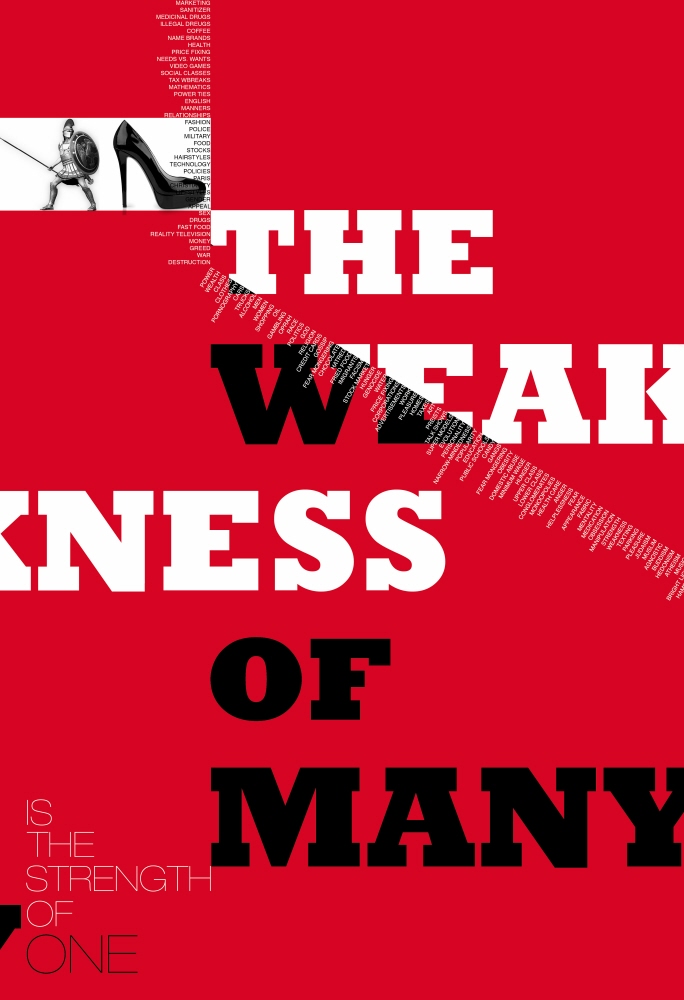
Achilies Heel - I made a poster to show mankind's weaknesses. The idea was to use a metaphor, find images to express it, then evoke an emotion. This evokes an emotion because the small type has a list of all our weaknesses, taken from a survey done by me.
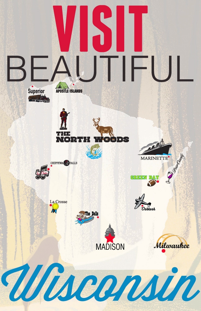
Visit Wisconsin - Promo for tourism in Wisconsin/
gLike
School