
22-Red Design Studio Postcard (copy + layout) Front - This is a marketing card that will be distributed by realtors to homeowners who are selling their homes. We wanted something catchy and fresh; something that made the audience feel the weight of the project, and then feel the release of it being passed on. I did all of the copy, plus the card design. It's carefree yet still very strategic and convincing. And the client loves it. (The back is uploaded as a separate file).

22-Red Design Studio Postcard Back - This is a marketing card that will be distributed by realtors to homeowners who are selling their homes. We wanted something catchy and fresh; something that made the audience feel the weight of the project, and then feel the release of it being passed on. I did all of the copy, plus the card design (not the logo). I think it's carefree yet still very strategic and convincing.

Baby Expo Banners 2 - Yet more... these ones appeal to the fashionista mama and give an emotional appeal as well.
Branding and differentiation are the key factors in this campaign overall. (In addition to the just-plain-cute factor.)
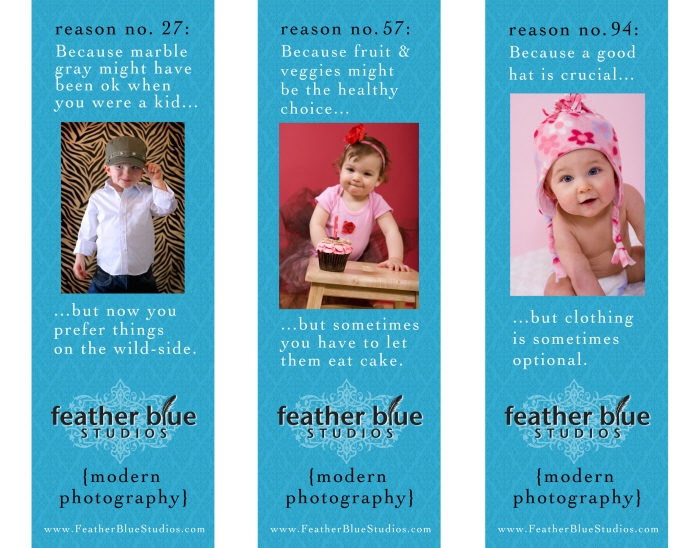
Baby Expo Banners 1 - These are large (apx 2'x7') banners used at a Baby/Child Expo that Feather Blue Studios was sponsoring -- they were hung throughout the event hall (six in all). In a world oversaturated by photographers, these were meant to set apart the keenly modern aspect of the studio, play up the branding. Marble gray backgrounds are a thing of the past (at least at Feather Blue Studios) and this campaign appealed heavily to the modern moms who want their baby apples to fall close to the modern tree.

Model Integrity "Superhero" Ad - This is a fun, lighthearted ad for Model Integrity workshops where text takes all. Because our target audience is a range of ages (from children to older adults) we try not to play-up the usual "fashion" aspect you might think of when modeling comes to mind. We want to appeal to real people, not sound intimidating from an industry perspective. Which is why the superhero angle works. I mean, who doesn't love a superhero? (Well, maybe a super villian).

Bead Gallery Ad 1 (moon) - In addition to the headline text, I did the design/layout for these two ads (with only the headings varying). They are intended for an email newsletter blast, so the target reader is presumably a beading enthusiast.
This first one is a cute play on the book "Goodnight Moon," a staple amongst young mothers (well in the range of our target audience) that reflects the special offer.

Bead Gallery Ad 2 (circle) - This second one is a bit more simple, and sentimental. Include mom in a new circle of your life - she'll love you for it.
gLike
Copywriting / Advertising