
The different variations that the logo can be used in.

A cool and calming color palette that accentuates the colors in the logo. The serif fonts are used to offset the modern feel of the color blocking used in the design layouts. I used a 'sans-serif' font for the Japanese for legibility because the Japanese is smaller than the English on all pieces.


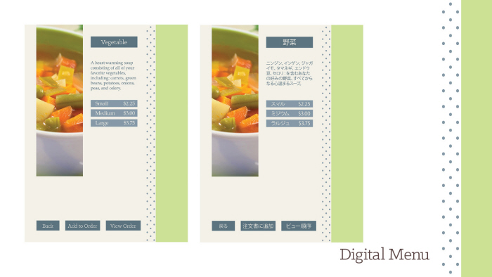
This is a digital menu template that would be utilized on in-store iPads only. This is a more technological alternative to the brochure menu shown previously.


gLike
Cafe Tabby
A branding system and pieces for a fictional cafe. The cafe is set to be in or near Japantown, San Francisco, CA. so I made the pieces bilingual.
*I was only able to translate some of the Japanese myself, most sentences or paragraphs were translated using Google Translate and I apologize if any of it is incorrect.
All photography in this was done by myself except for the photos of the soups and sandwich.