
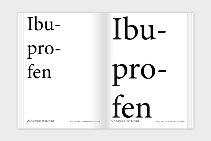
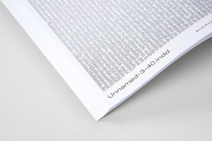
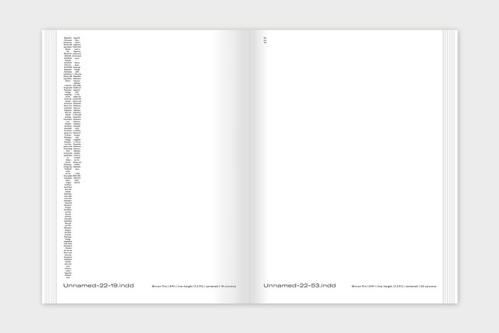
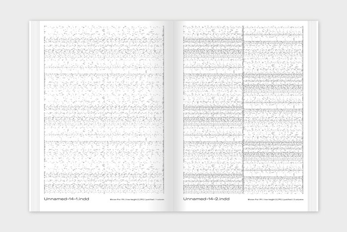
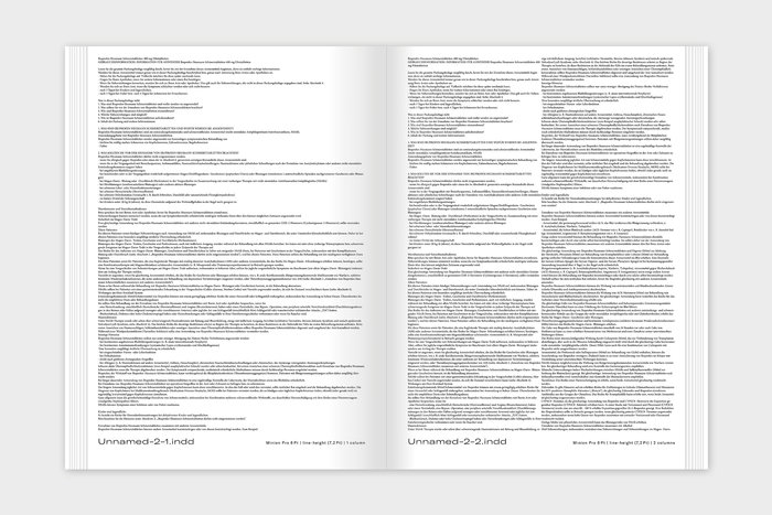
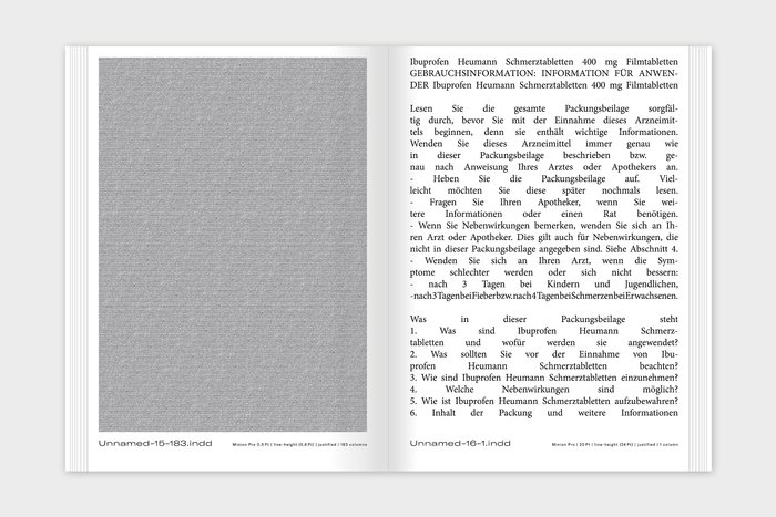
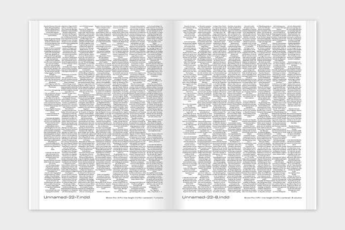
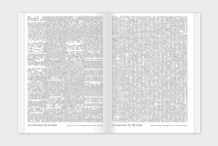
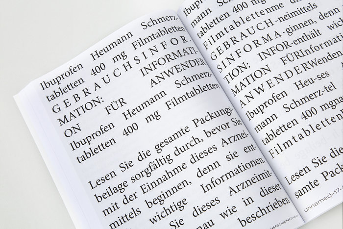
How does typography behave under extreme conditions? What visual phenomenons, patterns, artifacts, and graphic elements can be provoked by pushing type through extreme grids and using extreme typographic parameters? At what point does a text step back to its original purpose of informing the reader? When does text become something else: a graphic element, a gray surface, a static noise, or a haptic pattern?
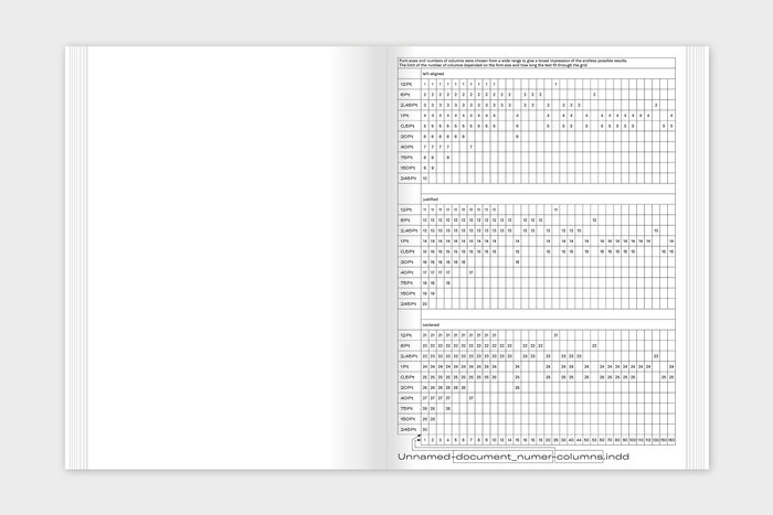
To investigate these questions, graphic designer Juliane Nöst systematically pushed text through various grids in the framework of a typographic study. Starting with the InDesign default-settings, a range of font-sizes and columns were used to generate a broad spectrum of diverse typographic outcomes.