
gLike
Giorgio de Chirico
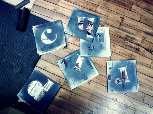
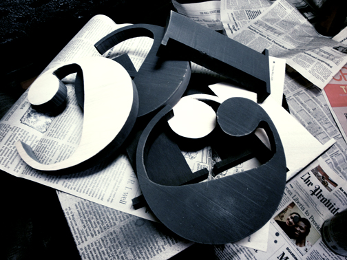
In this exhibition poster design for Giorgio de Chirico emphasis was placed on dramatic lighting and a sense of scale to capture a similar haunting, lonely feeling found in his paintings. The Bauer Bodoni typeface was chosen for its ‘h’ which reflected very similarly to the arches found in the buildings in De Chirico’s paintings as well as its origins of being an Italian typeface. These letters were cut out on the band saw. Research on Giorgio de Chirico's life and history of his painting style, as well as seeing his paintings in person helped in the concept development phase.