
Grays School of Art Halloween Fundraiser 2009 Logo - The final outcome was an insanity driven theme. The ink blot is supposed to hide within it hidden images and that is what i created for this outcome. Encoded within are themes of Halloween and fear the ink blot test itself carries connotations of insanity and visually the ink formation posses a gothic decadence.

Grays School of Art Halloween Fundraiser 2009 Logo - The final outcome was an insanity driven theme. The ink blot is supposed to hide within it hidden images and that is what i created for this outcome. Encoded within are themes of Halloween and fear the ink blot test itself carries connotations of insanity and visually the ink formation posses a gothic decadence.
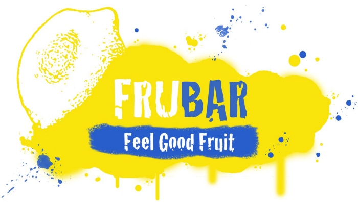
FRUBAR - This is a Logo i designed for a made up company. FRUBAR is a new take on fresh juice this aspect of the company i wanted to convey in the logo. The vibe i was going for was revoloutionary feel with hints of surf shack.

Client business cards - These are graphics i created for an Aberdeen based student jewellery designer. The client was confident enough to allow me total creative control. I decided to create a card that was elegantly simple. I used the same hallmarking found on gold and silver, these materials are synonymous with the jewellery trade. I used only the clients initials on the front as finishing touch. I carried the initialised marking onto the information side of the business card.
View PDF
View PDF

Client business cards - These are graphics i created for an Aberdeen based student jewellery designer. The client was confident enough to allow me total creative control. I decided to create a card that was elegantly simple. I used the same hallmarking found on gold and silver, these materials are synonymous with the jewellery trade. I used only the clients initials on the front as finishing touch. I carried the initialised marking onto the information side of the business card.

Bread PR Cycling - Shirt design for cycling event.
gLike
Graphic work