Non-profit organization, Literary Arts, wished to rebrand itself to a younger more masculine audience while retaining it's primary audience of middle-aged women
Typographic illustrations included in a rebranding campaign for Portland non-profit, Literary Arts. Each of the guest speakers was illustrated in this style and used throughout the campaign.
Detail of the typographic illustration for Peter Matthiessen included in a rebranding campaign for Portland Non-Profit, Literary Arts.
Detail of the typographic illustration for Cynthia Ozick included in a rebranding campaign for Portland Non-Profit, Literary Arts.
Annual publication listing the guest speakers that were involved with the Literary Arts organization and supporting information about them with typographic illustrations included.
Typographic illustrations included in a rebranding campaign for Portland Non-Profit, Literary Arts.
gLike
Literary Arts

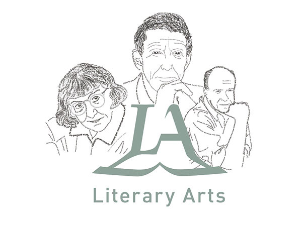
Portland non-profit, Literary Arts, wished to re-brand itself to appeal to a younger, more masculine audience, while retaining its main
audience of middle-aged women. The logo merges the letter “L” with a touch of elegance and sophistication, into the letter “A” set in a
modern san-serif typeface. The initials of the organization rest on an open book to symbolise a foundation firmly set in contemporary literature. The color palate utilizes a cool, earthy green that Portlanders of any age and either sex can identify with while the text illustrations serve as eye candy for all.

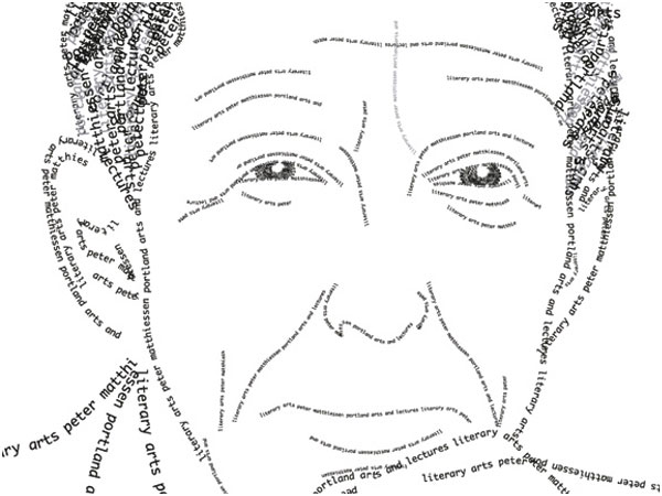
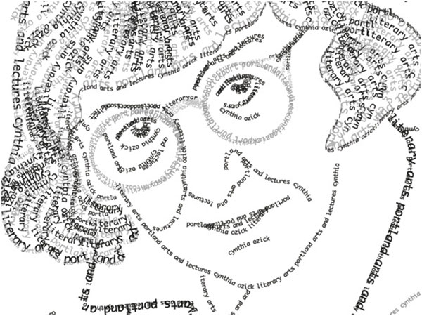
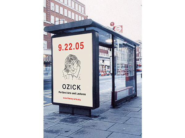
The concept behind the advertising campaign and the annual communications manual is based on the ability of literature to inspire new thoughts and ideas that shape the world around us.

View Website
Dave Smith
Designer Portland, OR