
Business Card - This is my Business Card with my newest version of my logo. Blue and Red for The Letters "TM" Which are my intials. Use a blue gradient of white to black so that it could give the logo some appeal. I found that Gradients are not so bad if they are used properly. I felt the need to list Some of the things that i can offer as a designer. In Blue to seperate it from the rest of the card.
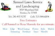
Samuel Landscaping - This a Business Card that i made for a landscaping business. His previous business card was a mess and the readibility was awful. He did not have a lot of money so he did not want to take a lot of time to work on it only a couple days. I used clip art that would be associated with lanscaping. The colors and fonts i used was used on his old business card that he wanted to keep. I also gave him two options for cards either lanscape or portrait. It is appropriate he chose the Lanscape one.
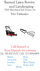
Samuel Landscaping - This a Business Card that i made for a landscaping business. His previous business card was a mess and the readibility was awful. He did not have a lot of money so he did not want to take a lot of time to work on it only a couple days. I used clip art that would be associated with lanscaping. The colors and fonts i used was used on his old business card that he wanted to keep. I also gave him two options for cards either lanscape or portrait. It is appropriate he chose the Lanscape one.
gLike
Business Cards