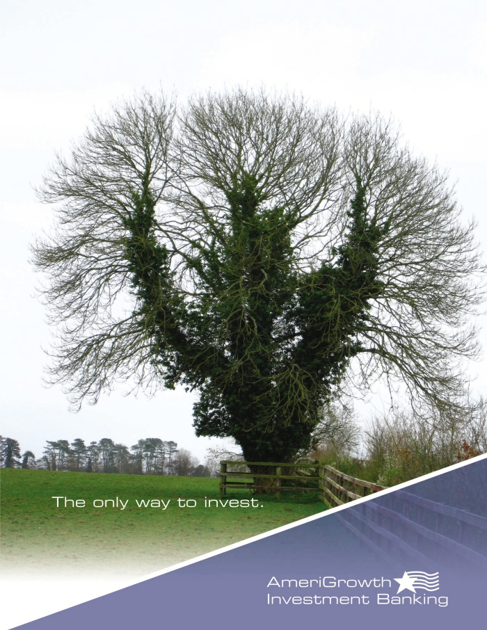
AmeriGrowth Advertisement - Created as an add for an investment bank. Used a classic blue color to divide the logo and the image. The tag line is to the left in white to make it pop from the dark backgound. Used a gradient mask on the image to transition into the white key line. Used the classic color blue because it implies calm and security.
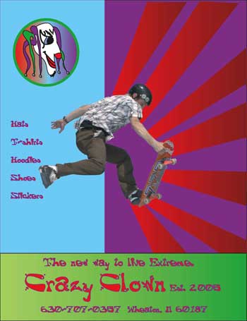
Crazy Clown Ad - This is one of a series of Four ads that a put together for a extreme sports apparel Company called Crazy Clown. Another corporate identity created. The Layout in this ad is like this to seperate The information for the action to help with the readability of the advertisement. The Colors were chosen to look like the colorful outfits of a clown. Red purple and green. The blue is put in to Contrast all the dark Colors to bring them out. This add has a lot of movement with the lines. Some may say it is to busy, but that is the idea Extreme sports call for Extreme Advertising and a lot of engery which this has.
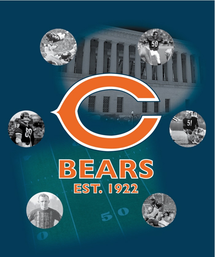
Bears Poster - This a 24X36 poster created for a sport fan. Used masks on the feild to ghost the columns and the feild. Used a similar font used by the bears. The colors used throughout are for the bears. Used the images of the classic bears players in black and white to show the legacy and nostalga of the bears players. The classic bears "C" is the first thing noticed and ties in the the whole poster. This is something a bears fan would love.
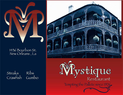
Mystique Bilboard - This bilboard originally was a magazine ad for a restaurant identity. Fine dinning establishment in New Orleans I used Colors that I would associate with mystery hence the name "Mystique". Originally it was just a maroon Color with the off white I added the Navy to Compliment the Red. The ornimentation on the logo is eyes hiding behind the "M" suggesting mystery. Put a gradient inside the logo of red and the off white to make it pop with the Navy Blue background. It was set in New Orleans because it seem like the perfect setting. A city where everthing is different.

Ireland Brochure Inside - This is a standard 6 panel brochure. I used Image of a rolling green hill in Irish country side for the outside. Used shades of green on the inside that would be associated with Ireland. All the photos used in the brochure are all from Ireland. They were all photographed by me. The color of the typefaces where selected because the contrast with the deep greens throughout the design. The type faces for the copy were selected for readability.
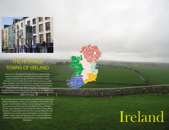
Ireland Brochure Outside - This is a standard 6 panel brochure. I used Image of a rolling green hill in Irish country side for the outside. Used shades of green on the inside that would be associated with Ireland. All the photos used in the brochure are all from Ireland. They were all photographed by me. The color of the typefaces where selected because the contrast with the deep greens throughout the design. The type faces for the copy were selected for readability.
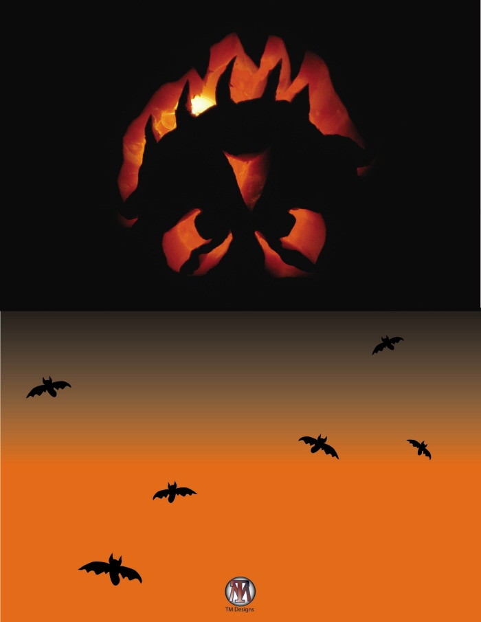
Halloween Card Outside - This is a standard 4.25"X5.5" greeting card. The color shcheme i chose bcause it is associated with halloween. I used a bat pattern and pumkin to give it even more of the holiday's feel.
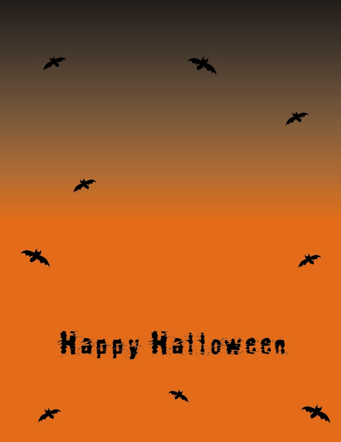
Halloween Card Inside - This is a standard 4.25"X5.5" greeting card. The color shcheme i chose bcause it is associated with halloween. I used a bat pattern and pumkin to give it even more of the holiday's feel.
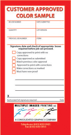
Approval Sticker - The Print shop that I work at ran out of approval stickers to put on their proofs they give to customers. They were unable to find the file for the stickers. They asked me to recreate the stickers. So I did and they were very happy with the result and use them on all their proofs.
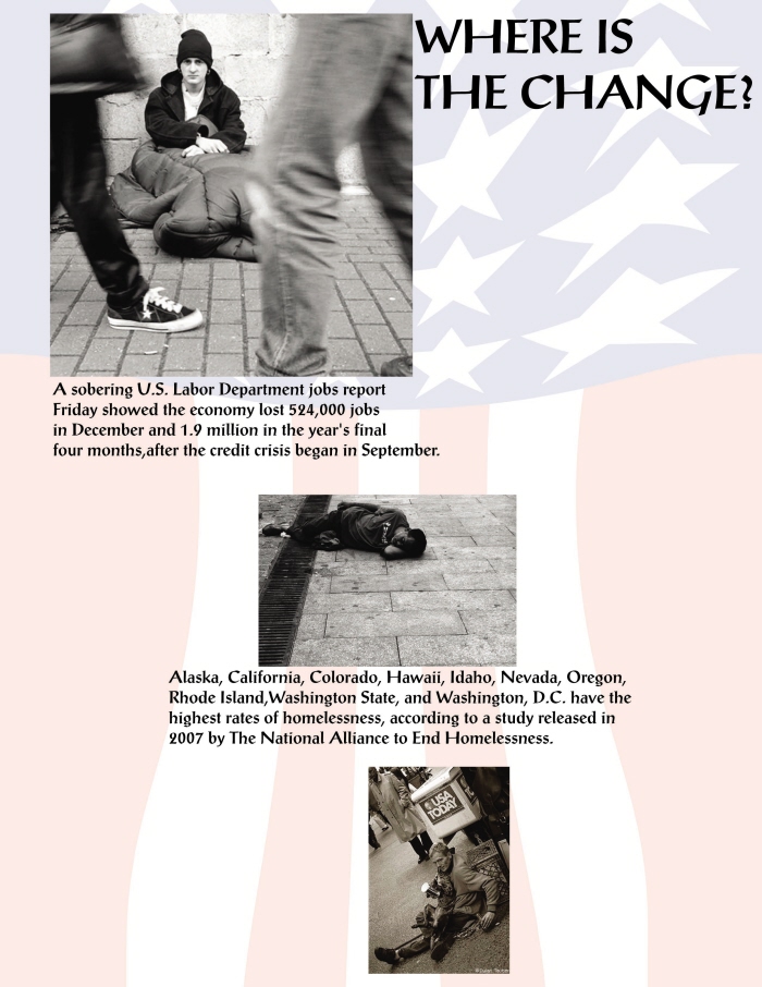
Homless Poster - This a informational poster about being aware of the facts about homlessness in America. Used warped american as background because it ties it all the images together. I align the pictures on a diagonal so that it will keep your eye moving down. The fonts used to give an edge, but still be able to receive the message.
PNC Banner - This was an out door banner I designed banner designed. used the colors of PNC throughout the banner. treated as almost an extra large business card.
It was to be used for multiple events. it was printed on a very durable scrim material. Which lasts a long time. It was printed on a large format ecosolvent printer. It should last for several years.
Barbara's Elegent Touch Vehicle Magnet - This was a vehicle magnet that was designed for a event staffing company. I used a stylized font for the name to communicate "Elegant Touch" The other fonts were used for readability. the whole design i was going for that classical look. Gold and black gives it that nostalgic yet first class look.
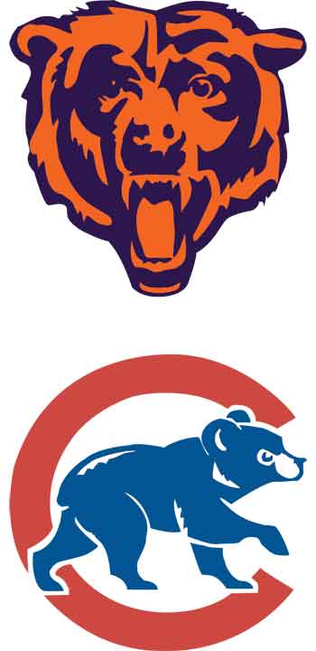
Bears/Cubs Window Graphic - This is an interior window Graphic. I recreated two of the traditional logos for both the bears and the Cubs. Converted small raster based logos into vector. They are both 30"x30" printed on clear vinyl backed up with white. The purpose was to block out the sun while at the same time show Chicago sports Pride.

Go Green Window Graphic - Simple vehicle window graphic. it was designed for the little window under the spoiler on a prius. used the colors of the company in the text. The font was used from his logo. The logo was originally stacked I changed it to fit within the dimensions of the window. Printed on white perferated window film.
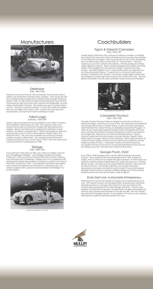
Mullins Museum Banner - This was a banner designed to go into a banner stand. For an automotive museum. The main focus here was readability because it was informational graphics. I used gold bands to compliment the black and white to communicate nostalgia. As well as to model it after there logo. This was one of two I created for them.
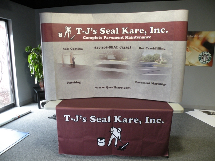
TJ's Seal Care Tradeshow Booth - I based the design for their booth graphics off their website. Then I used the same fonts and logo. I had to recreate the logo in order for it to come out sharp on the display. Naturally, I used their gray and red color scheme identified with them. I overlaid the scheme on an asphalt texture to help communicate that they were a paving and asphalt sealing company. The logo was also used on the table throw. Which is seen below the pop up display.
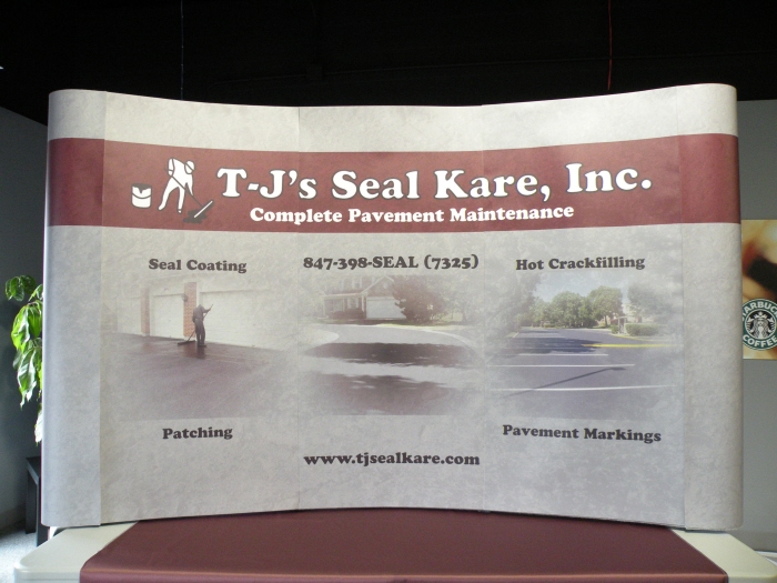
TJ's Seal Care Tradeshow Booth - I based the design for their booth graphics off their website. Then I used the same fonts and logo. I had to recreate the logo in order for it to come out sharp on the display. Naturally, I used their gray and red color scheme identified with them. I overlaid the scheme on an asphalt texture to help communicate that they were a paving and asphalt sealing company. The logo was also used on the table throw. Which is seen below the pop up display.
gLike
Portfolio