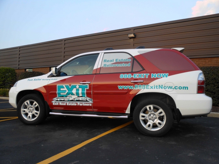
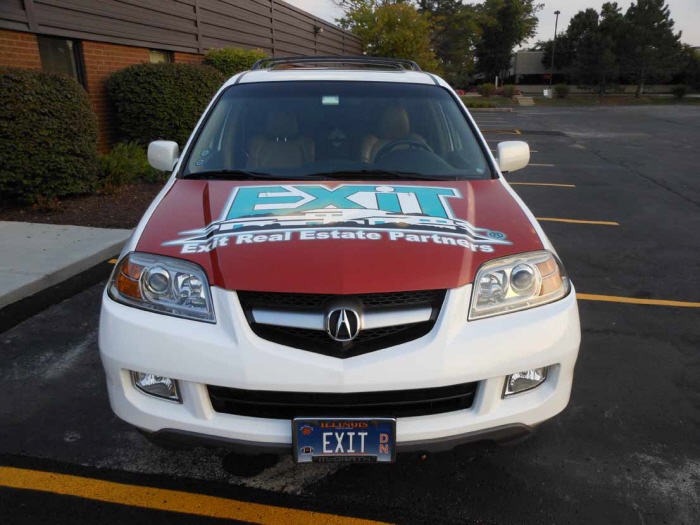
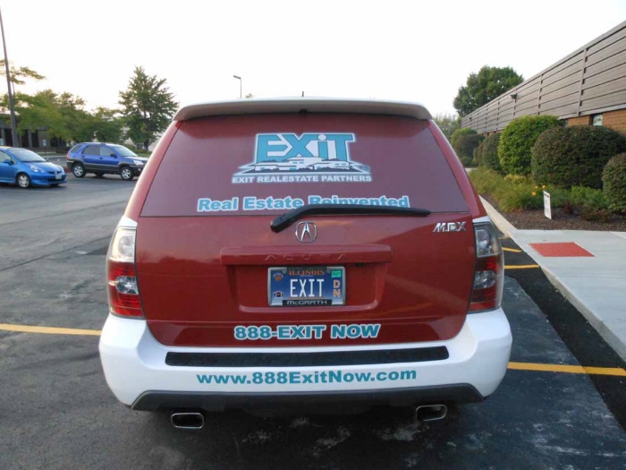
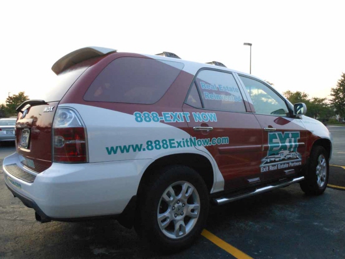
Exit Real Estate Vehicle Wrap - I used a basic design based on the client’s recommendation. The red swoosh was used to give a feeling of movement to make the viewer’s eye to move from the front to the back of the car. The colors that were used were those associated with the client’s scheme. It's simple the idea was to be a business card on wheels, as with all wraps.
Exit Real Estate Vehicle Wrap - I used a basic design based on the client’s recommendation. The red swoosh was used to give a feeling of movement to make the viewer’s eye to move from the front to the back of the car. The colors that were used were those associated with the client’s scheme. It's simple the idea was to be a business card on wheels, as with all wraps.
Exit Real Estate Vehicle Wrap - I used a basic design based on the client’s recommendation. The red swoosh was used to give a feeling of movement to make the viewer’s eye to move from the front to the back of the car. The colors that were used were those associated with the client’s scheme. It's simple the idea was to be a business card on wheels, as with all wraps.
Exit Real Estate Vehicle Wrap - I used a basic design based on the client’s recommendation. The red swoosh was used to give a feeling of movement to make the viewer’s eye to move from the front to the back of the car. The colors that were used were those associated with the client’s scheme. It's simple the idea was to be a business card on wheels, as with all wraps.
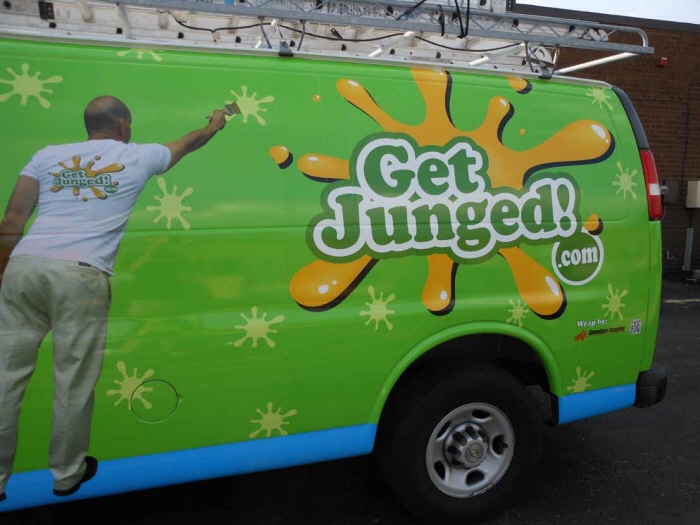
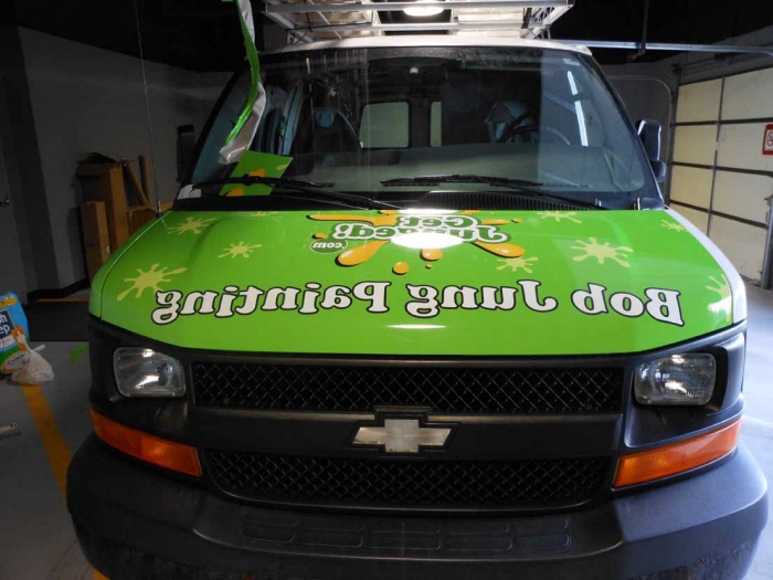
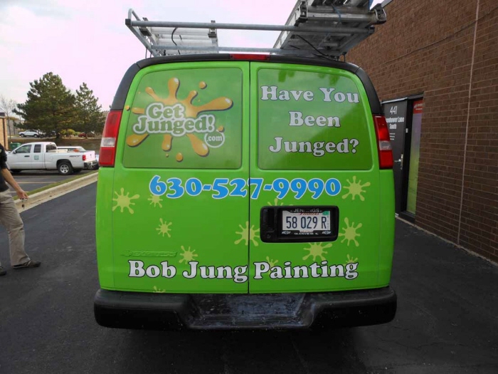
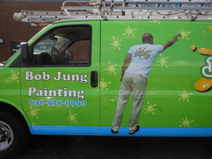
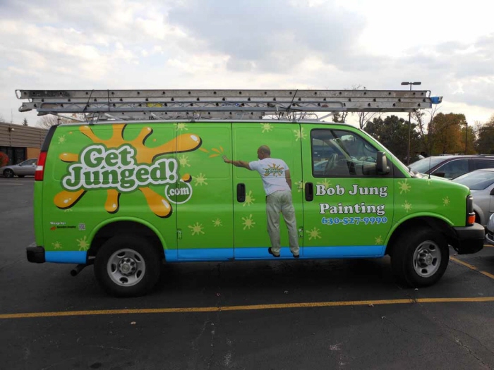
Bob Jung Vehicle Wrap & Tailgate - This was based on earlier posters that have been done for this client. The splatters; used in the background is the signature of Bob Jung Painting. It is the same splatter used throughout the design. The blue at the bottom is used as a platform that the painter is standing on. This is a in your face literal design. There is no question what this is an advertisement for.
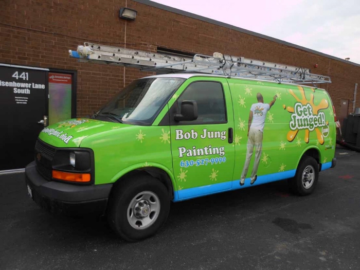
Bob Jung Vehicle Wrap & Tailgate - This was based on earlier posters that have been done for this client. The splatters; used in the background is the signature of Bob Jung Painting. It is the same splatter used throughout the design. The blue at the bottom is used as a platform that the painter is standing on. This is a in your face literal design. There is no question what this is an advertisement for.
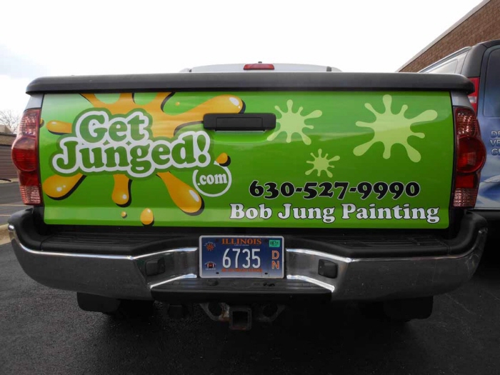
Bob Jung Vehicle Wrap & Tailgate - This was based on earlier posters that have been done for this client. The splatters; used in the background is the signature of Bob Jung Painting. It is the same splatter used throughout the design. The blue at the bottom is used as a platform that the painter is standing on. This is a in your face literal design. There is no question what this is an advertisement for.
Bob Jung Vehicle Wrap & Tailgate - This was based on earlier posters that have been done for this client. The splatters; used in the background is the signature of Bob Jung Painting. It is the same splatter used throughout the design. The blue at the bottom is used as a platform that the painter is standing on. This is a in your face literal design. There is no question what this is an advertisement for.
Bob Jung Vehicle Wrap & Tailgate - This was based on earlier posters that have been done for this client. The splatters; used in the background is the signature of Bob Jung Painting. It is the same splatter used throughout the design. The blue at the bottom is used as a platform that the painter is standing on. This is a in your face literal design. There is no question what this is an advertisement for.
Bob Jung Vehicle Wrap & Tailgate - This was based on earlier posters that have been done for this client. The splatters; used in the background is the signature of Bob Jung Painting. It is the same splatter used throughout the design. The blue at the bottom is used as a platform that the painter is standing on. This is a in your face literal design. There is no question what this is an advertisement for.
Bob Jung Vehicle Wrap & Tailgate - This was based on earlier posters that have been done for this client. The splatters; used in the background is the signature of Bob Jung Painting. It is the same splatter used throughout the design. The blue at the bottom is used as a platform that the painter is standing on. This is a in your face literal design. There is no question what this is an advertisement for.
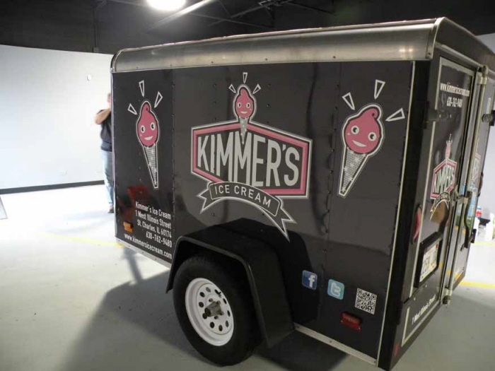
Kimmers Trailer - This client runs an Ice cream shop. This is a trailer that the take with to summer fests to sell their Ice cream. I used the black and pink color scheme that is identified with their logo. Created a simple design to get across the message we sell ice cream and this is who we are.
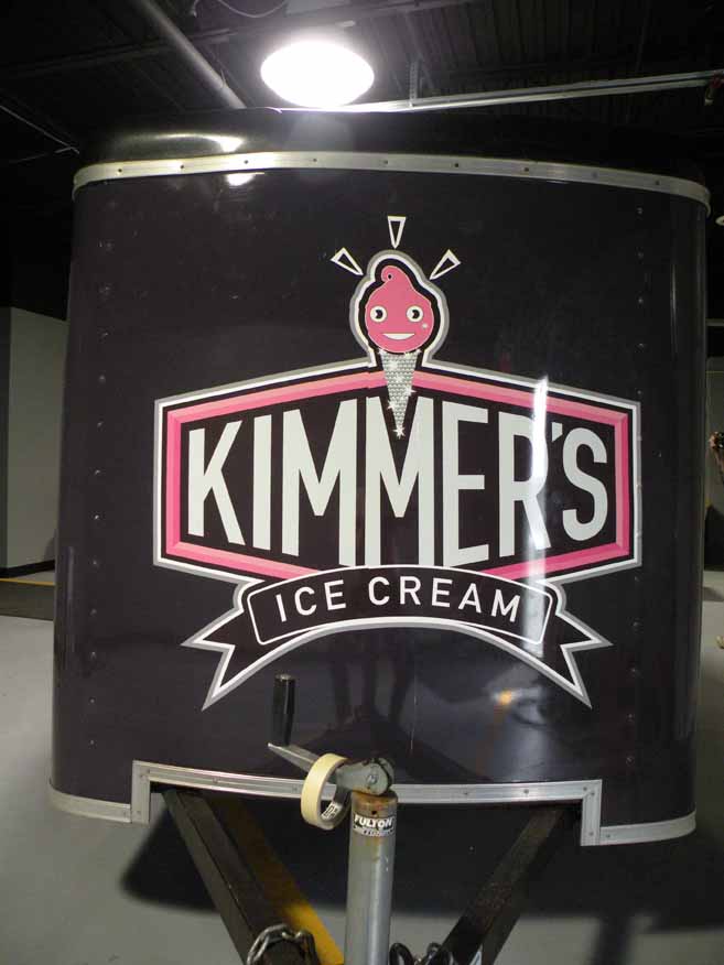
Kimmers Trailer - This client runs an Ice cream shop. This is a trailer that the take with to summer fests to sell their Ice cream. I used the black and pink color scheme that is identified with their logo. Created a simple design to get across the message we sell ice cream and this is who we are.
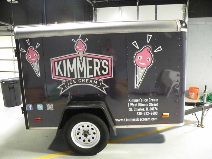
Kimmers Trailer - This client runs an Ice cream shop. This is a trailer that the take with to summer fests to sell their Ice cream. I used the black and pink color scheme that is identified with their logo. Created a simple design to get across the message we sell ice cream and this is who we are.
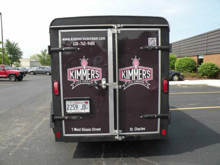
Kimmers Trailer - This client runs an Ice cream shop. This is a trailer that the take with to summer fests to sell their Ice cream. I used the black and pink color scheme that is identified with their logo. Created a simple design to get across the message we sell ice cream and this is who we are.
gLike
Vehicle Wraps