The following is the documentation of the Boogie Woodie Trek Trikester project, complete with a ton of sick photos and witty verbiage. Seeing that this was the first Christmas I was going to spend with my nephew, I wanted to make it memorable. So once again I decided to take on a big project, with a ridiculous time frame, and absolutely over load myself with stress, 5 hour energy, and surf music. Once I opened the box I had only 20 days to complete it, but in actuality it really came down to only having 7 days due to some unforeseen issues.
The main inspiration image for the project. Vinatge surf woodie wagon in a great color with a perfect back drop. image courtesy of Swanees Photographee 2011
The project started with a brand new 2011- present model Trek Trikester. This is pretty much the baddest and beefiest tricycle out there. One look at the diameter of the down tube and the fork sides and you can see why. It offers a large moto-style seat which is the hottest thing in the tricycle game today. The seat allows the kids to move around (as they tend to do) and it also accommodates them as they grow. Plus the handlebars are standard diameter and the pedals are 9/16" which allow for hundreds of available aftermarket options for grips and pedals. In addition, the large downtube, fork sides, and over-sized front fender provide an abundance of real-estate to do almost any style of paint and graphic scheme you can think of without the worry of it looking crowded or dis-proportioned.
Immediately after opening the box. Assembly of the handlebars, front wheel/ fork and bearings are required along with rear wheels
Stock front fender fresh out of the box
Stock seat/ seat pan also fresh out of the box
This was the first "approved" concept rendering. The purpose of this rendering was to show individual part colors and illustrate the color/ pattern breaks on the frame and fender. My goal was to keep a nice balance of high contrasting colors between the tan, white and the aqua, and also have a smooth, almost graceful flow of the woodgrain from the fender onto the downtube. The addition of Vans/Cult grips, ODI bar ends, and Odyssey pedals are shown
After about a half hour of debating, I decided to sand the waterslide graphics out rather than blast the entire frame. With a very truncated time schedule I didnt want to run the risk of creating additional work for myself. I found it fairly easy to sand through the clear top coat with 1000 grit. I ended up "burning" it in a couple spots down to the bare steel but it was going to get a coat of primer regardless. It appeared that there was a clear, 2 different base colors (dark and light blue), and a white primer coat stock...which will only add the the ginormous "coating totals" at the end GRAPHIC DEVELOPMENT: concept sketches - final production ready artwork Seeing that I only had a weekend to design and make production vector artwork, I didn't spend a significant amount of time developing the graphics individually. I basically sketched out very quickly the ideas I had for each graphic, scanned those sketches in, and made refinements to them in Illustrator.
I knew from the beginning that I wanted to give the bike a name, but what that was, I had no idea. With the inspiration coming from the woodie wagon, I knew I wanted to incorporate that into the name somehow. I then began looking up surf terminology, board types, you name it. I had already had the concept of Boogie Boards in my head, (little surf board for a little 2 year old person) but it wasn't until I started to listen to some Beach Boys to get that "surf influence" while working on the project that I stumbled on the name. (its very important in the design process to immerse yourself in visual imagery or music that relates to what you're designing..IMO) At the very end of the 1963 album Surfer Girl is a song called "Boogie Woodie" I saw that title, instant WIN! ("Boogie" = small surf board, small person "Woodie"= woodie wagon influence) With an extremely symbolic meaning, a nice sounding flow, and screaming "custom tricycle", the Boogie Woodie was the perfect name
I wanted to create a head tube badge that had the company name, had somewhat of a vintage look to it, and also have relevance to the project. I had already designed and completed vector artwork for the Swade Industries "past-time" typeface so I figured it was perfect to use for this application. A strong circular element in the background in the form of a bicycle chainring along with some clever verbiage to visually balance everything and it was complete
Seeing that I'm into BMX riding and restorations, I wanted to create a "shop decal" typical of the ones found on bottom of the seat or down tubes on most bikes. There is no "Mathews Surf & Bike Shop" but for the sake of this project and to make it more personalized, lets pretend there is. Also Mathews is my brother-in-laws last name...so I didn't forget the apostrophe mark between the W & the S, and I omitted it at the end due to the visual graphic element balance of the overall logo. I wanted this graphic to have an over-whelming beach feel to it...like seriously too much...the cheeseier the better. So a surf board, some palm trees, throw a tiki-bar typeface look at it, a city in Florida.... BOOM!, surf graphic.
After a number of bike concept renderings, I felt the best look overall was with the forks being white. Aqua was a bit too much, and woodgrain would break up the flow of the pattern due to the forks being a strong vertical element. With the forks white, they offered a nice contrast to the rest of the bike but still needed a bit of aqua to tie them in. After trying a few logo style concepts I quickly knew that wasn't going to be the answer, they all looked like an after thought. I then got the idea to do a silhouette image using the aqua color. I decided on a palm tree and 2 small surf boards (or boogie boards) to represent my nephew and soon to be niece/nephew. Their differing sizes reflect their age to one another, (2-0) and them leaning against each other is symbolic of their sibling relationship. I also needed it to have the correct proportions to work with the rest of the bike, and fit in the available real-estate, so some trimming was needed, which worked out well IMO
After a few iterations this was the final concept rendering. (Illustrating color, color/ pattern breaks, and decal placement.) I felt the tan seat made the bike visually look too "heavy" and the stark contrast of the tan pedals against the white front wheel made the pedals become a strong focal point, which I did not want. Also by eliminating these tan colored elements, and making them white, helped the wood grain pattern become more prominent as well as the aqua color. My goal was to keep a nice balance of high contrasting colors between the white and the aqua, and also have a smooth, almost graceful flow of the woodgrain from the fender onto the downtube. Shown are the addition of aftermarket grips, bar ends, and pedals. The final completed trike featured co-branded Cult/Vans sole pattern open-ended grips, AME bar ends, and a slightly larger than stock white 9/16" pedal set.
After I finalized all the graphics and completed all the vector art, it was time for sizing and placement. This becomes a very tedious and time consuming process for someone like myslef with OCD. Its not just getting the sizing of the graphic and its proportions correct, Its getting them all correct. Not just how they look themselves, but how they look with the rest of the graphics as a complete package...line thickness, color, placement, angle etc... The amount of paper and exacto blades I went through will not be mentioned. But after a few hours I emerged victorious with a cohesive, proportioned and accurately placed complete graphics package
Final mock-up sizing and placement of down tube Boogie Woodie graphic and Mathews Surf & Bike Shop graphic
Final mock-up sizing and placement of head tube Swade Industries graphics and front fender stripe
Final mock-up sizing and placement of front fender woodgrain hydro dip and fork side graphic
complete mock-up graphic layout including design, sizing, and placement
In order to get an exact profile of the front fork for graphics, I pulled a template off of it along with the rear foot pads using clear 3M transfer film. Once these were templated, they were scanned and vector art was completed of the profiles using Adobe Illustrator
After scuffing the existing stock coating, the frame and front fender were primed, air dried, and prepped for the wood grain hydro dipping
After scuffing the existing stock coating, the front fork and lower wheel bearing brackets were primed, air dried, and prepped for the Arctic White base coat. Arctic White was chosen due to its close match to the stock wheels. With the wheels being plastic I was worried about possible adhesion, and the beating they were foreseen to take so I opted to leave them as is for fear the paint may flake off
After an off-white base coat the frame was dipped in a wood grain pattern. The frame was actually dipped twice. Once on the down tube and once for the rear platform. Seeing that I was going to add 2 additional paint colors, the finished edges of the hydro-dip pattern were not a concern. I just needed the edges to extended beyond my color break. Special thanks to: Brutal Hydrographics New Holstein, Wisconsin 53061
The front fender right after the wood grain hydro-dipping and after a coat of clear to seal everything. Once the clear has air dryed, a paint mask will be applied to mask off the wood grain pattern before spraying the fender Arctic White. (again the center edges of the hydro dip did not need to be clean due to the base coat of Arctic White to follow) Special thanks to: Brutal Hydrographics New Holstein, Wisconsin 53061
I was always a fan of the teal woodies. To me the color just seemed to fit perfectly with the overall surf-feel of the car, so I wanted to do a similar color for the trike. However the one key factor with developing a teal color was getting the ideal hue, and value so that it would work for a boy or girl. Too much blue, and it looks like a boys bike, too much yellow and its a tractor. So I took some colors I already had (Bright Aqua, and Turquoise 91) and began to mix the 2 together at different rates, till I came to a color that I was comfortable with. (Turquoise 91 is a very vibrant more green color, whereas the Bright Aqua is more blue and tinted, so it looked more like a pastel) Draw down tests on the top 4 choices, and we had a winner. I personally feel the color came out great. Its not biased towards a boy /girl, has great saturation/ contrast with the white and woodgrain pattern, and it has a very tropical feel. (the quality of these photos do not do the color justice)
Due to some issues with obtaining the woodgrain film I chose, instead of having 2 weeks to finish painting, apply decals and assemble, I only had 6 days. Piece of cake!....So after a very quick coat of clear and a scuff sand the trike was ready for the first base aqua color. Prior to the hydro-dipping I laid out all my color breaks with 3M fine-line. I then pulled "splashes" off them with 3M transfer clear, did some tracing, scanned them in, and created vector art files of all the color break lines using Adobe Illustrator. After some quick testing I then made appropriate sized paint masks using 3M masking film. This 3M vinyl doesn't have a very aggressive adhesive so it is easily removable. However after a few passes through the oven, it does become brittle and harder to remove, so it should be replaced as necessary.
Additional images of vinyl paint masking
Seeing that I only had 4 days remaining to complete the painting, the only way to complete the project on time was to put it through the oven and bake it. (My original intention was to spray it in the booth and have it air dry) Luckily I was able to get it fixtured securely on a stand and have it fit through the line. This is the frame coming out of the oven after the aqua base coat and the second coat of clear.
After a thorough scuffing of the plastic seat pan, I was able to achieve good adhesion with a primer, followed by a base coat of aqua and a final clear coat. Due to the seat pan being an injection molded plastic, I was not able to put it through the oven to bake, therefore it had to air-dry in the spray booth. As a result I was only able to get one coat of clear on it due to time constraints. Ideally I would have liked to have a least 2 coats, but the placement of the pan does not come into contact with the rider, so 1 coat will suffice.
I opted to have the seat wrapping sourced rather than do it myself. I have some experience with upholstery (restoring my 240Z) but with this I wanted to make sure it would hold up the abuse of a 2 year old, ..plus I didn't want the kid getting jabbed with a staple. I needed a highly recommended durable material that would stretch, be easy to clean, and be cost effective for the project. I was recommended, and went with a very durable white vinyl that was a color match to the Arctic White, and had a bit of elasticity to it. It turned out to be the perfect choice. Special thanks to: Ace Auto Trim Shop 3424 W Washington St West Bend, WI 53095
Once the frame was sprayed with the aqua base color and cleared, it was time for the second Arctic White color. I also made paint masks for this color. Given the 0.150" stripe width along with the flared tip, and also the fact that the Arctic White had to be sprayed (it could not be brushed on) therefore paint masks were necessary. Also, (shown in the center pic) the profile of the down tube wood grain as seen from the underside is in the shape of a long board. Long boards (if you are not familiar) have been around since the time of the sixth-century. These boards were carved out of solid wood, reaching lengths of up to 14 feet long and weighing as much as 150 pounds. Now, this profile detail would probably go unnoticed by pretty much everyone, (so I wanted to call it out) but sometimes nothing is better than sweet subtle design elements
The frame completely masked up with the paint masks along with a bunch of pieces of masking tape. It was now ready to be sprayed Arctic White
The frame after the Arctic White and a coat of clear.
Additional images illustrating the underside of the downtube after the Arctic White and a coat of clear.
Additional images illustrating the rear platform after the Arctic White and a coat of clear.
Also, it was now time to paint the front fender Arctic White. I made a template off of the original fender decal with some slight modifications and made a large paint mask for the wood grain. With some slight scuffing of the cleared fender and application of the paint mask, it was ready for paint
The front fender after the base coat of Arctic White. Once the paint mask was removed the fender was sprayed with 2 coats of clear. As with the seat pan, the plastic fender had to air dry as well. Due to an unfortunate run in the clear, it had to be sanded and re-cleared. An excellerator was added to speed up the dry time of the second coat of clear. Being the last day before final assembly, I carefully had to transport it home, still tacky. When I got home, I cranked up the heat and placed it in front of the floor register for the night. The next morning it was fully cured and ready for assembly.
I ended up having to source the graphic printing due to the Gerber Edge printer that I have access to being down. Given that I had only a week and a half to get the graphics printed after I supplied the artwork, I had 2 separate companies working in parallel to print them. Worst case I end up having an additional set and spend a few extra dollars. Small price to pay for completing a project. And as it turns out one company completely dropped the ball, so this was probably the best idea I ever had. Thankfully I got word from the remaining shop that the graphics had been printed and were ready for pick-up on Wednesday. With the help of a good friend who was able to make a special trip to pick these up for me, I was able to apply them Thursday night and have the frame/fork/ fender ready for clear on Friday...nothing like getting it all done at the 11th hour. GRAPHIC APPLICATION Images illustrate after graphics have been applied. (final clear coats have yet to be applied)
After the frame and front fender were sprayed with the Arctic White and a coat of clear, it was time for applying the graphics. The above image illustrates the final application of the head tube Swade Industries graphic and the down tube Boogie Woodie graphics
The final application of the down tube Mathews Surf & Bike Shop graphic and the fork side silhouette graphics. Once all the graphics were applied to the frame and fork, they were then placed back on the line where they received five (yes 5!) additional coats of clear. Bullet proof, yes....2 year old proof.... yet to be determined.
The final application of the front fender stripe graphics. After the graphics were applied 2 additional coats of clear were applied to seal them.
This was the start of the final bike assembly. The 2 images illustrate before and after the installation of the fork and bearings. These are the only assembly images I took, because once I had the fork installed I realized what time it was and quickly had to finish in order to have some day light for the outdoor photoshoot. In reality, you arent missing much....4 bolts holding on the lower fork brackets which clamp the wheel bearings, 2 fasteners for the rear wheels, 2 fasteners for the seat assembly, and the stem bolt for the handlebars
I also decided to pick up a helmet for the kid as well. I was able to find a plain white one that wasn't covered in some gaudy over styled pattern, and as luck would have it the helmet had a raised center rib that was just a hair wider than the fender stripe graphic. I had ordered a few extras of each graphic, and after some trimming on both ends I was able to apply the stripe to the helmet.
After completing the final assembly around 1pm on Saturday, I was able to call upon a fellow Swade Industires associate to get in a quick photoshoot before heading out east the next day for a Christmas vacation. I figured this was going to be the last time I'd ever see it in this condition (keep in mind this is going to a 2 year old) so I wanted to capture the last good memories I had of it before eventually seeing it months/ years down the road in a "why in the world would you give me to a 2 year old?" state. So these are a couple of behind the scenes images of Adam snapping some pics in our epic back drop locations. A snow covered playground (its December in Wisconsin...our beaches aren't open year round) and in my "I refuse to grow up design studio" that would make any 10 year old or Pittsburgh sports fan feel like they just found their Graceland.
It actually rained the night before these playground images were taken so the snow was actually frozen to the point where you could walk on top of it and not sink in. Also, this playground is located directly behind the local police station. Needless to say we got rolled on pretty hard and had my plates run at least 4-5 times. Couple guys in a Porsche taking photos of a tricycle....better call for back-up
Wrestling Buddy Approved!
A mash up with the Predator
It only took him a day AFTER Christmas to warm up to the bike and start riding it. Once he did, he was all about it. Also seeing that I had so much free time to complete the project I also had a little Boogie Woodie shirt made for him as well. After a quick fun trip to BuyBuyBaby, I found a plain blue shirt and was able to get a good friend to heat press the logo on the front, as well as the Mathews Surf & Bike Shop logo on the back. Special thanks to: Liz at Axis Racing
The proportions of everything in this image are simply epic
This was the exact spot where my sister and I had our picture taken almost 27 years ago to the day (1986) with our bikes. Who would have thought we'd be doing it all over again in 2013 with his photo bombing munchkin. I want to give a special thank you to everyone that helped out, offered me a sick deal, and tolerated me for the week of hell this project put me through. As it turns out my sister found she is having another boy, so hopefully they will share, but more than likely Uncle Toddy is gonna have to build a another damn one. Thank you for taking time to check out the project. Please feel free to share it if you so choose. Project Spec Sheet
A services and cost break down of the entire project illustrating my personal out of pocket expenses as well as cost estimates for out sourcing a project like this. I tired to break each "section" of the project down and provide a fair market estimate (what I would charge) for all services associated. Also please note that I had roughly 60+ hours total invested into this project, so when you break that $1200 estimated cost down, it doesn't sound "that" completely insane
gLike
Trek Trikester: custom "Boogie Woodie" surf edition

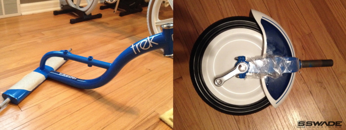
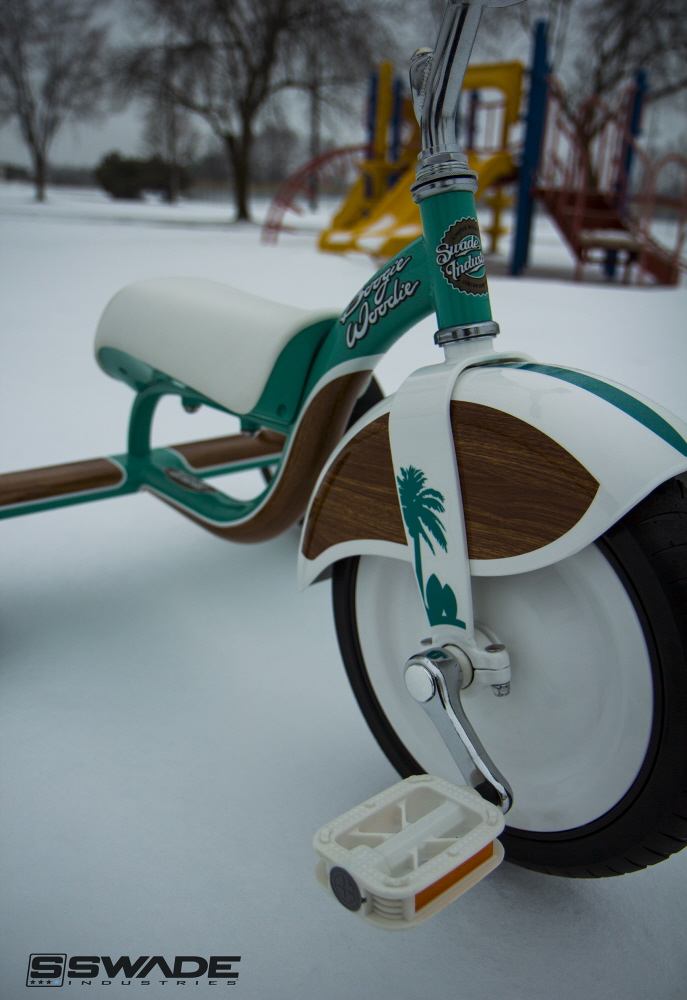
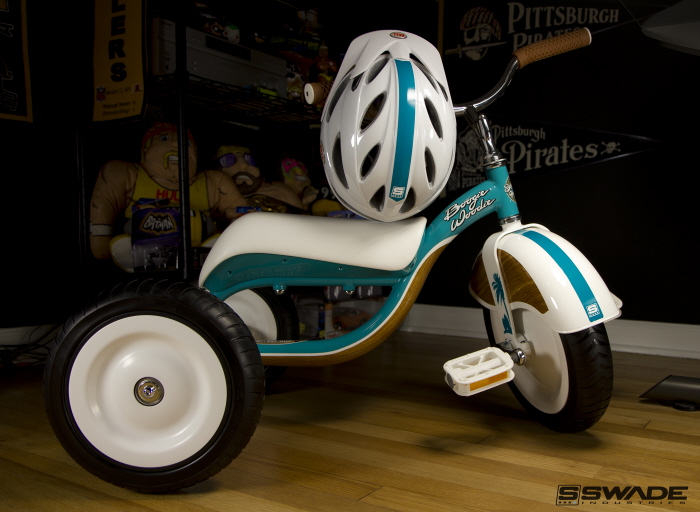
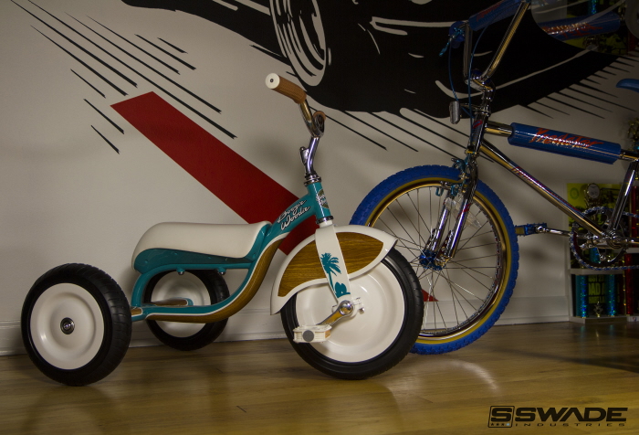
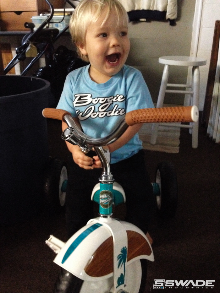
A custom designed Trek Trikster based off of the woodie surf wagons of the 1960s. I wanted to create a one-of-a-kind tricycle for my nephew and additional soon to be nephew or neice. (the sex of the baby was unknown at the time) So the biggest hurdle was to create a trike that would to be made to appeal to 2 people with the possibility of them being a boy and a girl. Having said that, with my sister and brother in law hailing from Florida (he being all about surfing, her being all about tanning) I knew I wanted to give the trike a real beach vibe. Being a car guy and loving the classics the woodie surf wagon was the obvious choice for my inspiration. With only 3 weeks to complete, I needed to develop a concept, create an entire graphics package, determine a layout, paint, hydro-dip, upholster, assemble, photograph, and deliver half way across the country all during the busiest time of the year.

SWADE INDUSTRIES /Todd...
Graphic Designer Milwaukee, WI