On reception of the brief, my first move was to design the entire homepage from scratch. I did it loosely on illustrator and a huge amount of this was carried though to the final design. I prefer a do-first-think-later approach to some design briefs because I find the best ideas are probably conceived during that initial 'rush' of enthusiasm.
I then went back to basics and the initial plan was wire-framed using FIreworks and carefully dimensioned on a 60pixel grid layout. The impact and relationships between different forms and sizes of buttons and content was considered.
The links on the main page always link to 'landing pages' this was the initial concept. No button on the main page links to anything directly, instead users are always presented with options. This slows down power users somewhat, but it is intended to encourage the less computer-savvy users to explore the resource and feel comfortable digging through the heirachy of options without say, downloading PDF files, or opening new browser windows accidentally.
The initial HTML version of the site
A template for the 'landing pages'.
This is how the content of the site was organised into a tree of options. The site spans 19 HTML pages, and any number of dynamically generated news pages
After consultation with management, the company colour green was introduced, and the remaining features implemented.
After another round of consultation, it was decided a more expansive set of resources would require access, and other changes should be made, such as giving the news feature a bigger role. In order to facilitate such changes, the site was re-structured to use an 80x80 pixel grid and the hierarchy of resources was changed.
This re-structure changed the landing pages in the same way, a change was also made to give up to three options.
The news page of the site uses an XML database and can process text and images., and contains an infinite amount of browsable pages. A simple, clean look was used to minimise visual clutter and focus on content.
A vast array of iconography was created in line with the project to accompany/define the aesthetic of the intranet resource. The icons are done in a simple, flat style. Otl Aicher was clearly a huge influence
The Main Page of the site in it's final build.
Files available on request
gLike
Nucleus Intranet

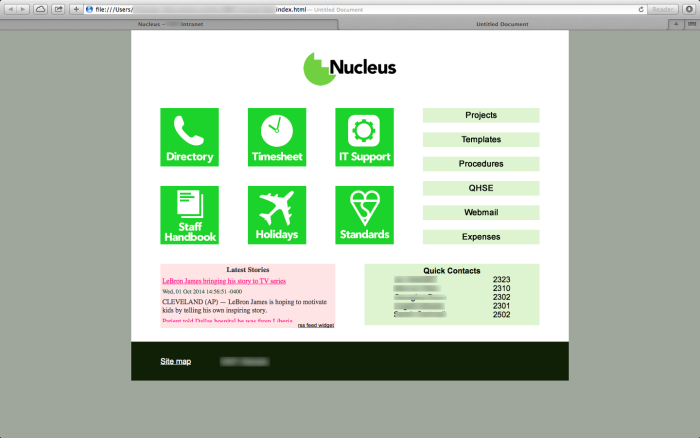
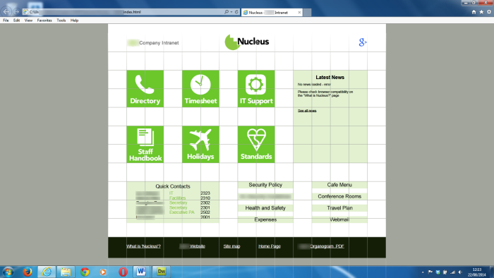
Project to Create a small, lightweight and basic intranet for an engineering company with 100-150 employees. The site was/is hosted on an internal server and uses only XHTML, CSS, JavaScript, and XML files.

The Project took about a month, and during that time I consulted the IT managers of the company, and the directors of said company.

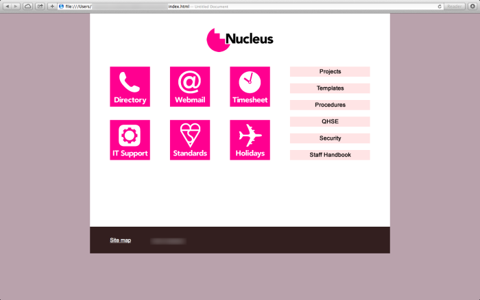
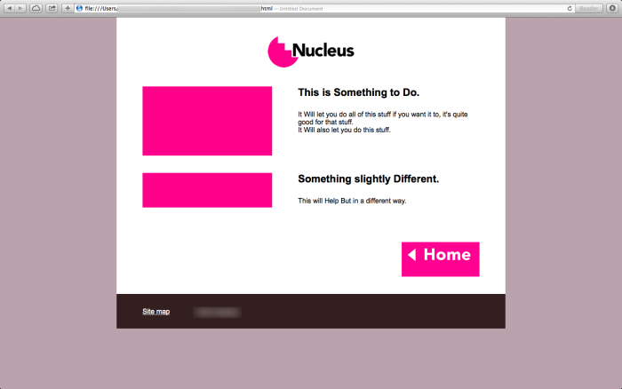
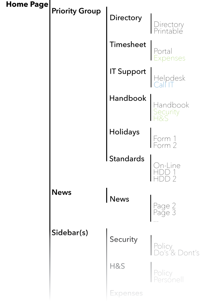
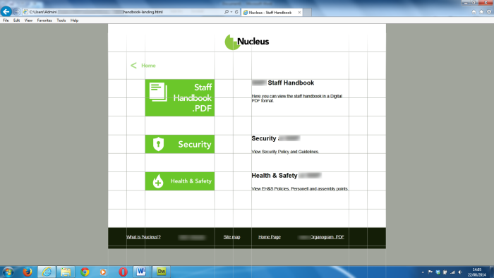
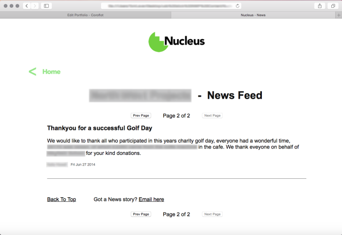
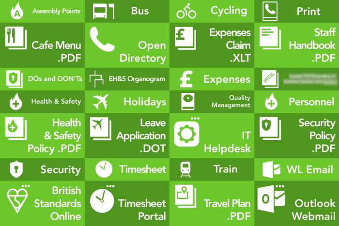
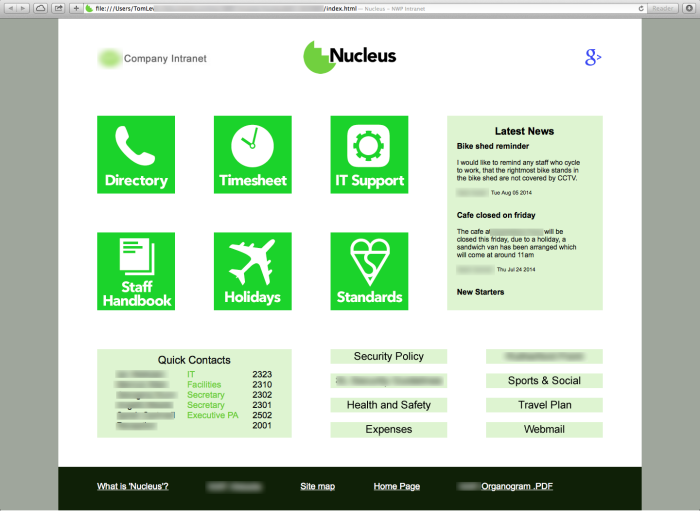
The Intranet is a lightweight system by design and it's primary function is to help employees reach a complex network of online and locally hosted resources to help them with their jobs.

My Job entailed planning, designing and executing the site, which included working in Illustrator, Photoshop and Fireworks to create all the raster and vector graphics on the site and writing HTML, XML, JavaScript and CSS files in Dreamweaver.

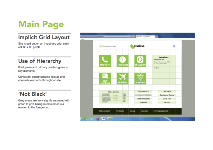
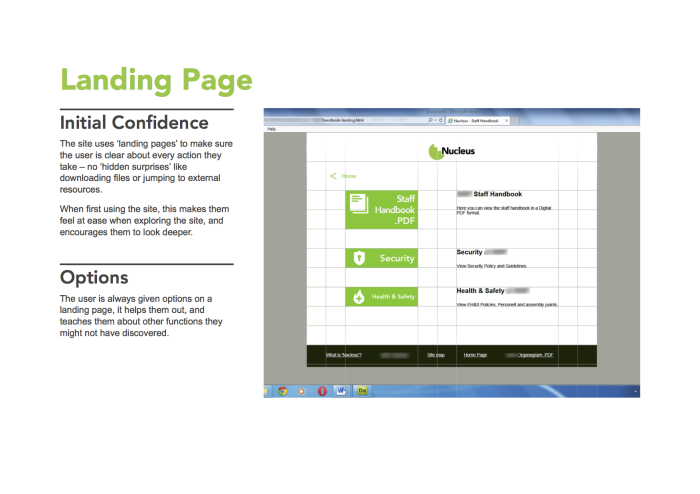
A Detailed but Simple design language was borne from the Project, with a major focus on enhancing user experience, with a purposefully limited range of technologies, using clear visual hierarchy and functional design scheme.

Tom Lever
Product Design Engineering MEng Student Glasgow, United Kingdom