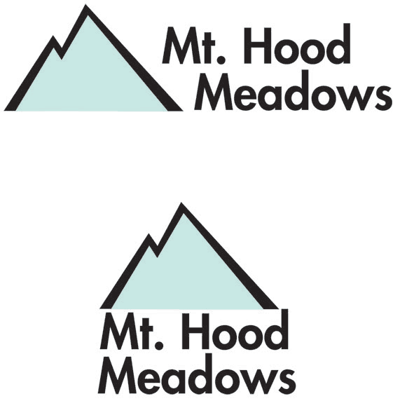
Mt. Hood Meadows - I also redesign the logo for Mt. Hood Meadows because the original logo seems a little childish. Still keeping the letter M for the image of the mountain, but giving it more of a sharper edge to actually feel like a mountain.
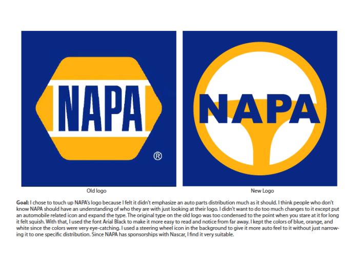
NAPA_logo Revision - This is a revision of NAPA's logo. I always thought since NAPA is such a big automobile distribution. The logo should have something that emphasize automotive. Since NAPA also supports Nascar racing, a steering wheel seem appropriate.
View PDF
View PDF
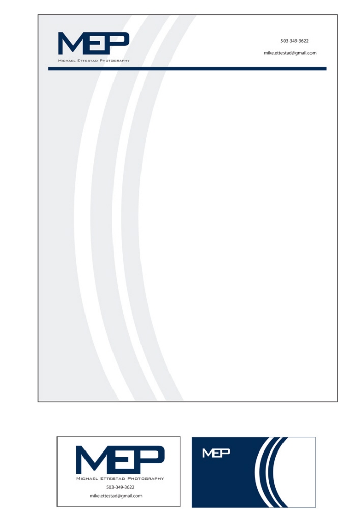
Michael Ettestad Photography - An identity for photographer Michael Ettestad. Created business card, logo, and letterhead for him. Logo are just his initial and the back of his business card is an illustration of the side of a camera lenses. As you can see, his identity is very consistent.
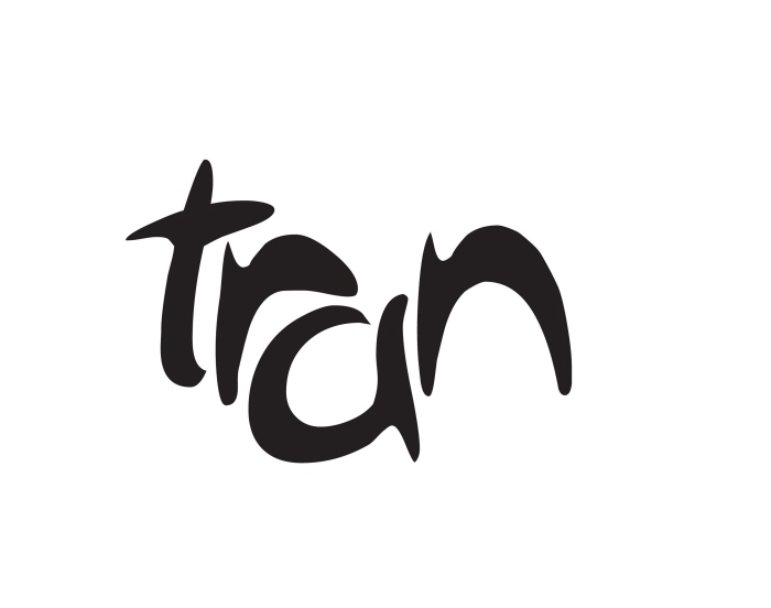
My logo - This is my logo. In my culture, our last name is very important and I personality like it a lot. So I used a lot of different fonts, then finally came across one called Arabolical. Moved the letters around because I didn't them to line up. Tried a lot of different ideas and thought this one looked the best.
gLike
logo