

When I walked into Gary's office and saw this poster on the wall, I realized this was sheer luck I had chosen red to be this year's themed portfolio.
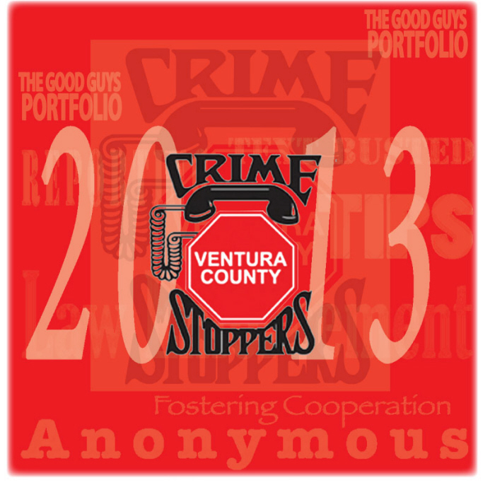
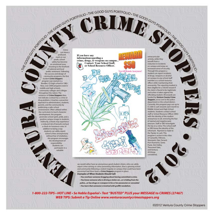
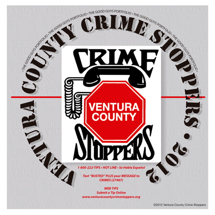
Asked back to design the final portfolio for this firm, I choose red to be the main stream lined color throughout the book. Unknown to me, this year's poster submission, (the "cover Image" I have for this project) was also red and far superior to everything I had seen on VCCS. I can do this, pre-thinking, out-of-the-design-box for you too!
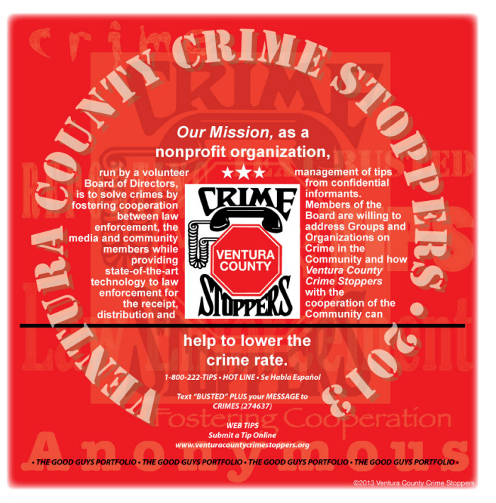
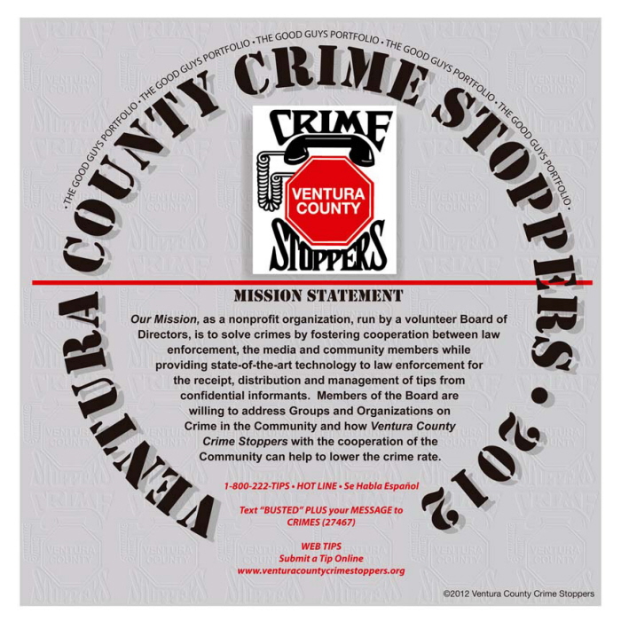
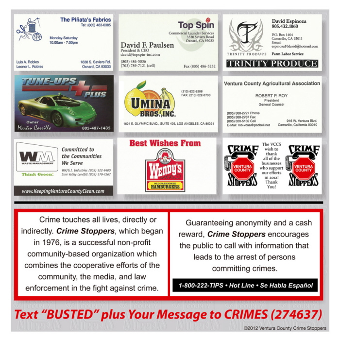
I liked the way I handled their mission statement last year however I wanted to add a twist to update and keep it fresh. Typography is so much fun!
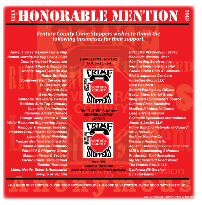
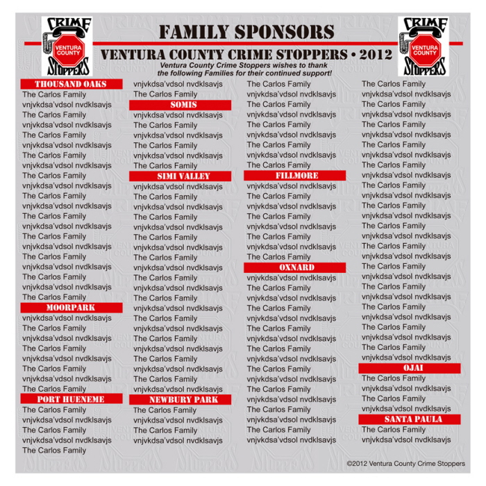
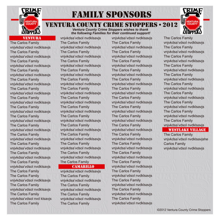
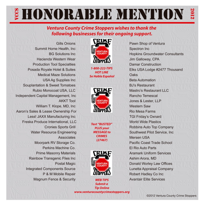
This year's HM page, nice subtleties in the color randomness by the placement of the names provided.
.
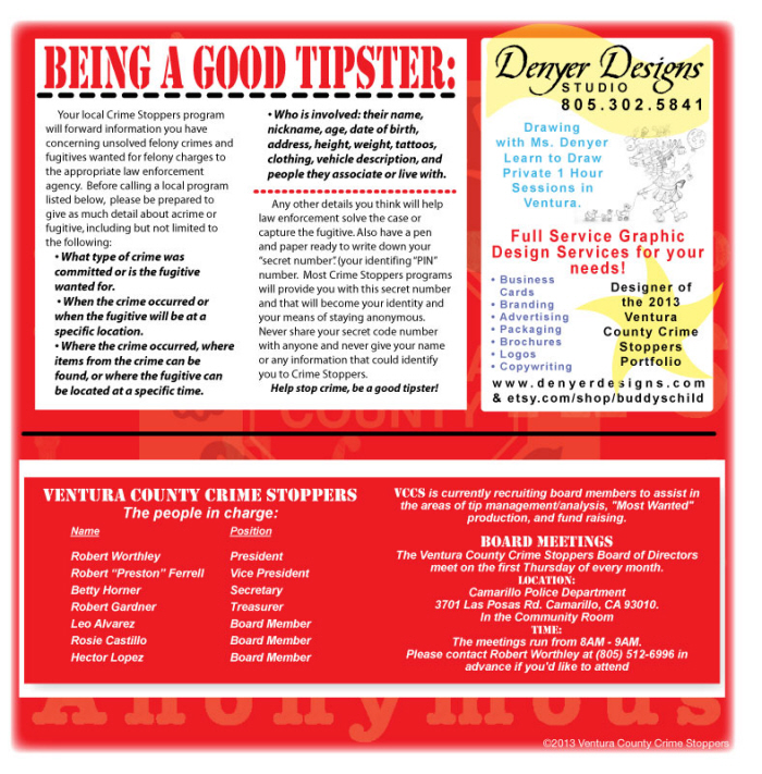
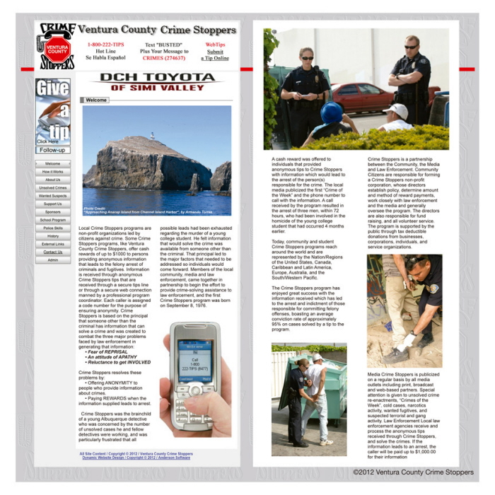
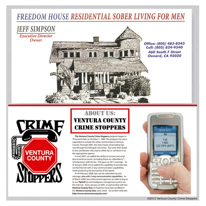
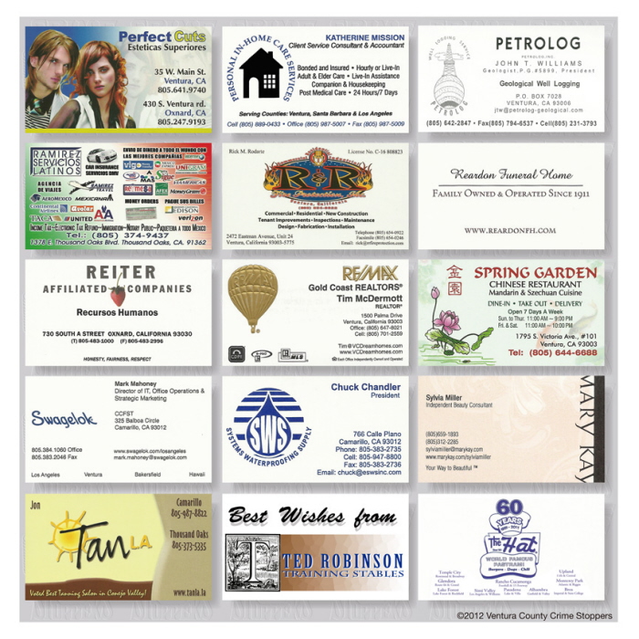
A sample page...
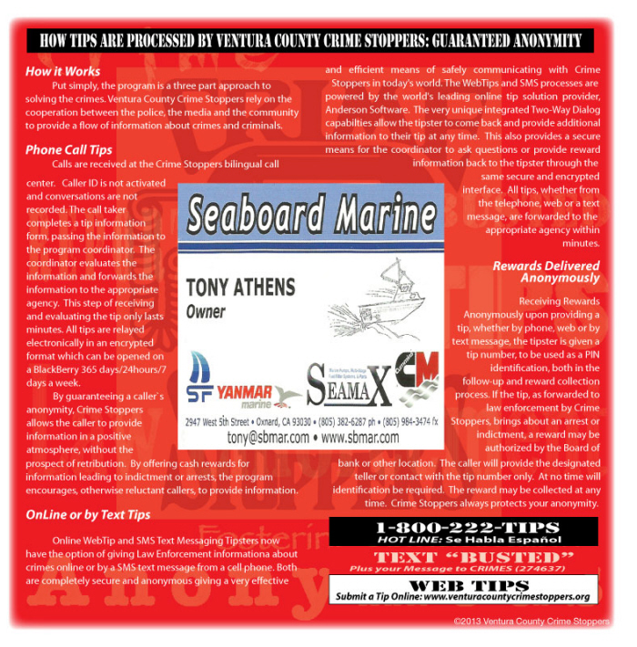
"I think this page will get the most exposure in the whole book, because how it stands out from the rest, it's so pleasing."- Gary Diamico, Diamond Star Productions, Client. This was a repeat performance from last year and the poster submitted ironically was after I had the design idea to do red as this year's themed color. I think I hit the right color for what may be their last portfolio designed, I heard rumor to this notion..
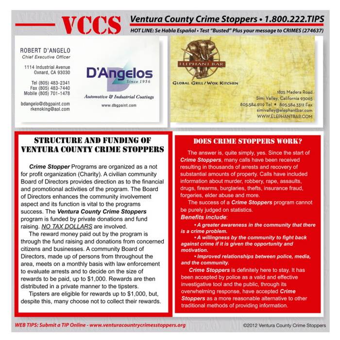
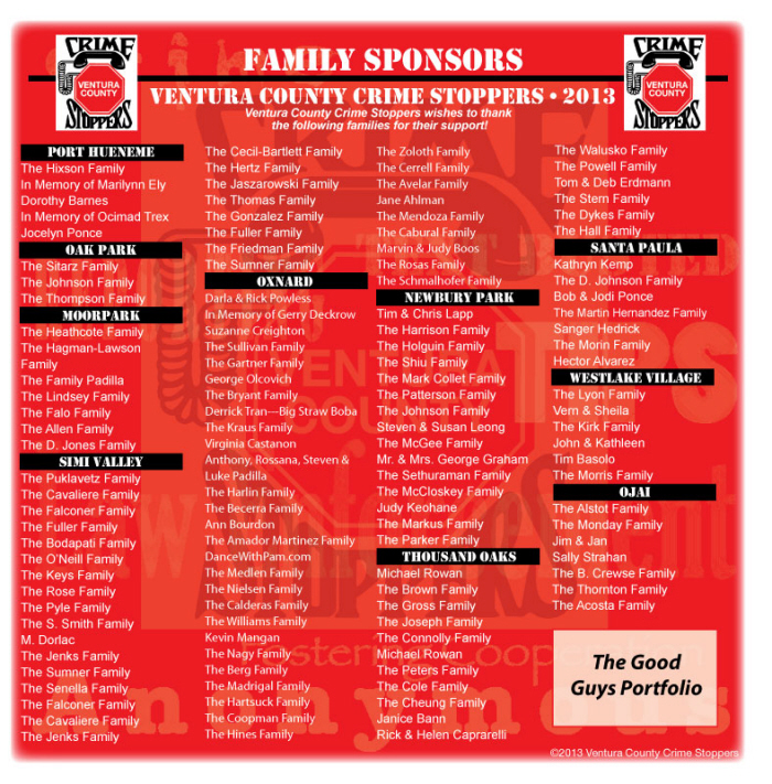
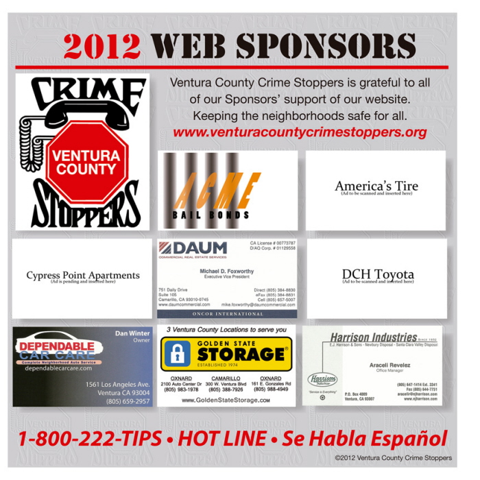
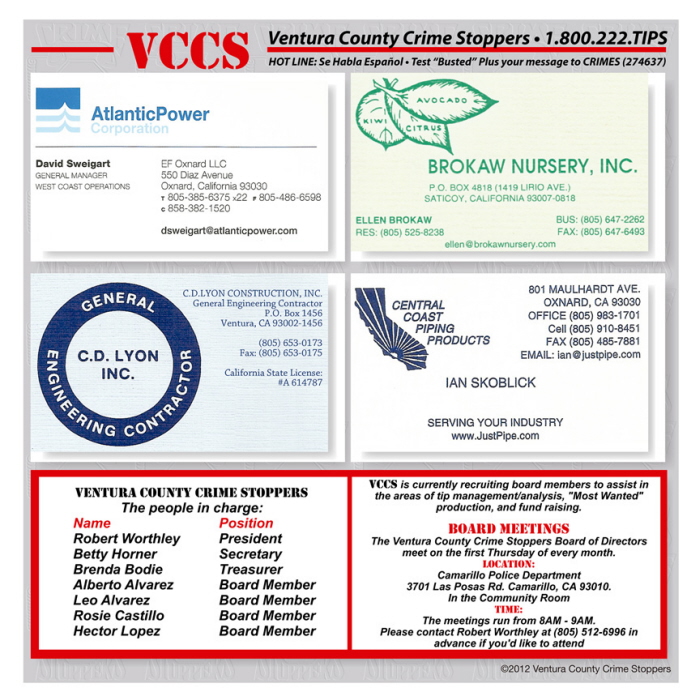
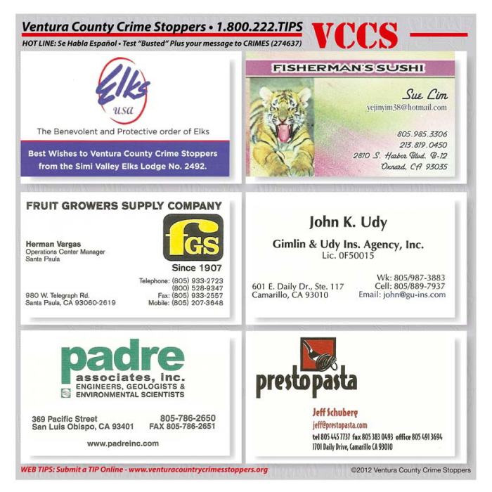
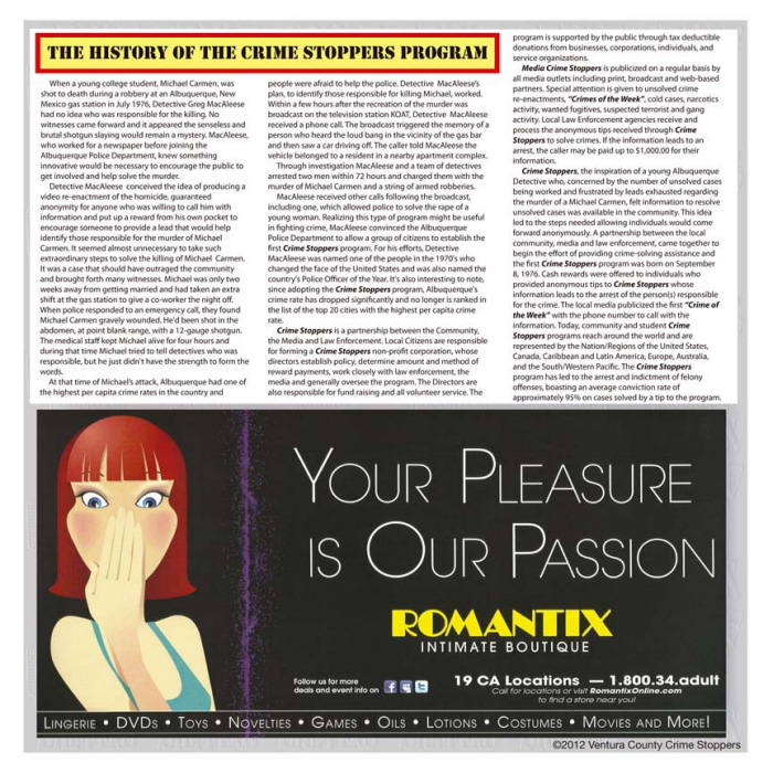
These pages are the ones that changed the most, the other pages were not much different from last years, - the good news was the portfolio grew in sponsors between 2013 and 2014,. Hm-m-m? could it have been the great design maybe?





gLike
Non Profit Marketing Book
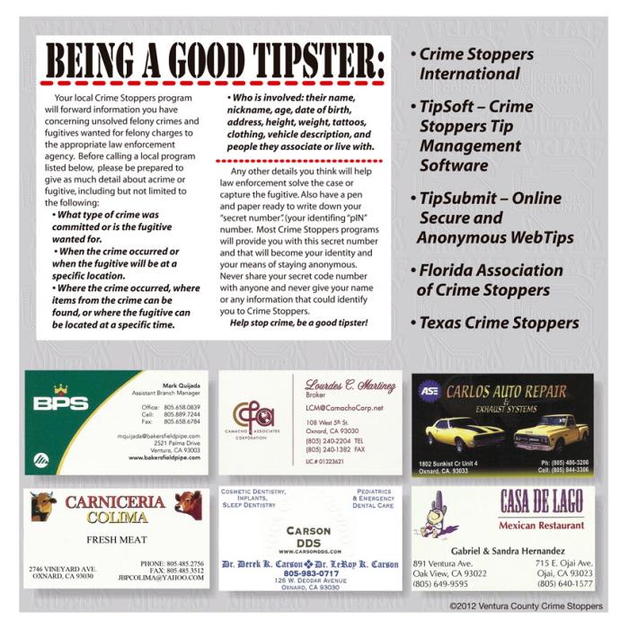
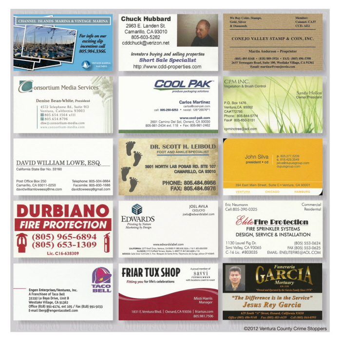
This is a project designed to be a Marketing tool to get volunteers and donations for the Ventura County Crime Stoppers, a program designed to help lower crime through anonymous tipsters. Using supplied business cards, a previous book by another designer and copy, I designed a new branding look for this years marketing tool, edited the copy, enhanced photos snagged from the VCCS website and currently waiting for missing lists, copies and new advertisements to finish the project.
View Website