
ROUGH DRAFT #1 --
One of the possible ideas we had was climate change. We knew we wanted to go for a minimalist design so we came up with this idea of a sun. The design didn't yet focus on any details such as logos and facts and call to actions. We just were trying to find a design and a topic we liked.
View PDF
View PDF
ROUGH DRAFT #2A --
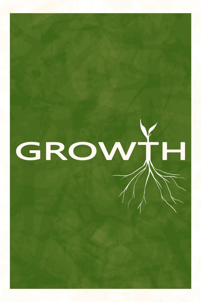
The other idea we had was deforestation. We continued with the minimalist theme and focused on the word "Growth." We had the idea of having the two posters be under the same campaign but contrasting, so that they were different but when brought together, they would complement each other nicely. This version has only one set of roots.
View PDF
View PDF
ROUGH DRAFT #2B --
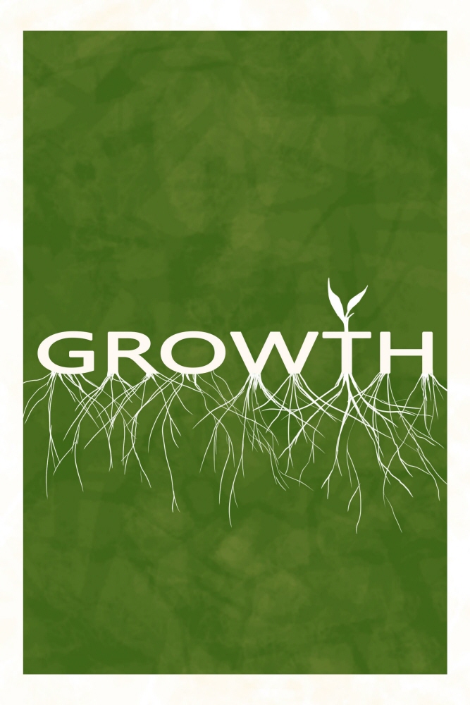
This is similar to the Rought Draft 2A except we tried to add more roots. Ultimately, it ended up looking too busy so we didn't go with this design, but it was an idea to try.
View PDF
View PDF
ROUGH DRAFT #3A --
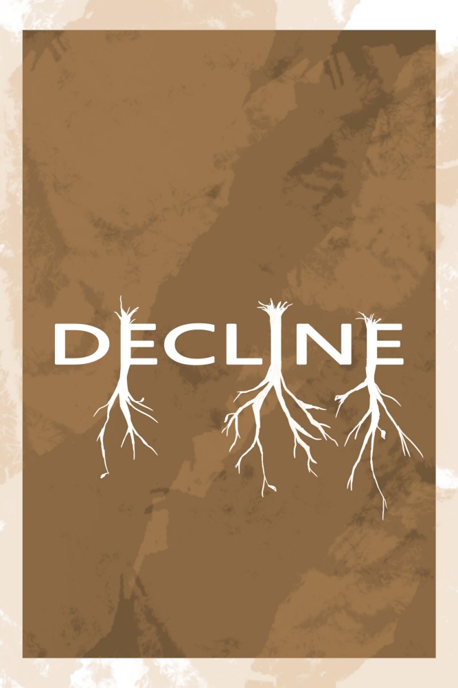
This is the other part of our deforestation campaign rough draft set, where instead of focusing on "growth" we focused on "decline" and therefore added a brown color as the background to represent a dead earth, as opposed to the healthy green color of the growth poster. In this version, we added a lot of roots as well, but as with the growth poster that had a similar design, it was too busy.
View PDF
View PDF
ROUGH DRAFT #3B --
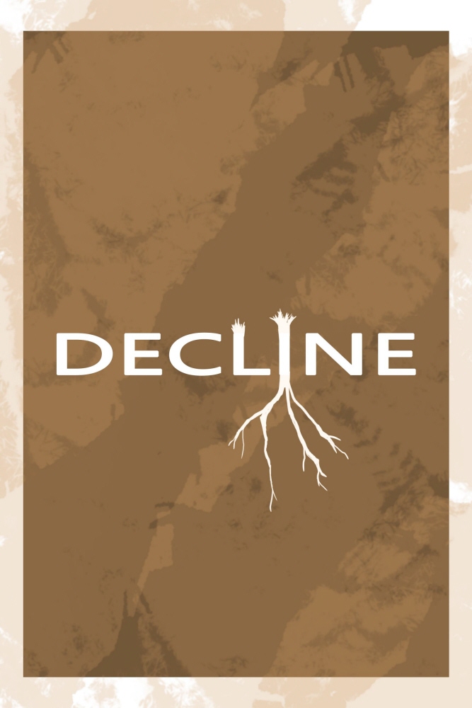
This is the version of the decline poster that we decided to use - as it was the most minimalist with just one cut down tree. It draws more emphasis and draws the viewer's attention to the issue without going overboard.
View PDF
View PDF
ROUGH DRAFT #4 --
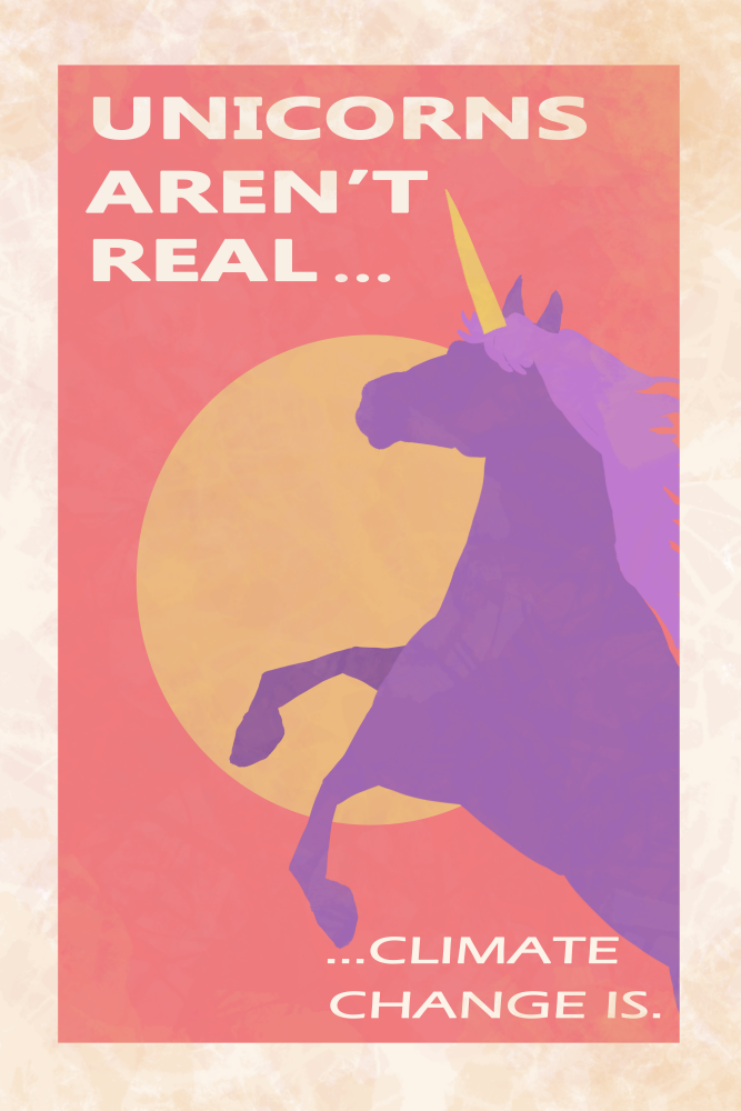
Going back to the climate change idea, we thought about continuing with the "climate change is real" motif. In this poster, we decided to use a mythical creature to highlight the reality of climate change. It was supposed to be a creative way to get the user more drawn into the poster, and while the design turned out well, the deforestation set turned out to be more cohesive.
ROUGH DRAFT #5 --
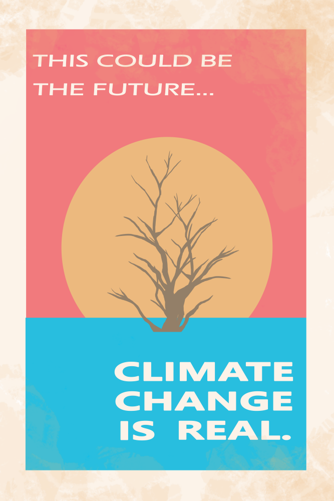
As a part of the set with the unicorn poster, this climate change poster depicts a tree drowning in water with the sun in the background to show that if we don't see the reality of climate change, this is what our world will look like in the future. We noticed that this poster and unicorn poster just didn't go together as well as the growth and decline posters.
ROUGH FINAL DRAFT #1 --
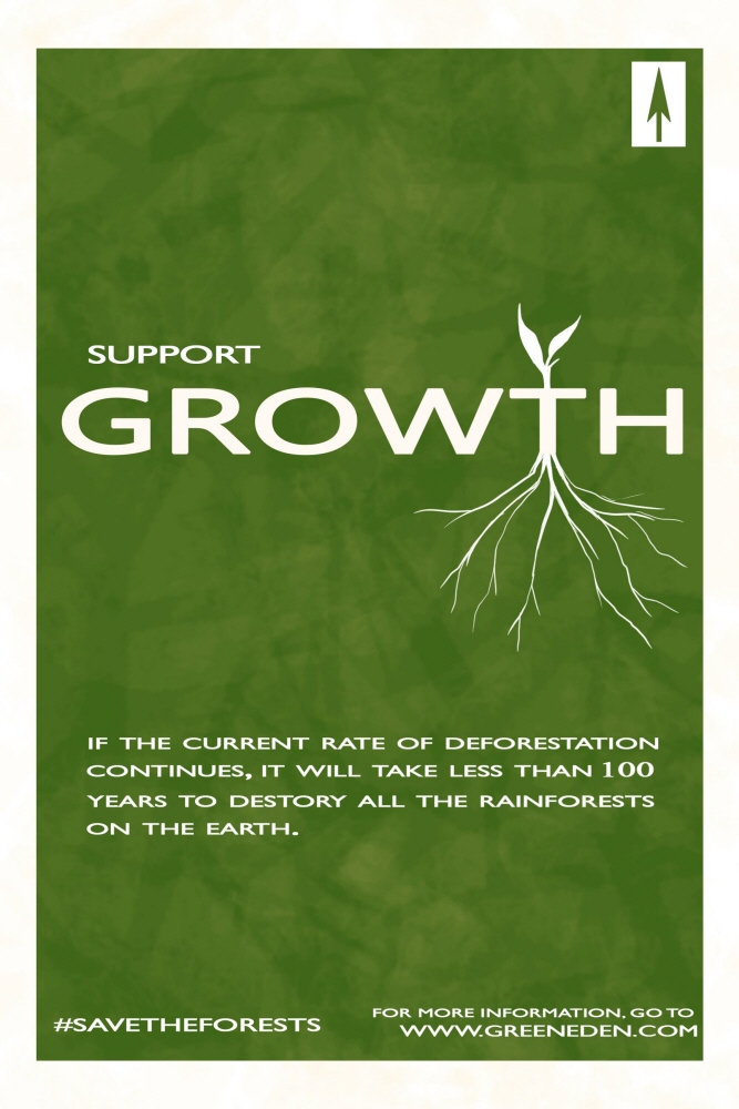
We stuck with the growth and decline posters, but added in a logo, a call to action, a website, a hashtag, and a fact, to make it seem more like a campaign for people to follow and support. A couple things were brought to our attention though -- the logo looks like a north arrow symbol, the bleeding of color off the edges looks like a mistake, and the fact was too long and these are all things we eventually fixed in our final draft.
View PDF
View PDF
ROUGH FINAL DRAFT #2 --
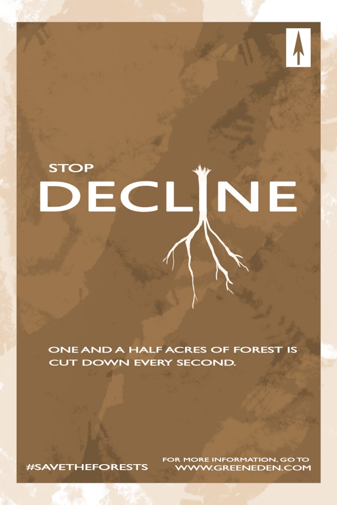
The changes made to the decline poster were similar to that of the growth poster with the different logo, hashtag, website, and call to action that were added to make the campaign more fleshed out and realistic. Since the two posters are designed similarly , they both had the same issues that we went on to fix in our final draft.
View PDF
View PDF
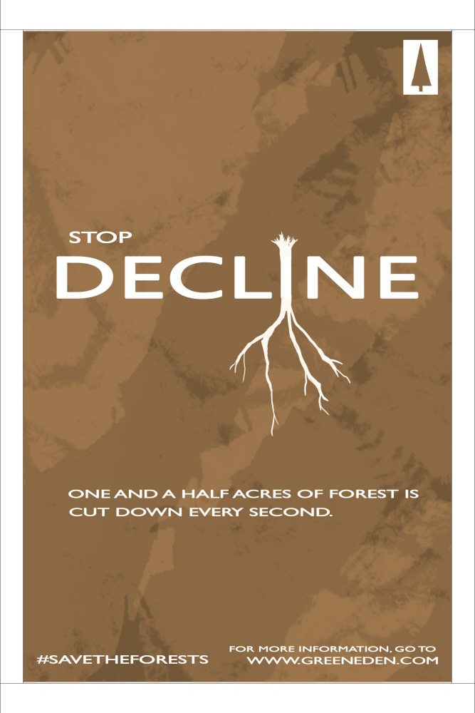
FINAL DRAFT #1 --
In our final draft, we were able to refine all the little rough details that still had to be fixed in our previous drafts. We changed the logo by lengthening the tree and shortening the stump to make it look more clearly like a tree and not a north arrow. We didn't change our fact in this poster like we had to with the growth poster. Lastly, we took off the blurs of color on the edges to give it a more clean look.
View PDF
View PDF
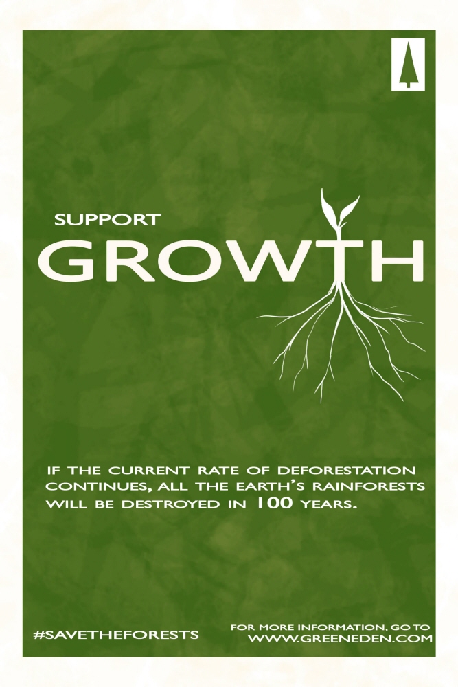
FINAL DRAFT #2 --
For the final growth version of our campaign, we changed the quote to be more concise and made all of the same changes as with the decline poster.
View PDF
View PDF
gLike
LMC 2720 Poster Project
An assignment for LMC 2720 Principles of Visual Design at Georgia Tech by Vivian Lee and Mandy Musselwhite --
We were asked to create two campaign posters that were similarly designed that spoke about a current issue. We chose deforestation.