
R•Home May/June 2015: Kitchen feature opener
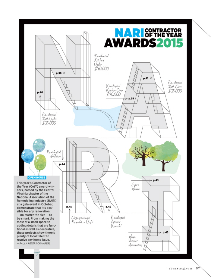
R•Home Nov/Dec 2015: NARI feature opener
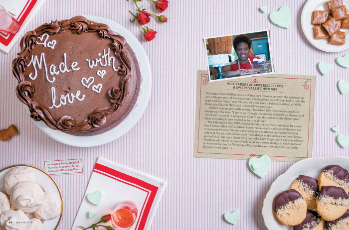
R•Home Jan/Feb 2015: Valentine's Day food feature. I art directed these shots to include space for recipe cards with "Valentine's Day card" inspiration. Each page was then designed with this in mind. Also, I asked the chef to spell out the opening title on the cake as a different approach to a normal typographic header.
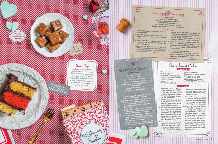
R•Home Jan/Feb 2015: Valentine's Day food feature. I art directed these shots to include space for recipe cards with "Valentine's Day card" inspiration. Each page was then designed with this in mind.
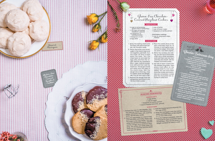
R•Home Jan/Feb 2015: Valentine's Day food feature. I art directed these shots to include space for recipe cards with "Valentine's Day card" inspiration. Each page was then designed with this in mind.
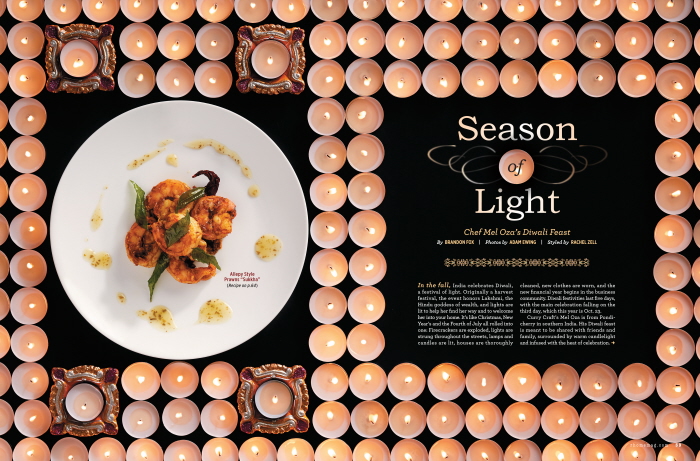
R•Home Sept/Oct 2014: Indian food feature. Diwali, a festival of light, is an Indian holiday celebrated in the fall. Here, we shine a light on five Indian recipes, from drinks to dessert. I wanted to incorporate tea lights into the design, constructing a pattern for the opener, and using them more organically on the adjoining spreads. We lit over 200 candles for this feature.
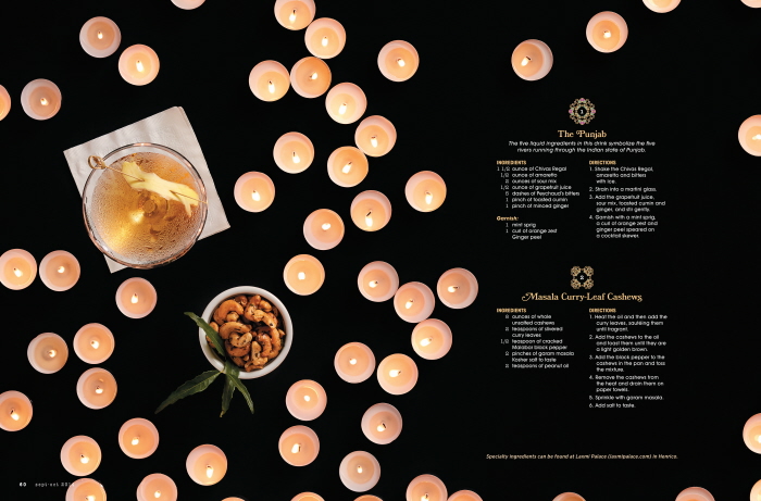
R•Home Sept/Oct 2014: Indian food feature. Diwali, a festival of light, is an Indian holiday celebrated in the fall. Here, we shine a light on five Indian recipes, from drinks to dessert. I wanted to incorporate tea lights into the design, constructing a pattern for the opener, and using them more organically on the adjoining spreads. We lit over 200 candles for this feature.
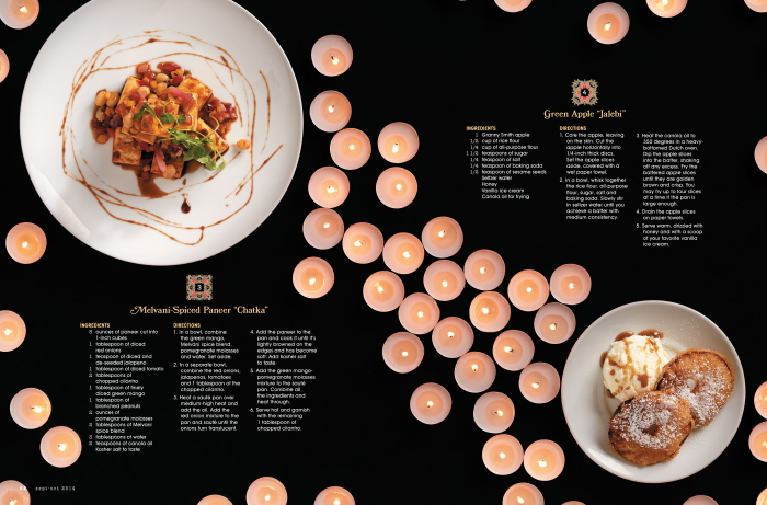
R•Home Sept/Oct 2014: Indian food feature. Diwali, a festival of light, is an Indian holiday celebrated in the fall. Here, we shine a light on five Indian recipes, from drinks to dessert. I wanted to incorporate tea lights into the design, constructing a pattern for the opener, and using them more organically on the adjoining spreads. We lit over 200 candles for this feature.
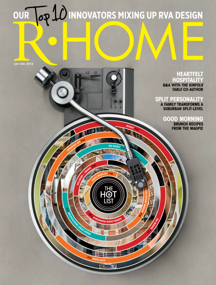
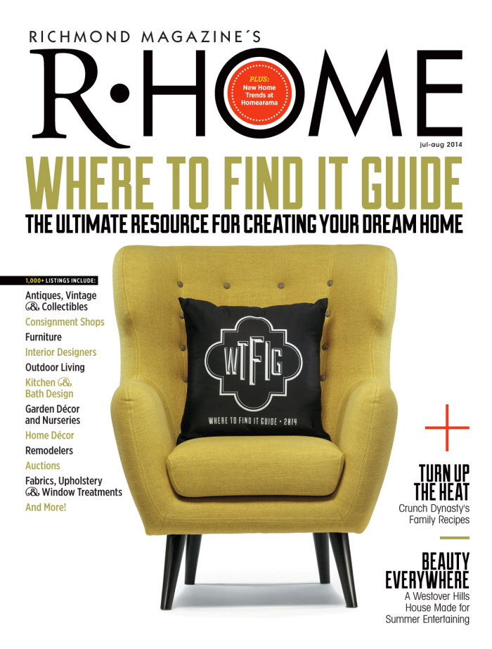
R•Home Jan/Feb 2014: Cover
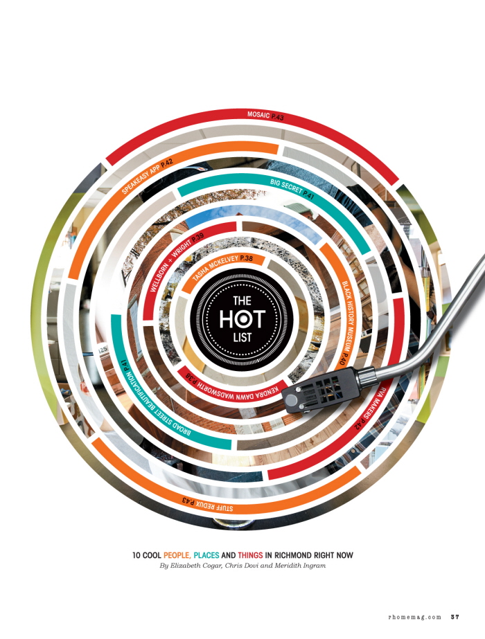
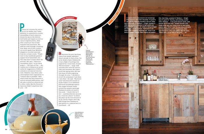
R•Home Jan/Feb 2014, Hot List opener. For our annual "Hot List," a collection of 10 innovators in the Richmond design community, I came up with the concept of visually playing our "Top 10" using a record schematic. Each ring of the record represents an innovator, and the design also acts as an internal Table of Contents.
R•Home Jan/Feb 2014
R•Home March/April 2013: Readers' Favorites. Annual survey based on our readers' favorite servicemen (ie. cleaning service, wallpaper hanger, accessories store, etc). I'd always wanted to do something with a dollhouse for R•Home and decided this would be the perfect opportunity. Five winners were shot on a white backdrop and photoshopped into a dollhouse showcasing their specialty.
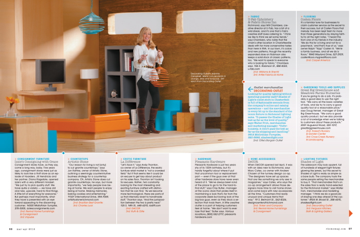
R•Home March/April 2013: Readers' Favorites. Each winner was photographed two different ways: one for the opening photo-illustration showing the entire dollhouse and one for their individual room shot, seen here.
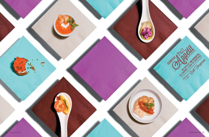
R•Home Sept/Oct 2013: Food feature opener. I wanted to take a more graphic approach to food photography, and thought using a napkin pattern for an hors d'oeuvres feature was appropriate. Each napkin was shot separately on a pane of glass to cast a shadow onto white paper, which I concepted prior to shooting.
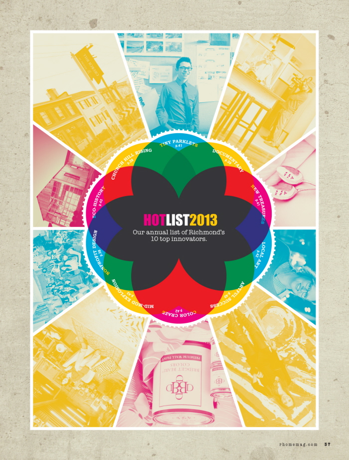
R•Home Jan/Feb 2013: Hot List feature. For our annual Hot List, I created this colorful dial where each circle stood for a winner. The dial turned as you moved throughout the feature, shining a light on each winner. This also worked as an internal Table of Contents. This feature was highlighted as a Best in Show at the 2013 Virginia Press Association awards banquet.
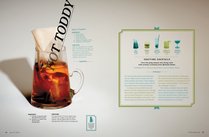
R•Home Jan/Feb 2013: Cocktails feature. I wanted to create a sophisticated winter cocktail spread using a refined color scheme and interesting type. Also, our readers wanted to know where to buy dishware from past food shoots, so I hired a stylist to collect glassware that we could credit on the page, represented here by a silhouette of the glass in the corner of the page. This feature was highlighted as a Best in Show at the 2013 Virginia Press Association awards banquet.
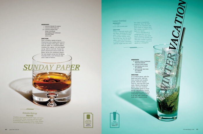
R•Home Jan/Feb 2013: Cocktails feature. I wanted to create a sophisticated winter cocktail spread using a refined color scheme and interesting type. Also, our readers wanted to know where to buy dishware from past food shoots, so I hired a stylist to collect glassware that we could credit on the page, represented here by a silhouette of the glass in the corner of the page. This feature was highlighted as a Best in Show at the 2013 Virginia Press Association awards banquet.
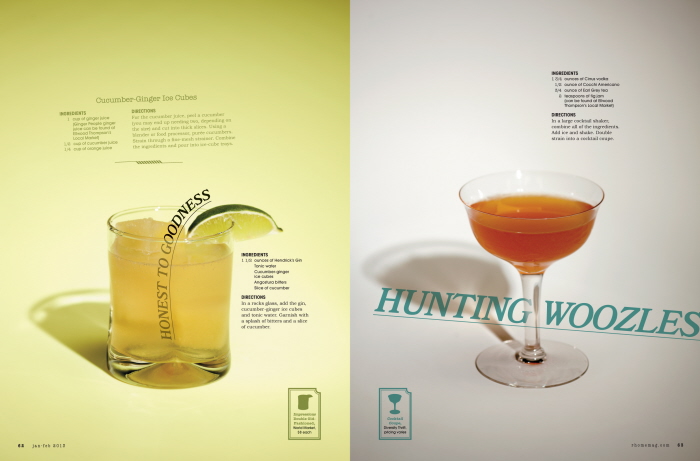
R•Home Jan/Feb 2013: Cocktails feature. I wanted to create a sophisticated winter cocktail spread using a refined color scheme and interesting type. Also, our readers wanted to know where to buy dishware from past food shoots, so I hired a stylist to collect glassware that we could credit on the page, represented here by a silhouette of the glass in the corner of the page. This feature was highlighted as a Best in Show at the 2013 Virginia Press Association awards banquet.
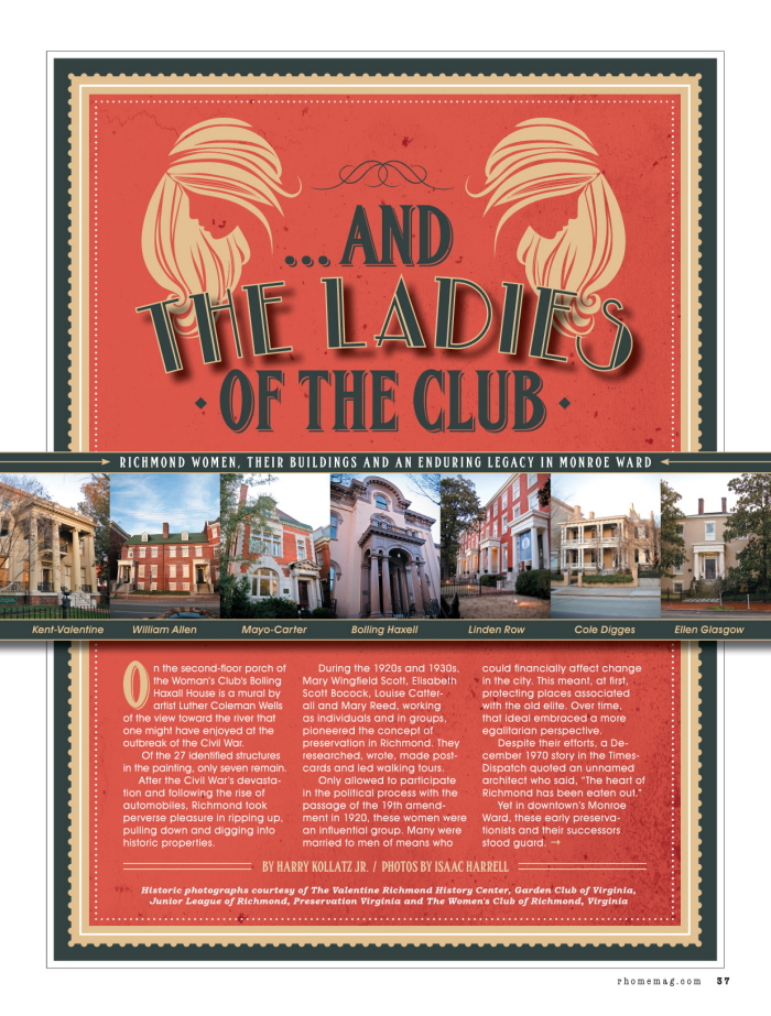
R•Home Mar/Apr 2013: Historic feature on how women's organizations in the '20s and '30s saved Monroe Ward's historic buildings. I was inspired by 1920's poster design and typography, and applied the look to the pages of this feature. This feature was highlighted as a Best in Show at the 2013 Virginia Press Association awards banquet.
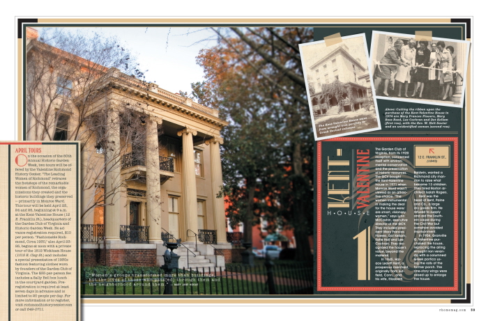
R•Home Mar/Apr 2013: Historic feature on how women's organizations in the '20s and '30s saved Monroe Ward's historic buildings. I was inspired by 1920's poster design and typography, and applied the look to the pages of this feature. This feature was highlighted as a Best in Show at the 2013 Virginia Press Association awards banquet.
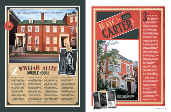
R•Home Mar/Apr 2013: Historic feature on how women's organizations in the '20s and '30s saved Monroe Ward's historic buildings. I was inspired by 1920's poster design and typography, and applied the look to the pages of this feature. This feature was highlighted as a Best in Show at the 2013 Virginia Press Association awards banquet.
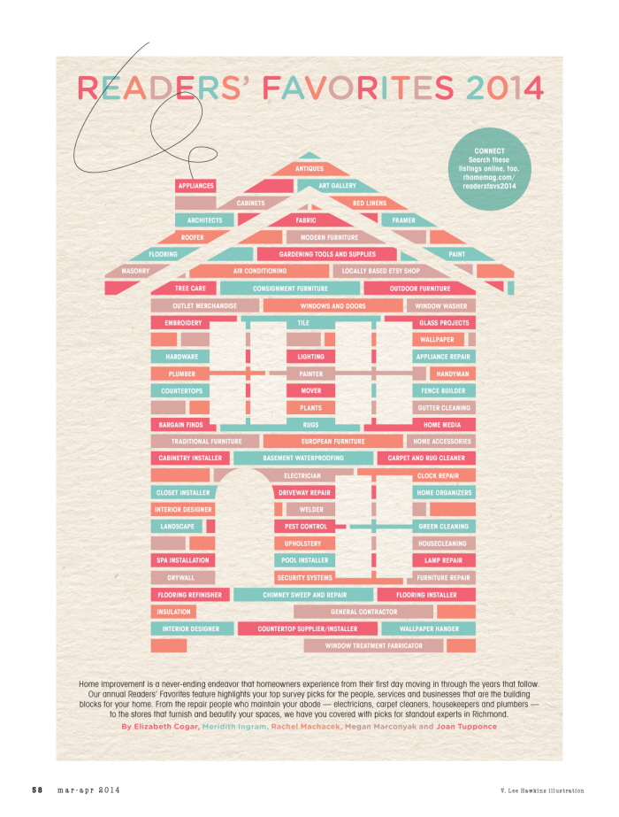
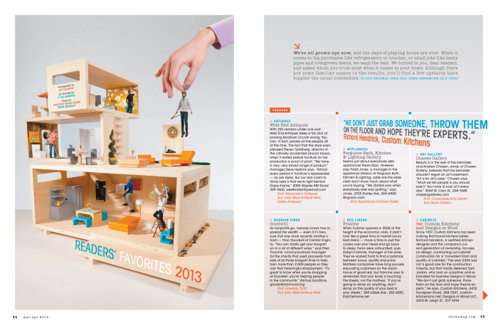
March/April 2014 R•Home: Readers' Favorites opener. I came up with this infographic based on the idea that each building block represented a category of our Readers' Favorites survey. When you put them all together, you can build a dream home.
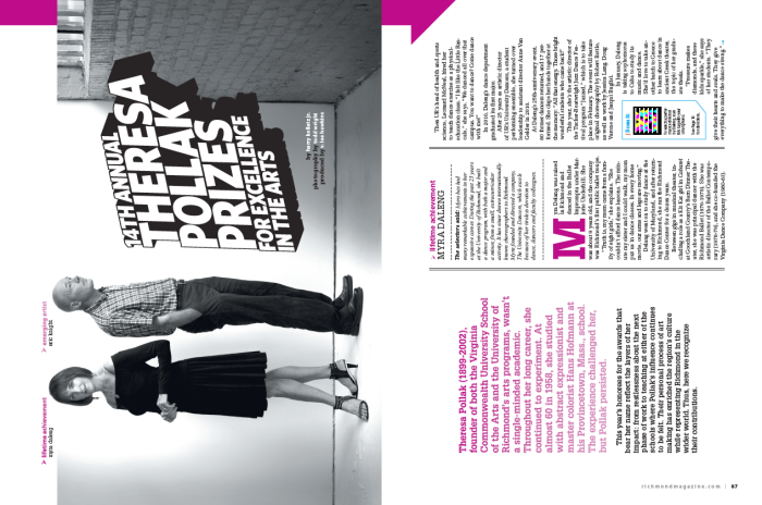
24th Annual Theresa Pollak Prizes - for Excellence in the Arts. I wanted the reader to have to read this feature in a different sort of way, just as the winners of our annual Pollak Prizes forced their audience to see things (whether it be dance, art, or music) in a new light. By turning the spread on its side, I kept the pages simple yet dynamic by incorporating creative black-and-white photography with a violet accent color.
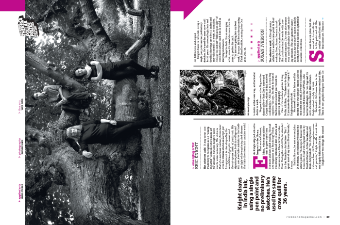
24th Annual Theresa Pollak Prizes - for Excellence in the Arts. I wanted the reader to have to read this feature in a different sort of way, just as the winners of our annual Pollak Prizes forced their audience to see things (whether it be dance, art, or music) in a new light. By turning the spread on its side, I kept the pages simple yet dynamic by incorporating creative black-and-white photography with a violet accent color.
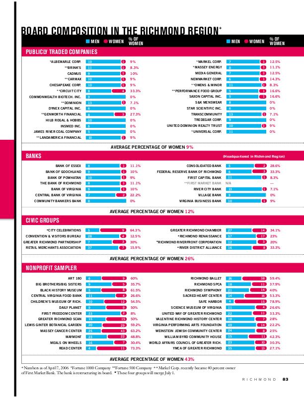
Women of Power, Richmond Magazine, May 2006 - Chart comparing the women to men ratio in various companies around the city. This simple, primary color scheme makes it easy to soak in a lot of information quickly. 1st place Virginia Press Award for "Infographics."
View PDF
View PDF
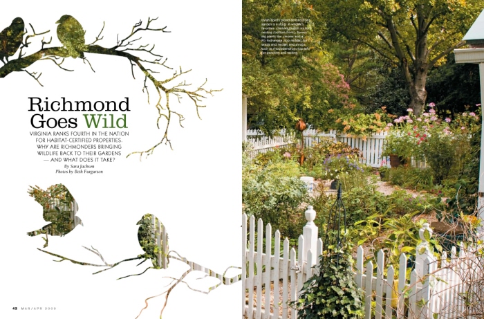
R•Home: Wildlife Gardens
gLike
R HOME
A collection of my work at Richmond magazine