
Wallace Wiskey - Art 427: Packaging
Cross Cultural Packaging project
Whiskey is one of the most popular exports of Scotland. They are known for their amazing whiskey and it is sold all around the world. In this project we were to compare a country from our heritage with a country of interest. My last name is scottish so I chose Scotland to represent my heritage. The second country I chose was Greece because I have always loved their ancient history and architecture.
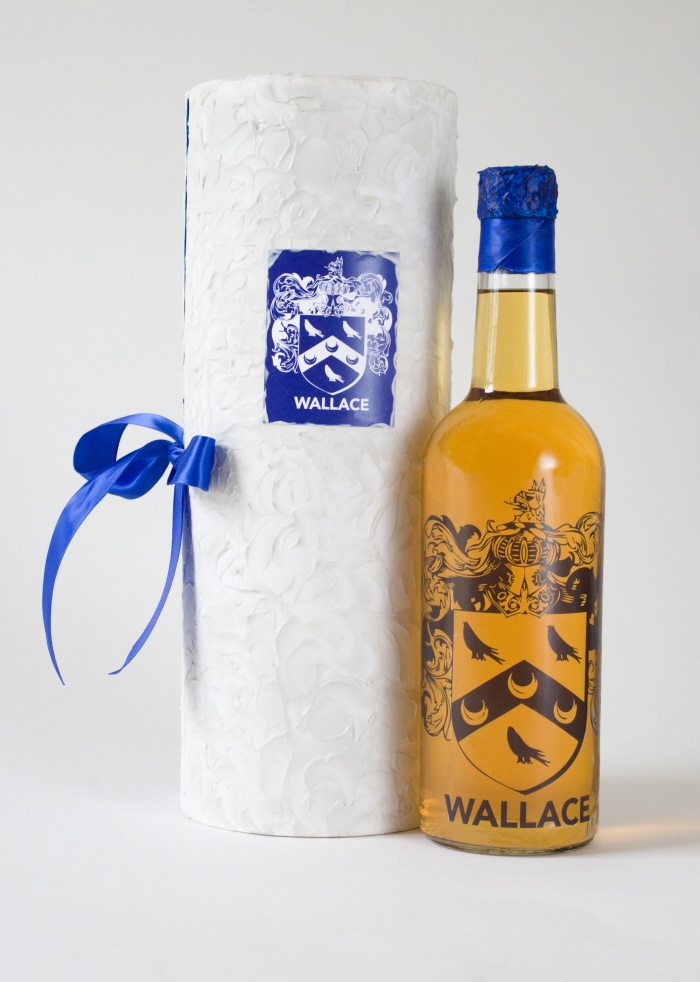
Wallace Wiskey - The logo is made from my family coat of arms. I chose blue and white to represent Wallace Whiskey because they are the two colors that are prominent in Scotland and Greece’s flags. I was inspired by the clean white plaster of ancient greek architecture and I used that aesthetic in the carrying case.

Logo - Wallace Whiskey is named after the famous Scottish warrior William Wallace. Wallace actually means “foreignerâ€, which is perfect because this Scottish whiskey is designed to be sold in Greece.
Vitamins - Art 427: Packaging
Vitamin design
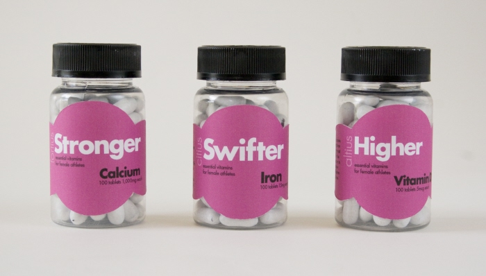
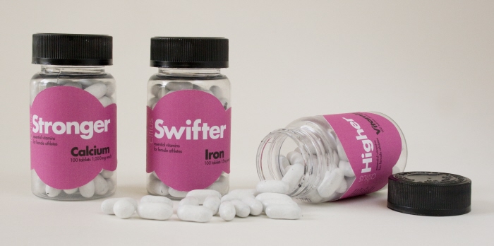
These vitamins are designed especially for female athletes. Female athletes are at risk for vitamin d, iron and calcium deficiencies. This vitamin pack gives athletes the essential vitamins they need to perform their best.
Vitamins
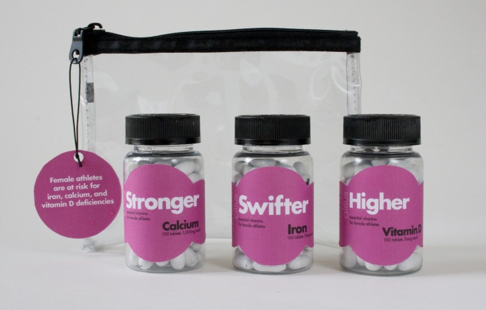
Vitamins - Vitamins with carrying case.

Labels - These vitamins were inspired by the Olympics and the female athlete. They represent the olympic motto, altius (higher), citius (swifter) and fortius (stronger). The label is made out of circles to represent the concentric Olympic rings. The pink label represents femininity but the bold typeface keeps the design strong. There are success stories on each bottle from famous female athletes throughout history to give a little extra motivation.

Trois - Art 427: Packaging
Sustainability
This project challenged us to design packaging that is sustainable. Every part of the product and packaging had to be used so there was no waste. The idea behind this shoe box was that it is used to display and protect your shoes in your closet. It is small, stackable and you can see your shoes through the box.

Trois Logo - The shoes were the inspiration for this project and shoe box. The decorative lines on the side of the shoes inspired the lines for the logo. There are three lines of different widths in the logo and those same lines on front of the box. These three lines are what inspired the name trois, which is three in French.
gLike
Package Design