
DEFY - The objective here was to create an instantly identifiable logo that will communicate a tangible product benefit to the consumer. The product itself is a coating to protect deck surfaces from the destructive effects of the weather. There are many different products in the product line - all held together by the strength of the brand identity.

Team building logo/ P&G - Identity for a special series of seminars of team building exercises.

Brand Impact - This project was much more than just a logo. It was an entire program created to meet the specific needs of industry leaders. The way it works is for clients to specify particular interest areas. Materials and information are then assembled and presented to professional groups as they are coached to develop improved processes that build on their brands awareness.

Kroger - Food product logo for Krogers.

Ciba Geigy - Identity and signage were developed for
this major pharmaceuticals company.

Pringles - This edgy design was created to appeal to the fickle Gen X market segment and promoted an unconventional way of consuming the product - called "Slamming the Stack". This graphic enjoyed a long run on the package and appeared on signage and collateral for the "X" Games. Pringles was considered edgy and cool by an age group that turned many other brands away. Mission accomplished.

Noetic - Objective: Create a fresh and memorable identity for an Industrial Design client. The name was provided.

Van Melle - This Identity tune-up both simplified and increased the impact of the Air Heads brand on packaging and POP displays.
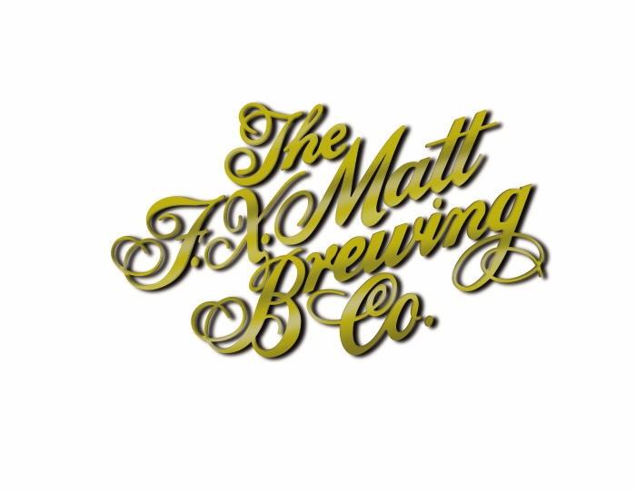
Matt's Beer - This small upstate NY brewing company has a great reputation - even if it tends to be more locally focused rather than national.

Hammermill concept - This was never used as final art - but it was too good to throw out.

Dixie identity graphic - Concept only - not used by client
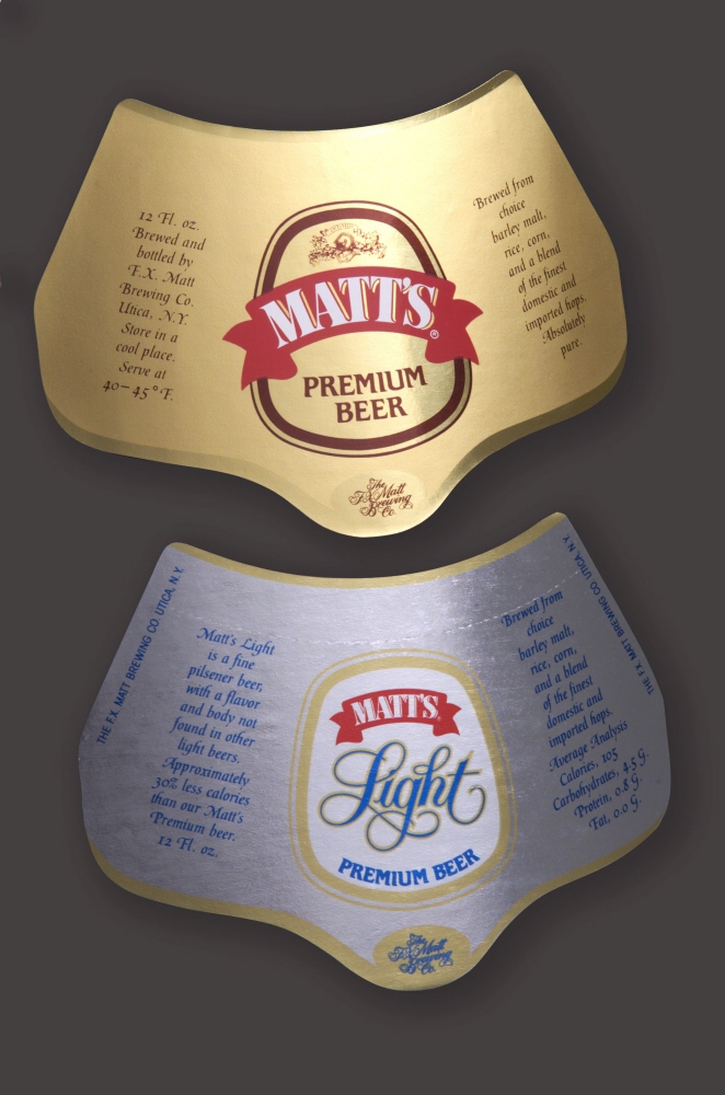
Matt's beer neck label

Pringles logo concept - Logo for a promotional display.

Geofizika Krakow - Warsaw, PO (2006)
The notion of using green in the logo didn't at first seem like a good choice - but the client wanted to keep the overall effect friendly with more of an "eco" feeling to it. The client was in the mining business. Personally - I preferred black for the whole logo - but I lost.
gLike
Logos