
Crest - This promotion design was spun off into numerous iterations. The "deal" varied from account to account and the graphics had to show difference as well as communicate the premium being offered. The challenge was in developing a graphic approach that communicated "premium", but could also do the heavy lifting required of special incentive packaging.

Bush's - One of many packages done for Bush's and features their brandmark. The brandmark as well as the packaging architecture for all of Bush's products was created as a complete program and has been a tremendous success- stimulating gains in market share and profit as well as propelling them to the number 1 brand in baked beans.
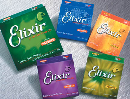
Elixir - This refreshed packaging was created to enhance the product differences so that the consumer could easily shop this confusing category.

Pepto Bismol - Every brand needs to be updated periodically to maintain it's uniqueness and competitive features in the marketplace. In this case - the "P" was made into a prominent form that defines the Pepto identity and encompasses all supportive benefit elements (protective coating action) as well as the ever present brand benefit icon "gut man" image.
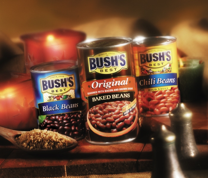
Bush's family of products - In addition to providing a unique branding identity and architecture for the product packaging- the line of products had to be readily identifiable and distinct versions of the product.
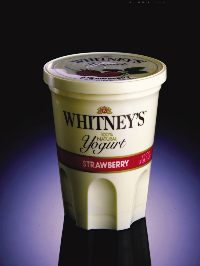
Whitney's (Kellogg's) - The original "Premium Yogurt".
The price was a bit too dear however, and
it left the market shortly after a huge push
to get it on shelf. It was available only in
New York City where it had to either "make it" or "break it".
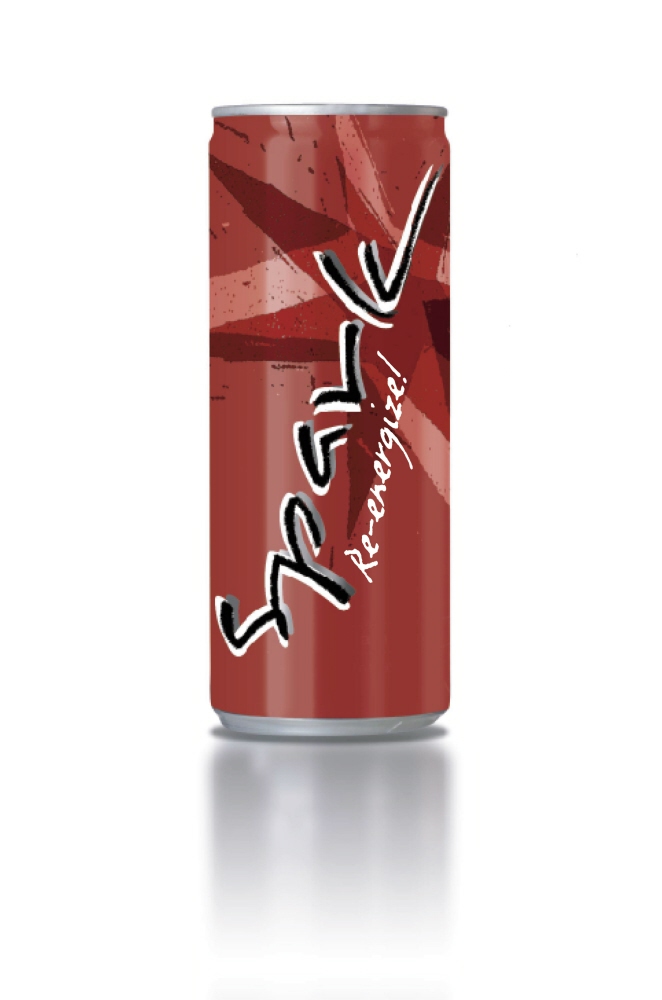
"Spark" drink concept - Concept for a large producer of trendy drinks.
Name withheld.
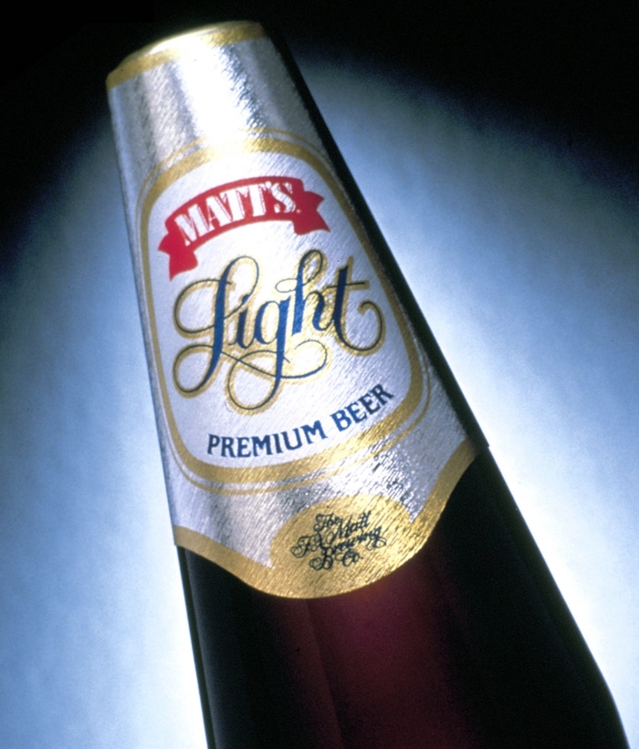
Matt's Beer - Premium Light - This beer broke a lot of "rules" for a very traditional brand when it changed bottle shape and went for a more modern neck wrap approach while introducing it's new "Light" beer.
U.S.Navy retail packaging

Splashwear - Convenient swimwear for kids. Disposable and convenient for parents at the pool or beach.

Flintstones - New packaging but with a "retro" looking Fred. This fun rehash had all the Flintstone characters splashed over the new packaging.

Dawn
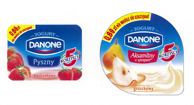
Danone / Poland - Create an updated label for the line of yogurts for the Polish market. Must feature the 5 benefits of having yogurt as part of your daily diet.
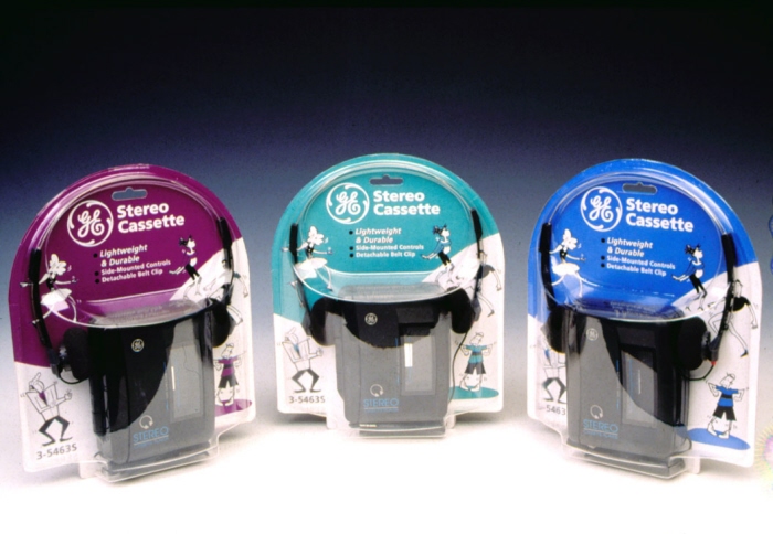
GE Electronics - GE needed packaging that would appeal to a younger audience while being tamper resistant. In this case the structure was actually more important than the graphics were.

Transderm - Over the counter drug for Motion Sickness Prevention

Energizer "green" packaging - Retail packaging for Energizer "green", environmentally friendly battery products.

American Tobacco "Lights" concepts
gLike
Packaging