
Crisco - Promotional and informational print work aimed at clarifying and promoting the Crisco product line up. These handouts were developed for a cooking tour which featured celebrity chefs using Crisco products.
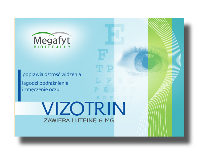
Vizotrin - A new entry to the rapidly growing European "neutraceuticals" category. The project was to create a memorable brand mark and a package architecture that would work across a line of products- as well as communicate the product benefit - which is a lot to do on a small package front that also has to build brand recognition. The client was delighted with the work.
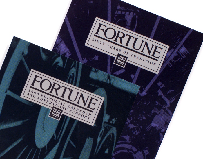
Fortune - Fortune was celebrating it's 60th anniversary and wanted to do something special for their sales kit. They agreed to use a metallic ink on the print materials which added a modern look to the old world images that they are famous for.
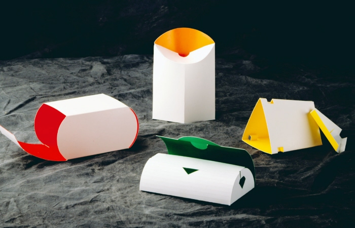
Low environmental impact packaging solutions - Originally conceived as a possible solution for "fast food" solid waste - this package solution has a much wider range of possible uses and benefits.
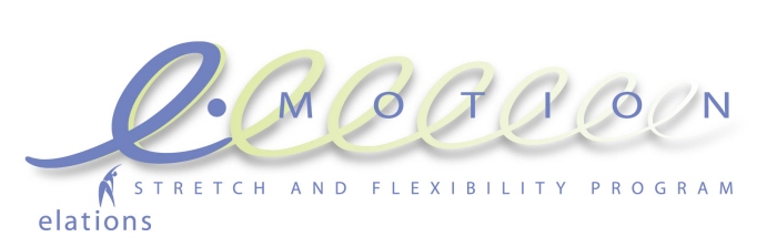
Elations - One of many programs developed for the Elations brand. This one moved more toward lifestyle solutions for people suffering with painful joints.
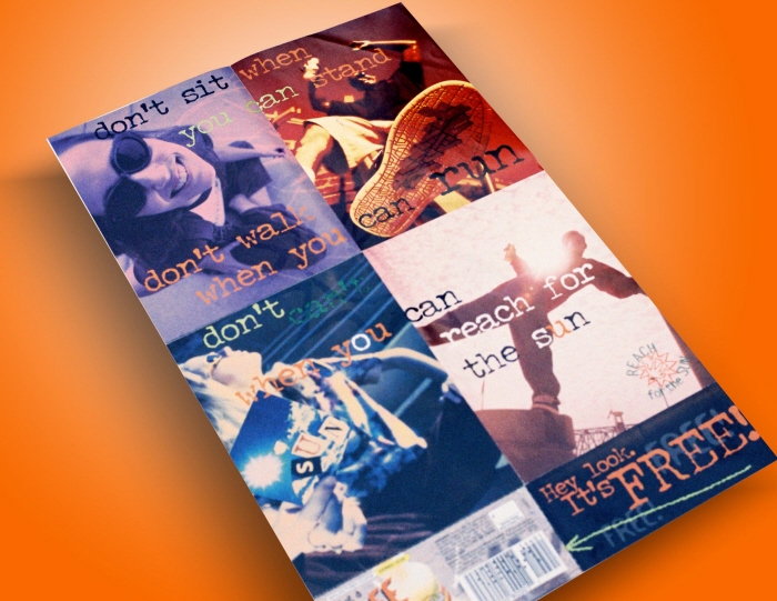
Sunny Delight - Poster relevant to youth market
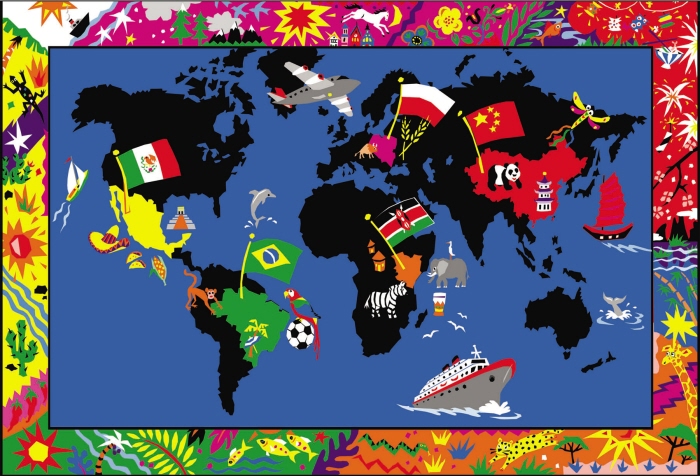
Map for kids - Map for a Bible School program. The objective was to make the information interesting and interactive.
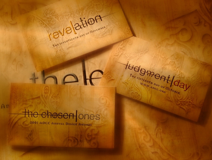
Cincinnati Art Directors Club Show - The Cincinnati Art Directors Club annual show team produced some wonderful collateral. Perhaps some of it would have won an award itself - except that it was too new to be in the show. The theme intentionally assumed a sort of "quasi-religious" look and feel - which was chosen to connect with the design folks who have a strong (religious) connection with their design passions.

Nestlé packaging series - With all the various graphic treatments of the different ice creams offered to kids - there was a need to keep a strong branded look in the freezer case. This red/white/and blue system made a rather difficult objective - seem easy and worked extremely well. It's simple to pick out the Nestle ice creams now.

80th B-Day poster - This poster was created for a family celebration - an 80th Birthday party. The two people shown are actually twins. This group didn't appear together as depicted here and are shown this way in the poster to depict some idealized memories. For me, it's purpose here is to demonstrate abilities other than packaging design. For the family, the purpose is much more sentimental.

Praktibank - Concept for a smaller and friendlier convenience oriented banking solution for todays busy banking customers.
gLike
Print