
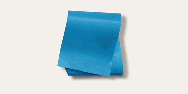
Centennials are often marked by grand celebrations, and ornate invitations to such events. The new logo concept played with this notion, using the idea of a flap of an invitation envelope to reveal the museum’s name.The reference to the envelope flap hinted at the year’s worth of celebrations to come in a playful way.
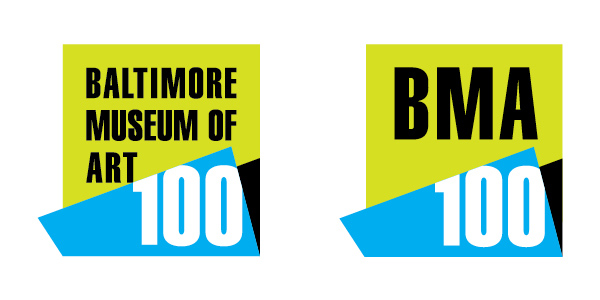
The graphic “box” from the preexisting logo was maintained in its entirety. The “box’s” strong, clean, and memorable lines helped tie the museum’s graphic language seamlessly to its new and temporary anniversary identity. Along with the standard version, the idea had to work with the acronym version of the logo as well.

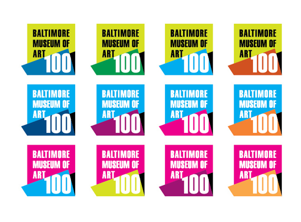
Part of BMA's existing identity are the bight, vibrant colors which had to be used in the centennial versions.
gLike
CENTENNIAL IDENTITY – Baltimore Museum of Art
To mark its historic 2014 milestone, the Baltimore Museum of Art wanted to create a centennial logo to be used on all materials throughout the anniversary year. The Museum wanted to call attention to the centennial milestone but the logo had to work with their existing graphic identity system so they would not need to redesign and reprint collateral and museum signage.
The graphic “box” from the preexisting logo was maintained in its entirety. The “box’s” strong, clean, and memorable lines helped tie the museum’s graphic language seamlessly to its new and temporary anniversary identity.