
gLike
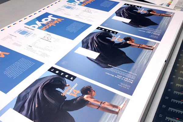
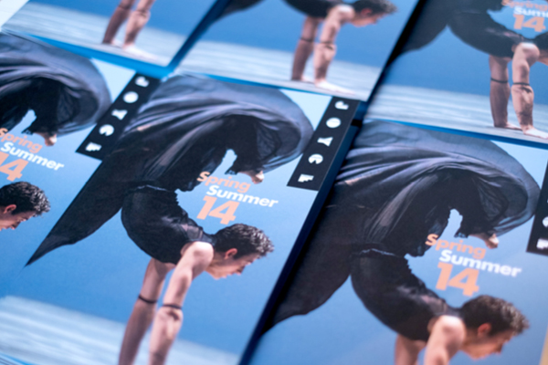
Spring/Summer ’14 Brochure - THE JOYCE THEATER
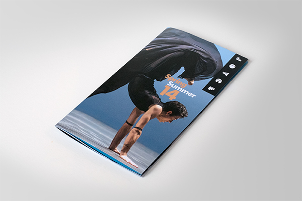
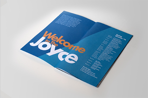
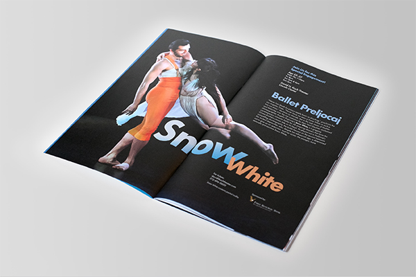
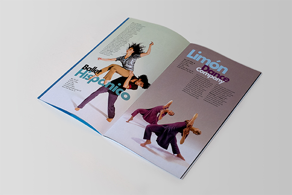
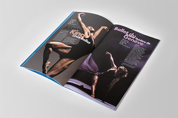
Typography became the main design element. The idea was to emphasize the names of the dance companies or the titles of the shows, which are all well recognized in the dance world. The large, vibrant typography and the images of dancers had to complement each other while still allowing for readability.