
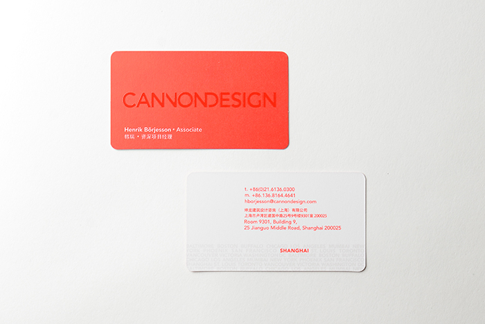
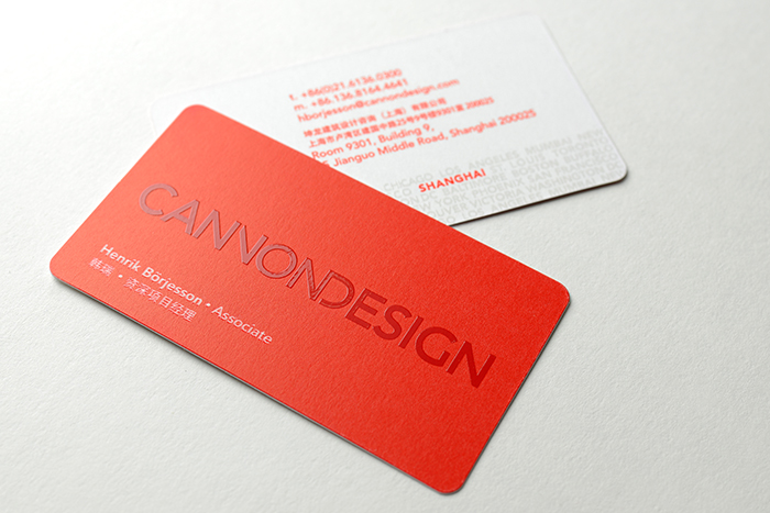
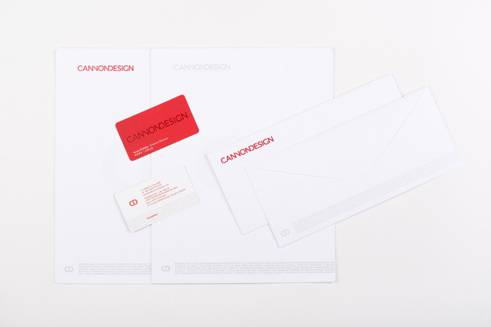
Business Card
The city names are repeated to form a city string and treated with UV coating. They act more as a texture or a pattern to compliment the design, rather than a list of cities to "show off" how many offices the firm has around the world. The graphic concept is based on the firm's corporate philosophy SFMO (Single Firm, Multiple Offices). The city name is highlighted in red on each card to indicate the location of that office.
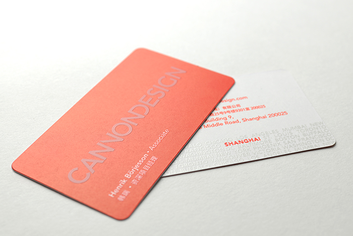
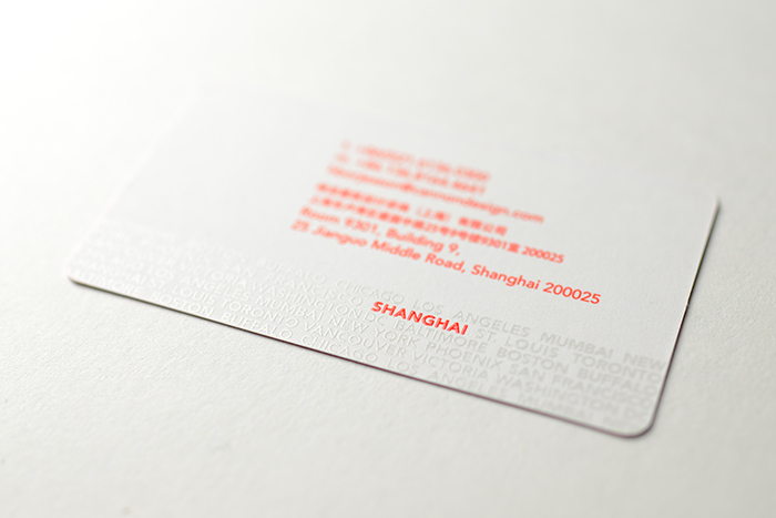
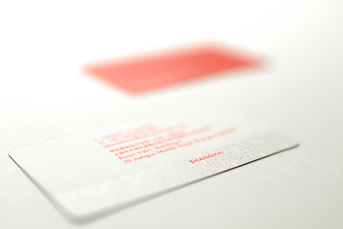
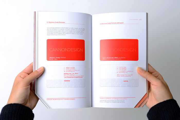
Brand Manual/Manifesto Book
The Brand Book is designed to be half manual (giving clear instructions on how to use the brand elements) and half manifesto (pointing to what our brand aspires to be).
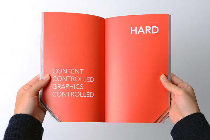
The manual portion is divided into hard, medium, and soft content. Hard items are fixed and can not be changed, such as the logo. Medium items are more adaptable to particular circumstances but should still adhere to a unified graphic standard, e.g. proposals. Soft items, e.g. presentations, are flexible, but even here I would like to offer suggestions on how to keep the firm's messages graphically clear and in alignment with their vision.
Brand Manual/Manifesto Book
The Brand Book is designed to be half manual (giving clear instructions on how to use the brand elements) and half manifesto (pointing to what our brand aspires to be).
The manual portion is divided into hard, medium, and soft content. Hard items are fixed and can not be changed, such as the logo. Medium items are more adaptable to particular circumstances but should still adhere to a unified graphic standard, e.g. proposals. Soft items, e.g. presentations, are flexible, but even here I would like to offer suggestions on how to keep the firm's messages graphically clear and in alignment with their vision.
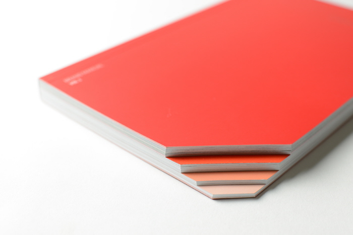
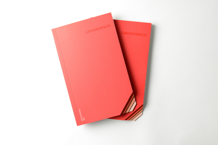
Brand Manual/Manifesto Book
Diagonally cut page tabs help you get to sections easily.
Brand Manual/Manifesto Book
The Brand Book is designed to be half manual (giving clear instructions on how to use the brand elements) and half manifesto (pointing to what our brand aspires to be).
The manual portion is divided into hard, medium, and soft content. Hard items are fixed and can not be changed, such as the logo. Medium items are more adaptable to particular circumstances but should still adhere to a unified graphic standard, e.g. proposals. Soft items, e.g. presentations, are flexible, but even here I would like to offer suggestions on how to keep the firm's messages graphically clear and in alignment with their vision.
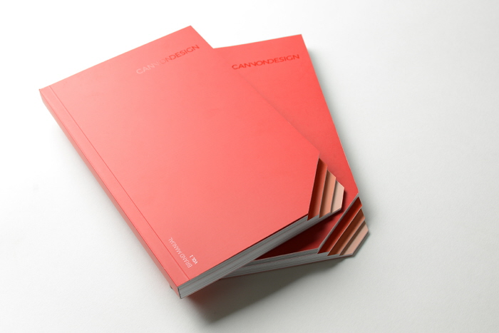
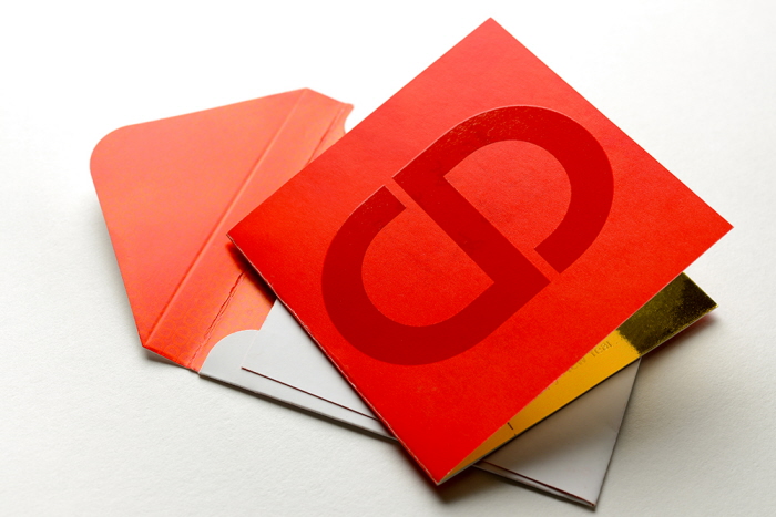
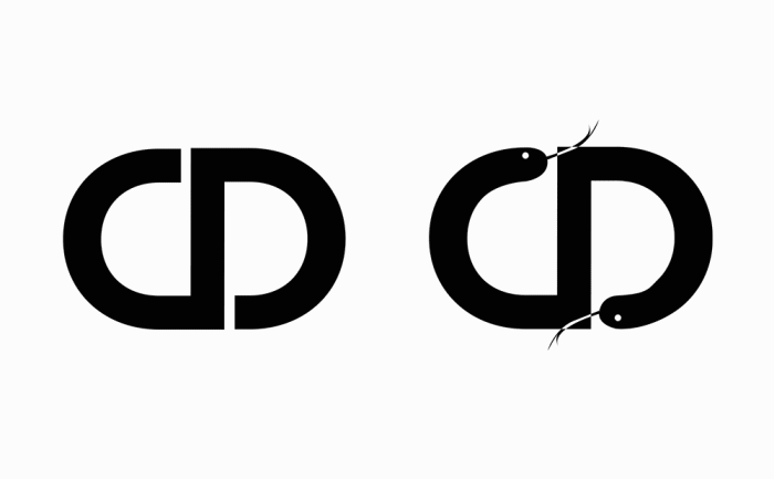
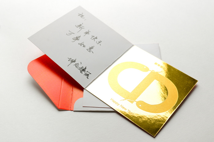
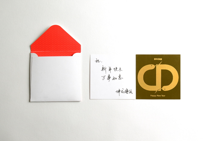
2013 Chinese New Year card
The Chinese New Year of 2013 came shortly after the new branding initiative launched. And it was a perfect timing to introduce our avatar as well.
2013 Chinese New Year card
The Chinese New Year of 2013 came shortly after the new branding initiative launched. And it was a perfect timing to introduce our avatar as well.
2013 Chinese New Year card
The Chinese New Year of 2013 came shortly after the new branding initiative launched. And it was a perfect timing to introduce our avatar as well.
2013 Chinese New Year card
The Chinese New Year of 2013 came shortly after the new branding initiative launched. And it was a perfect timing to introduce our avatar as well.
2013 Chinese New Year card
The Chinese New Year of 2013 came shortly after the new branding initiative launched. And it was a perfect timing to introduce our avatar as well.
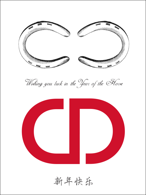
Chinese New Year 2014 e-greeting card
gLike
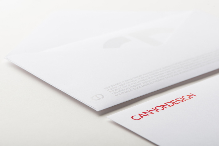
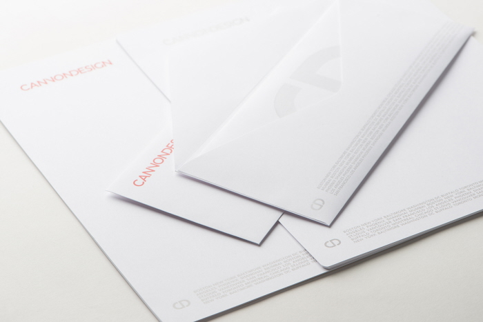
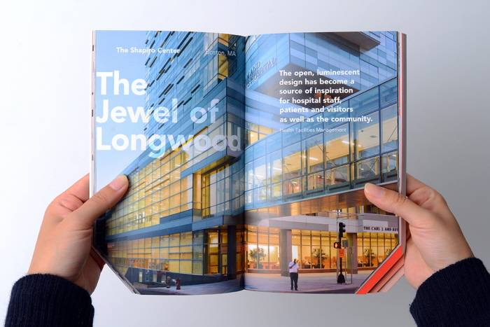
CANNON DESIGN branding
The brand refresh of an American architectural firm CANNON DESIGN included redesign of the logo, stationery, as well as rethinking / updating of the coporate vision statement and publication of the company brand manual/manifesto book, aiming to start a major transformation of the image of the firm which has been around for almost 70 years with 15 offices in the US, Canada, China and india.
Available
Full-time
Yasuo Kishibe
Creative Director/Art Director/Graphic Designer/Branding Specialist
Shanghai, China