
The welcome page is fun and interactive. The image shown on the page would be one of many that the perspective student can scroll through, depicting pictures of students at social events, pursuing academic projects, etc.
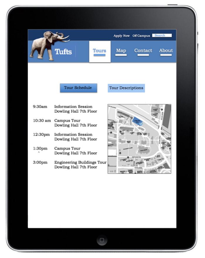
An important feature of the application is the attention to workflow and task efficiency. The first decision the user must make is to choose between viewing the tour schedule for that day and the types of tours offered. This option is therefore located at the top of the screen because that is the first place the user will look. As well, the timeline for the tours starts at the top, ends at the bottom, and moves left to right in order to maximize reading efficiency.
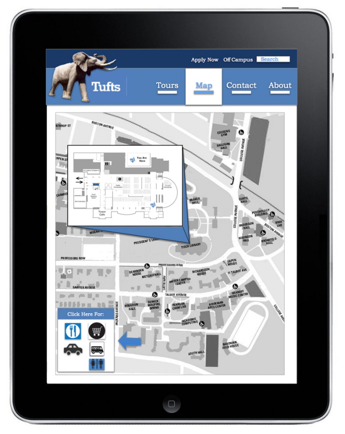
The color scheme and images on the header were chosen to match Tufts' personal brand. On the map screen, the jumbo sports icon is used as a “You Are Here” indicator to continue using images already promoted by Tufts. The user can click on different locations on the Tufts' map in order to see a floor plan of that building and the important destinations there.
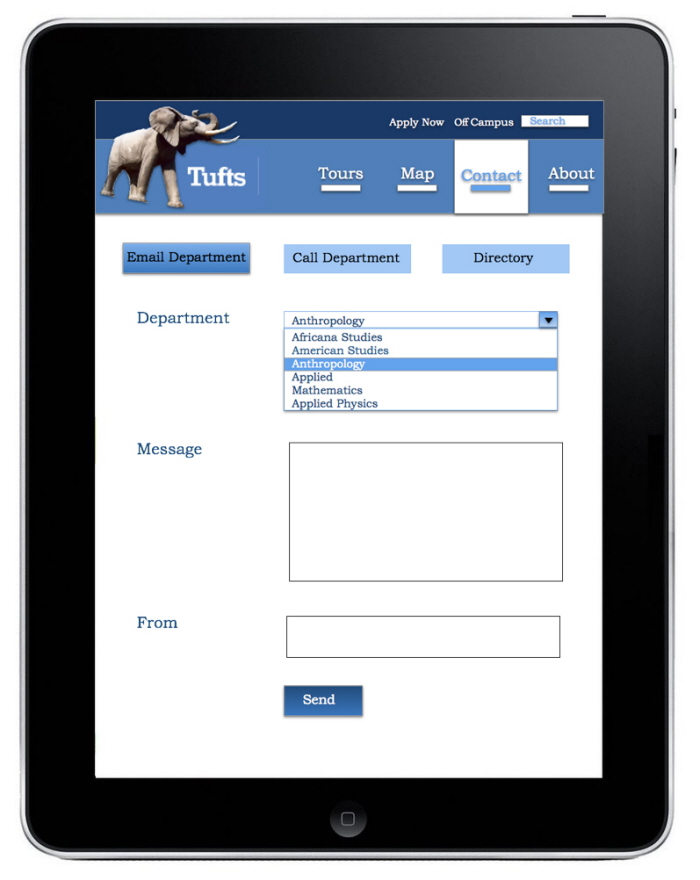
Similar to the "Tours" page, the “Contact” page was designed based on workflow, keeping in mind that the user will read from top to bottom and left to right. The order of steps the client takes to email the department moves from top to bottom. The “send,” button is at the very bottom and in a dark navy color to make it clear to the user how to complete sending an email.
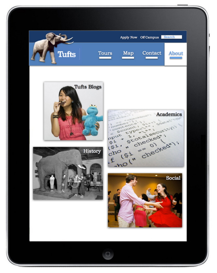
The About page gives the user more options to further learn about topics he heard about on the tour.
gLike
eCampus iPad Application
The goal of the eCampus Rover application is to enhance the experience of college prospective students during and after formal campus tours. My design process started with a concept model of all the features I wanted the application to contain. From there, I designed each page with workflow, visual cues, simplicity, and interactivity in mind.