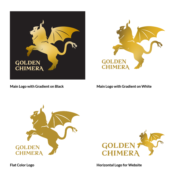
Main Logos: Flexible logo layouts and a flat, one-color option to ensure the brand looks great across every touchpoint — from website to marketing materials.
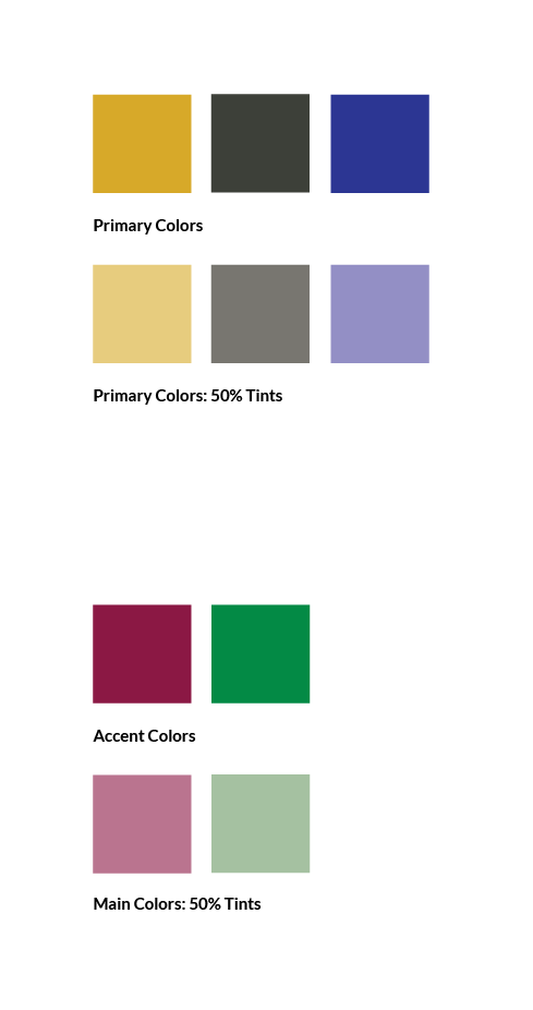
Color Palette: A rich, jewel-toned palette of gold, black, and blue with cranberry and green accents. These vibrant hues evoke a sense of abundance, energy, and magic — perfectly fitting for a brand about turning small opportunities into golden wins.
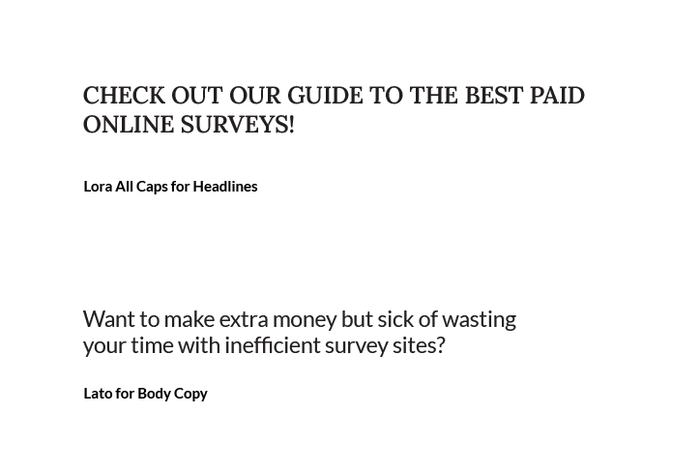
Brand Fonts: A serif and sans serif pairing chosen to balance personality with readability. The fonts bring visual contrast and energy while keeping the website experience clear and approachable.

Logo Inspiration: Inspired by a chimera icon I designed in college — a mythical creature with a lion’s head, goat legs, and a snake’s tail — this mark was reimagined to bring the brand’s personality to life.
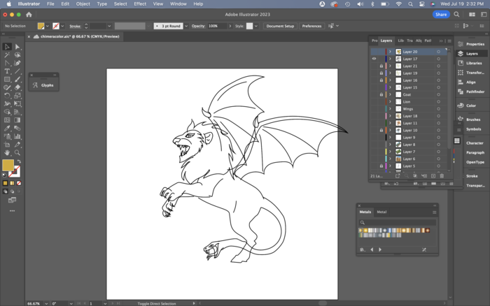
Mark Progress Work: Reimagining the chimera began with exploring the best pose and refining each element — from the lion’s head to the goat legs and snake tail — to create a dynamic, cohesive mark full of character.
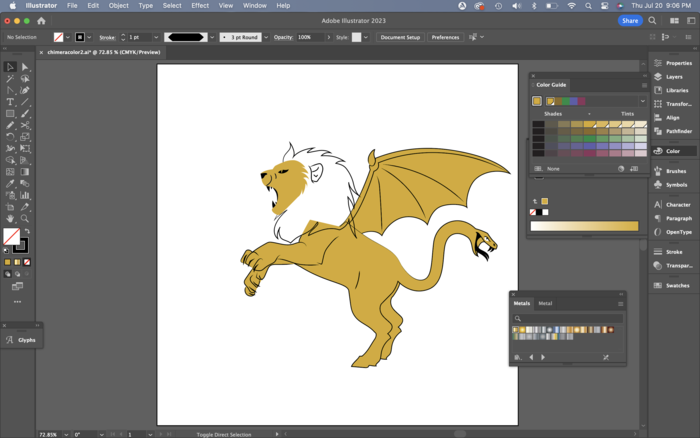
Mark Progress Work: Refined and simplified the chimera’s shapes to ensure the mark remains bold, balanced, and legible — even in a clean, one-color application.
gLike
Brand Identity: Golden Chimera
Golden Chimera is a review website focused on paid survey sites, helping users discover smart ways to earn extra income.
The Golden Chimera mark features a metallic gold finish, symbolizing wealth and opportunity — like a modern-day golden goose with a mythical twist. Its playful, wondrous personality reflects the brand’s unique voice and owner’s style.
Available
Freelance, Full-time, Moonlighting
Becky Ferrel
Senior Graphic Designer & Marketing Strategist
Woodbridge, VA