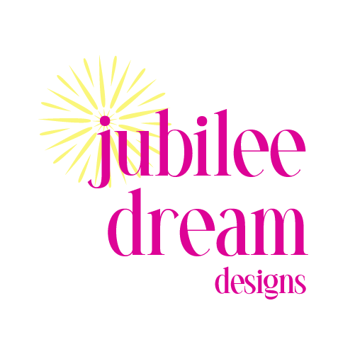
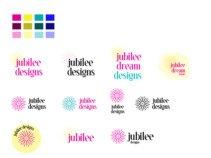
Main Logo
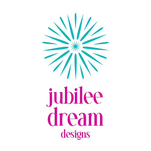
Main vertical logo
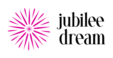
Alternate horizontal logo and colors
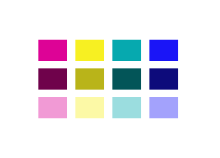
Brand Colors with Tints and Shades: Designed for a bold, expressive audience, the palette features bright, fun colors that reflect their confident, unapologetic style.
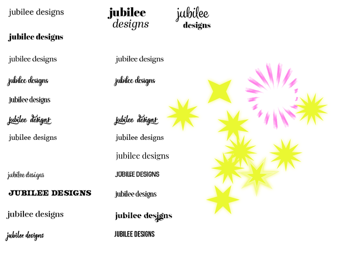
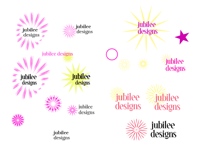
Branding Font Selection & Shape Exploration: To create a mark reminiscent of fireworks, I explored various star shapes and paired them with typography that complements the brand’s bold, playful personality.
Branding Progress: The name Jubilee celebrates individuality and self-expression. To visually represent this, I developed a mark inspired by fireworks — a symbol of joy, energy, and personal style.
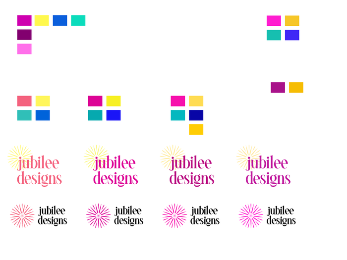
Color Selections: Bright pink and yellow form the core palette, complemented by teal and blue for added depth and vibrance.
Brand Progress Work: With the mark and fonts selected, I explored various logo layouts to find the strongest, most balanced composition.
gLike
Brand Identity: Jubilee Dream Designs
Jubilee Dream Designs is an online shop offering uniquely designed phone cases for women aged 25–45 who use fashion as a form of self-expression. The brand speaks to bold, confident customers who aren’t afraid to show the world who they are.
The name Jubilee Dream Designs celebrates individuality and personal style. Inspired by the X-Men character Jubilee — who shoots fireworks from her fingers — the brand identity includes a custom mark resembling fireworks, symbolizing joy, expression, and uniqueness. The signature pink and yellow also reference this playful origin, adding a personal layer to the brand story.
Available
Freelance, Full-time, Moonlighting
Becky Ferrel
Senior Graphic Designer & Marketing Strategist
Woodbridge, VA