
Hero Logo: A stylized wine glass and simplified grape cluster—rendered in layered shades of purple—combine with an elegant serif wordmark to strike a balance of sophistication and femininity, perfectly suited to the brand’s target audience.
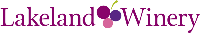
Alternate Horizontal Logo: A streamlined version designed for smaller applications where the wine glass icon may lose clarity—maintaining brand recognition in a more compact, versatile format.
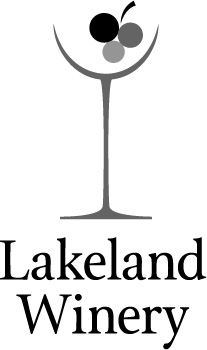
Grayscale Logo: A monochrome version of the hero logo that maintains clarity and elegance without color—ideal for black-and-white printing or understated branding moments.
gLike
Brand Identity: Lakeland Winery
This small Finger Lakes winery, known for its mainly female clientele, needed a brand identity that felt fun, feminine, and refined. The result was a versatile logo system that strikes a balance between playful and sophisticated—flexible enough to carry across multiple product lines. Over a decade later, the branding still holds strong, proving both its longevity and adaptability.
Available
Freelance, Full-time, Moonlighting
Becky Ferrel
Senior Graphic Designer & Marketing Strategist
Woodbridge, VA