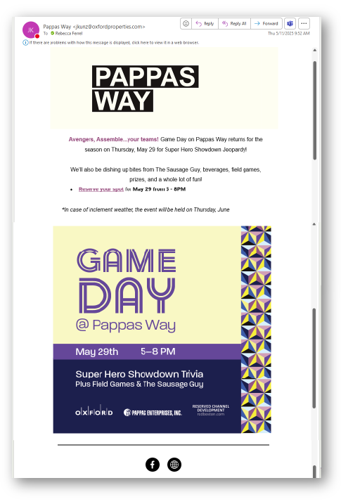

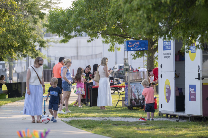
Oxford Properties hosts free community events at Pappas Way, an outdoor public space within its future Reserved Channel Development site in Boston. These events are designed to bring local families and young adults together and activate the space ahead of development.
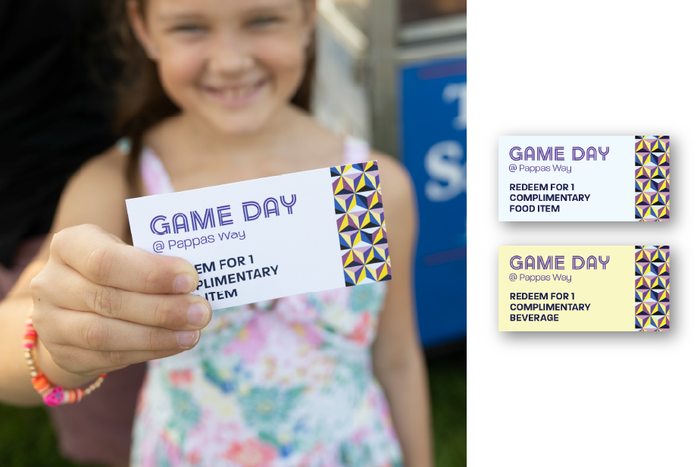
Game Day at Pappas Way is a recurring, family-friendly trivia event featuring free food and drinks, and activities for all ages.
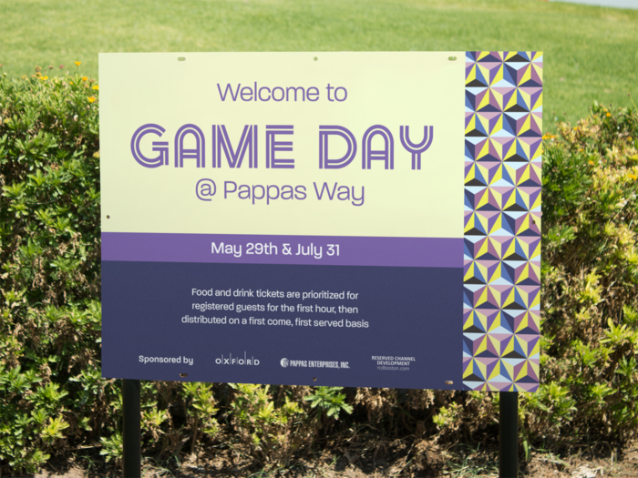
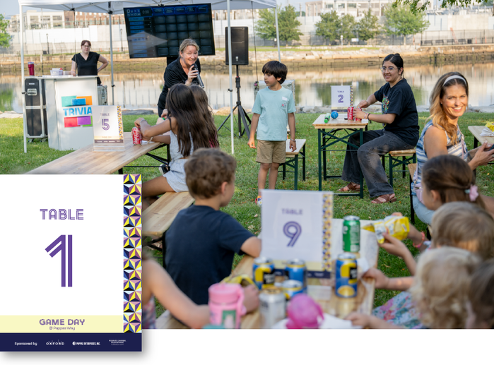
To reflect the fun, casual nature of the event, I pulled inspiration from the pattern and colors of the Recreation Station (pictured) using playful fonts and bright, approachable visuals.
I created the event graphics and copy for a distribution email, Eventbrite listing, welcome sign, table signs and drink and food tickets—ensuring a cohesive and inviting experience across all touchpoints.