
With little lead time to the boot camp's launch this logo was approved to at least give the feel of the bootcamp.

Facebook Cover Page.
Took the idea of someone working out in a gym and set them against the apocalyptic backdrop
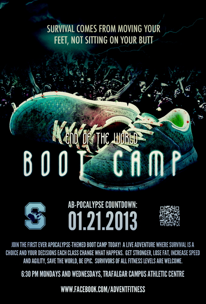
The original 11"x14" poster that was put up in the local area and college campus.
The "S" logo is belongs to the athletic centre where the boot camp is held.
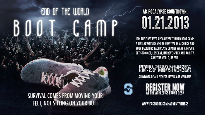
Conversion of the OOH poster to an appropriate format for display on the local college's CC TVs.
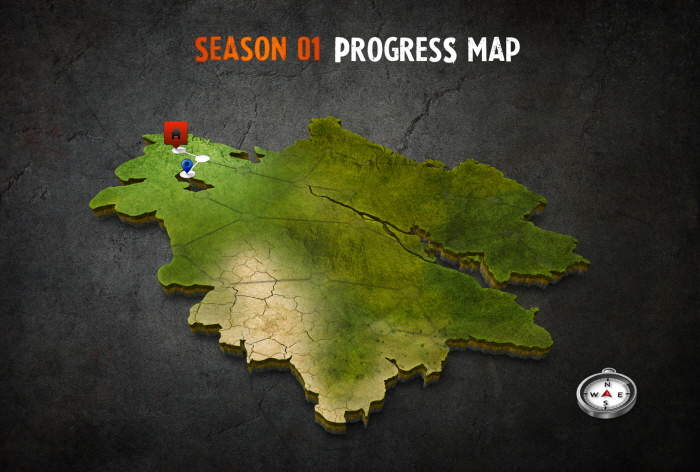
As the boot camp's story line progresses with each class, a map was created to show the progress of the survivours as they advance each week. The split paths are certain classes where they get to make choices in the storyline, which will reflect how their map evolves.
Fun Fact: The basic shape of the visible land mass was initially created by merging China, India and Germany, then tweaked from there.
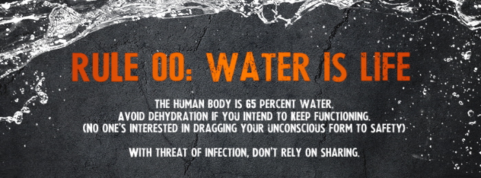
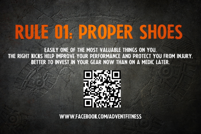
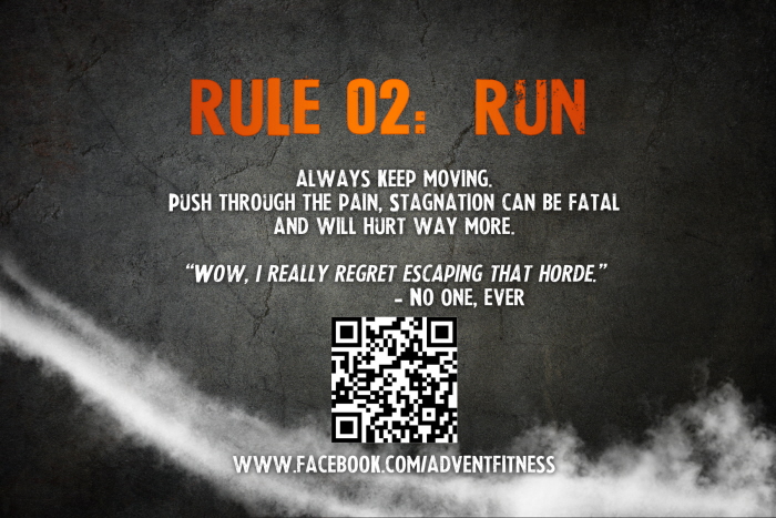
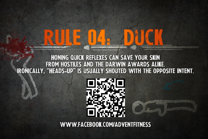
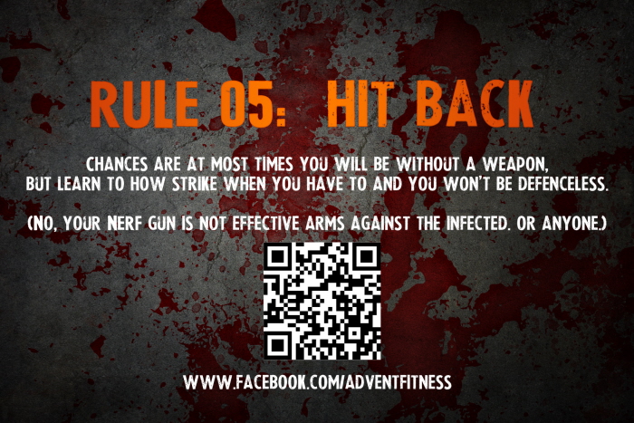
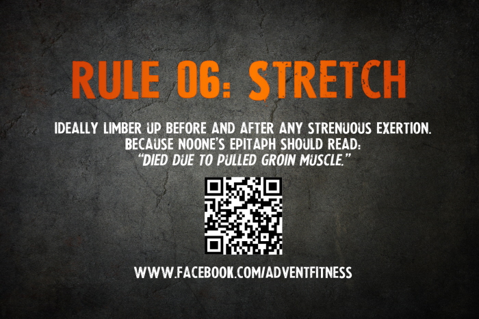
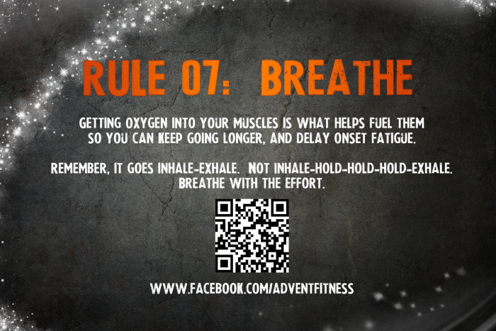
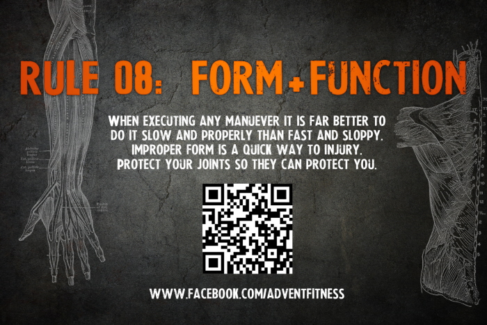
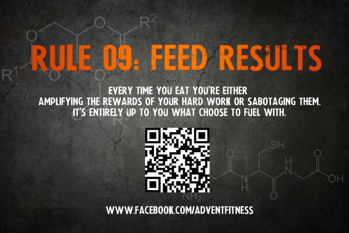
"The Rules" were created as promo material, with one released online per day leading up to the boot camp. The QR code was added for the versions that were put up around town, and would take people to the Facebook page.
Though given a grim theme, each rule is grounded in good principles of general sport and fitness.
gLike
Advent Fitness - Ab-pocalypse
Advent Fitness runs H.I.I.T.-based boot camps, "mixed with adventure" so that the students are given a part of the story each class and actually make choices as participants to affect how it plays out.
The first season is apocalyptic themed, so all the promo materials reflect that vibe.