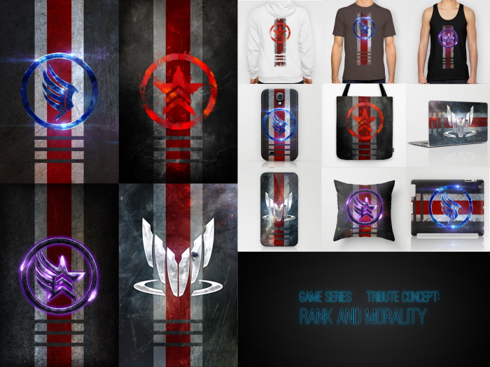
Conceptual product designs based on iconic symbols.
Got Candy in My Ears - "Tonight, baby"
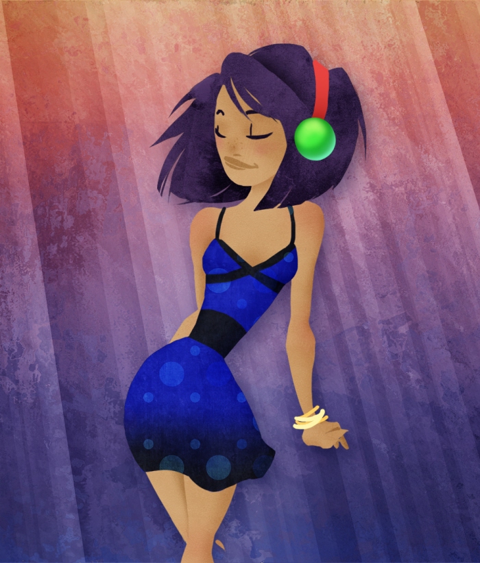
JUST DANCE
http://www.youtube.com/watch?v=KTx5mJtw9mU
What happens when I get Jamiroquai stuck in my head.
I have the dress, now I just wish I had those headphones. Which are apparently wireless - oh well.
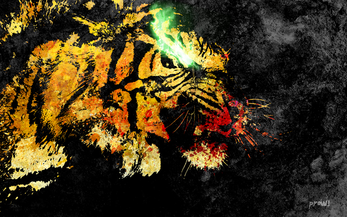
Prowl - Wallpaper.
Used a photo of an actual tiger as a base reference. Just wanted to create this really rough graffiti look, almost like cave wall painting, infused with a little bit of mystique.
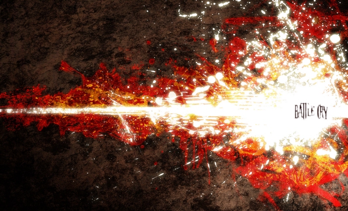
This is My... - Apparently continuing with my splatter paint look.
But going for a more evocative feel I think it works with this, the idea of the "battle cry" ripping forth from within, and there is nothing smooth or refined about it.
Just raw feeling.
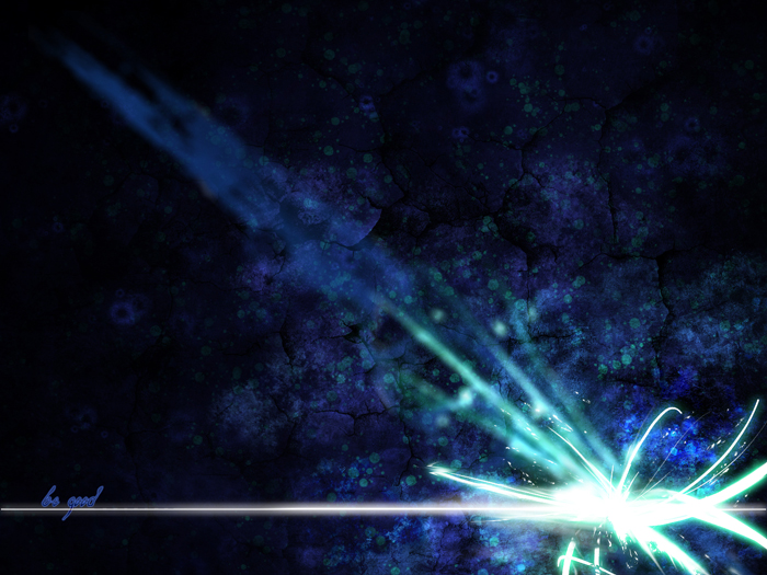
Be Good - Wallpaper.
This is more conceptual around the idea of a plea to be "good" as a part of one's strength of character.
I'm a sucker for bold colours & contrast.
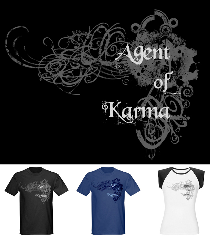
Agent of Karma - T-Shirt Design.
As an agent of karma what you do to others is just karma working through you.
Deep, or an excuse for random acts of violence?
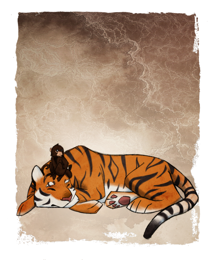
Tiger and the Monkey - Heh, just idly started as something silly on a piece of scrap, then quickly got away from me.
"Oh! That came out alright; maybe I'll just try this one more thing..."
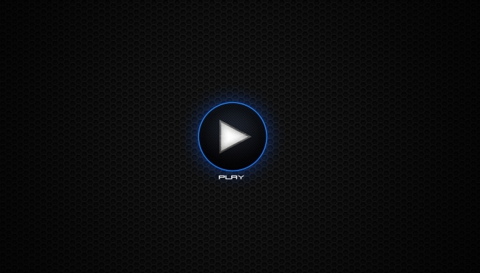
Play - Desktop/device wallpaper.
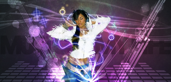
Music is My Life - I really wanna give you time,
But still I can't let go
I'm in love with you, baby,
But I also love my flow
Another song-inspired piece, this time from the awesome Don Diablo: http://www.youtube.com/watch?v=nVMywgnu3Ng
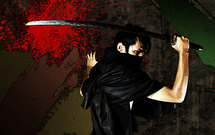
Samurai Samurai - Wallpaper turned Credits Sequence (in After Effects)
I was definitely influenced by the style of Afro Samurai here, hence the cell look.
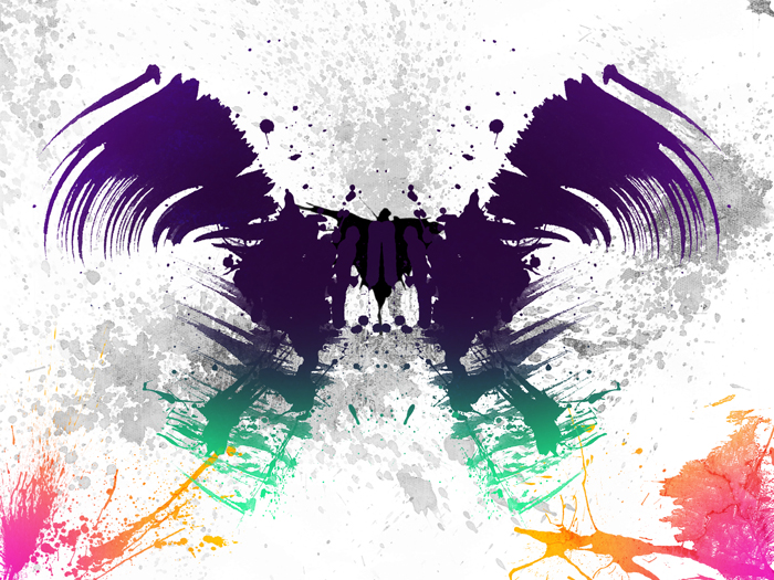
Soar - Going for a very summer, beach n' boardwalk feel, which is where the colour scheme and splatter-style came from.
While I liked the symmetry used to create the "bird" in the middle I felt it'd get boring if I made the entire piece symmetrical, hence the difference from one side to the other in the background.
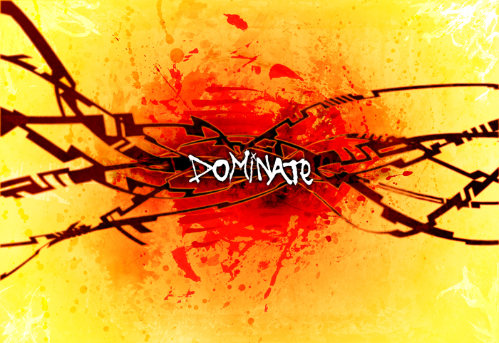
Dominate - Inspired by the inspiration of one of our Canadian Olympians (2008).
"Don't just win, Dominate!"
The colours where kinda chosen subconsciously, the warmer palette more aggressive as appropriate to the concept.
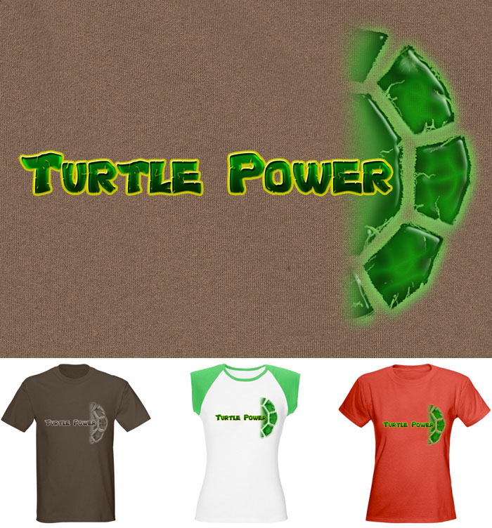
Turtle Power - Shirt Design.
The idea is a throwback to the TMNT days of the late 80s without having to literally brand the shirt.
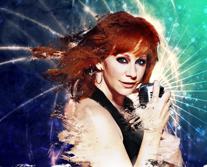
Reba - More fun with displacement maps. Created as a small homage to one of my favourite singers.
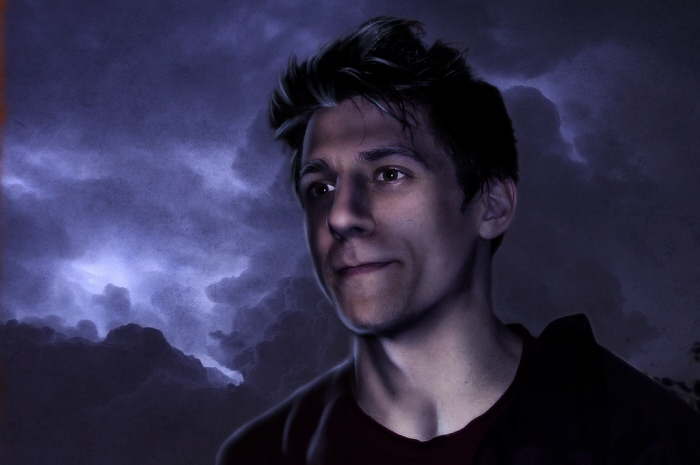
Jake - An early experiment into digital lighting. We took the original photo indoors under bright incandescent lamps, leaving him evenly well lit.
IT Girl - Another edit from a photoshoot.
gLike
Graphic Stuff