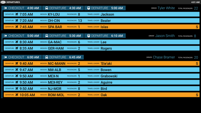
Along with a recolor, the fewer groups and lack of names made it possible to increase image size. (This was designed for a 60-inch monitor.) While most groups were light blue, senior groups were indicated in orange to match the Travel application. Train times were also added.
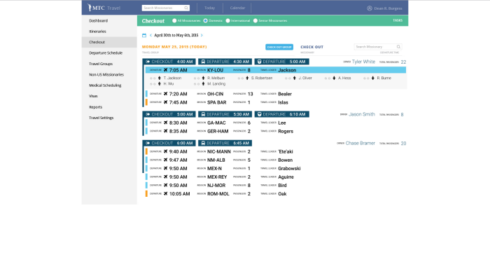
When the travel office begins to check out a group, the screen will shift into a view that only encompasses that group, and follows the same flow of graying out those individuals that have been checked out.
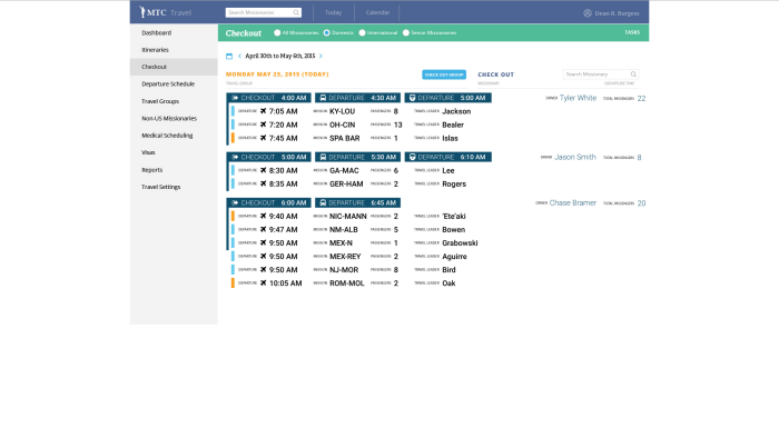
This is the back-end interface for the Travel Department, for use in managing the screen. It was designed to emulate the main screen as much as possible.
A single click on a travel group will open that corresponding departure group up on the main screen, allowing checkout to begin.
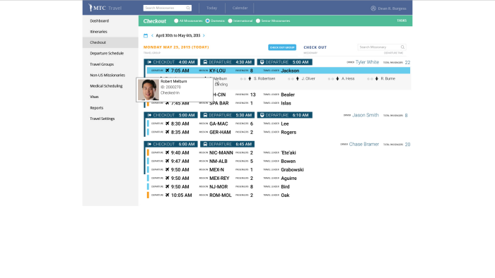
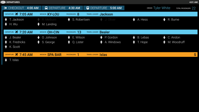
Clicking on a name will show pertinent information and status, which disappears on the next click.

If the missionary has been checked out, this information will also indicate the date and time of that last action.
gLike
MTC Travel Departure Version 2
For Version 2, the client felt that there was too much information on the screen at once, so the three columns were narrowed into just one. This version also includes some of the back-end screens implemented into the current Travel application.