


gLike
Alba / Brand Identity
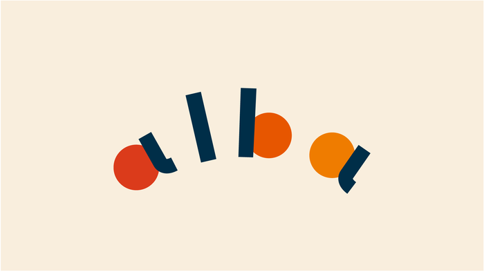
Alba - meaning “dawn” in Spanish, was the perfect visual metaphor to represent this brand so we made it a center point of the logo.
From dawn to dusk, Alba guides food brands from the moment of their conception to their peak of splendor and keeps them shining for a long time. The logo plays with the circular shapes of the sun, from "a" to "a", representing its trajectory movement, from when it rises until it hides.
The idea was translated into the illustration design that completes the brand and its web design which is seen as the main tool of the first contact in the company.
Available
Freelance
Daniela Perla
Designer helping brands find their story and craft unique brand...
Santa Tecla, El Salvador