
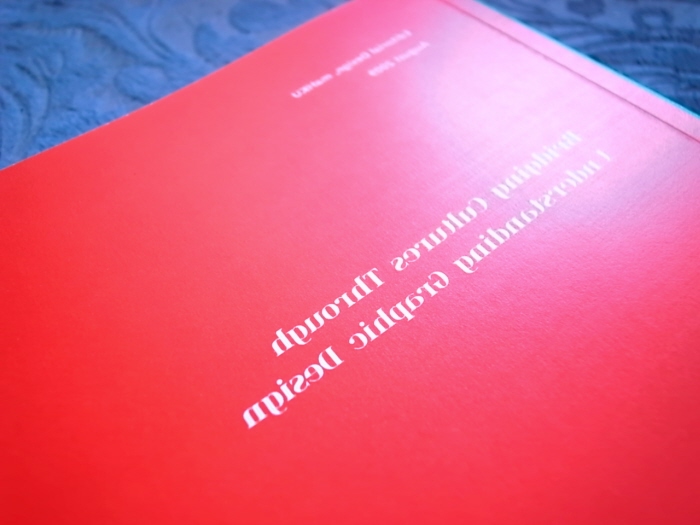
When I created the thesis book, I wanted to generate the conflicit and consistency at the same time; the main function was to correspond to my design project booklet. Therefore I applied the symmetrical structure by choosing two opposite colors (red and green) and reversed typograhy to design the front and back covers, which created the visual harmony between the thesis and the design booklet.
When I created the thesis book, I wanted to generate the conflicit and consistency at the same time; the main function was to correspond to my design project booklet. Therefore I applied the symmetrical structure by choosing two opposite colors (red and green) and reversed typograhy to design the front and back covers, which created the visual harmony between the thesis and the design booklet.
When I created the thesis book, I wanted to generate the conflicit and consistency at the same time; the main function was to correspond to my design project booklet. Therefore I applied the symmetrical structure by choosing two opposite colors (red and green) and reversed typograhy to design the front and back covers, which created the visual harmony between the thesis and the design booklet.
When I created the thesis book, I wanted to generate the conflicit and consistency at the same time; the main function was to correspond to my design project booklet. Therefore I applied the symmetrical structure by choosing two opposite colors (red and green) and reversed typograhy to design the front and back covers, which created the visual harmony between the thesis and the design booklet.
When I created the thesis book, I wanted to generate the conflicit and consistency at the same time; the main function was to correspond to my design project booklet. Therefore I applied the symmetrical structure by choosing two opposite colors (red and green) and reversed typograhy to design the front and back covers, which created the visual harmony between the thesis and the design booklet.
When I created the thesis book, I wanted to generate the conflicit and consistency at the same time; the main function was to correspond to my design project booklet. Therefore I applied the symmetrical structure by choosing two opposite colors (red and green) and reversed typograhy to design the front and back covers, which created the visual harmony between the thesis and the design booklet.
When I created the thesis book, I wanted to generate the conflicit and consistency at the same time; the main function was to correspond to my design project booklet. Therefore I applied the symmetrical structure by choosing two opposite colors (red and green) and reversed typograhy to design the front and back covers, which created the visual harmony between the thesis and the design booklet.
gLike