
Created company logo with new name. Formerly ETA hand2mind®. Brighter colors and simplified font (main font used in most of our student materials) to give a more modern feel. The "twinkle" is to represent a light going off, like an idea or growing minds. Kept similar colors and position from original logo to ensure customers recognition, as the company was undergoing a full rolling rebrand. Secondary logos to be used on product and merchandise only. All final logos were created in Illustrator.
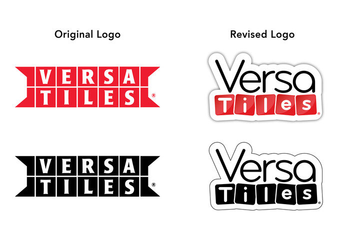
Updated the product logo to be more versatile on both dark and light backgrounds. Adding rounded corners gave it a modern and sleek look, also allowing it to stand out more and not blend in with the background. The simplistic, rounded font made it easier to read at small sizes, and reflected the intended age/grade of the product use (PreK-8). The tile shapes mimic the revised product tiles (rounded, not square). All final logos were created in Illustrator. I did not design the original logo.

Hands-On Standards® was original product line aligned to Common Core and TEKS standards. Hands-On Standards® STEM in Action™ was the first sub-brand that I created. After a few years STEM in Action® became its own brand with multiple sub-brands. As the brands evolved, so did the logos. I brightened the colors, and gave all pieces a rounded look so they didn't resemble stickers (feedback from 1st generation), but still stood out and kept black, red, orange, green, and blue as the signature colors. All final logos were created in Illustrator.
Created a logo for an educational app. The logo was designed with the hairy Yeti mascot in mind (tufts). Used an existing font with slight character modifications to make easy to read, added hair, and layers in photoshop to create 3D effect.

Company logo.
Simplistic design representing owners heritage.
Illustrated bee, arrow, and tepee.
gLike
Logos
Most logo options were presented in black and white for first review. Multiple designers presented concepts. All of these logos were derived from my original concepts and modified based on feedback. These are final versions that I created; used in print, molds, and on the web. Once final approval and both color, black/white, and mold (if applicable) versions were approved and created, then I created and maintained the brand books which included the logo guidelines.