
Engine Clinic - I wanted to use elements and type that felt powerful and strong and masculine.

Bike Blessing - I wanted a clean look for a clean event. I used some effects on the type. I am learning how to mix type up and really use the track and kern.

Charity Fundraiser - This was a collaboration with Breann Fredritz of Thiel's Wheels. She came up with the color scheme and basic idea and I reworked the layout and type to fit our dealership.

Phone Ap Cover - We needed a simple image that only shows up for a short time. I used the new wildly poplular 'Slim' for the shot.
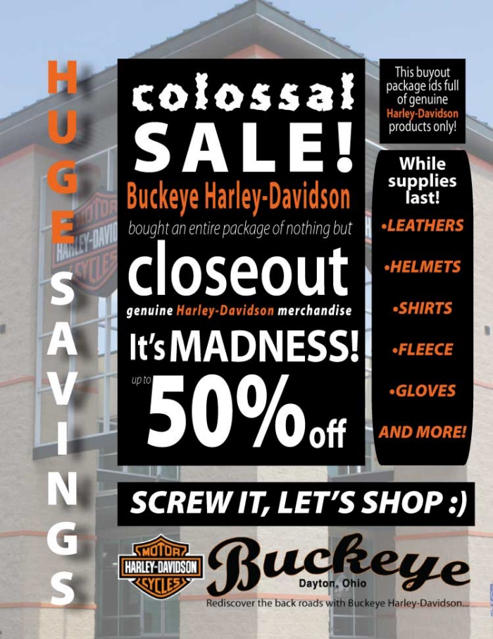
In Store Sale Ad - I started with a photo of the store that I took and put it in the background and then played with the type to give it one of those crazy sale ad looks to create a feeling of frenzy to get people to act now!

Old School Swap Meet - I wanted to give an old school poster feel with a clean look. So I did some hand pen tool design and made it not perfect on purpose. I also used the live trace in illustrator to get the effect on the motorcycle.
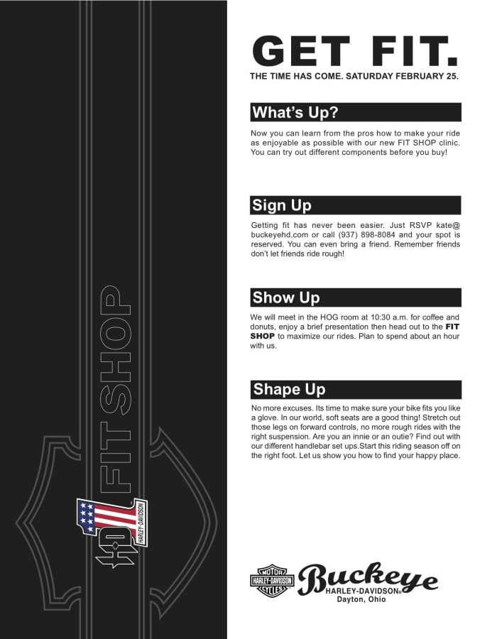
Fit Shop Clinic - This was a quick flyer made in half a day. With Harley-Davidson you get the benefit of online catalogs of approved artwork so I have incorporated it in this fit shop flyer yet I rotated it and put it on a vertical grid.
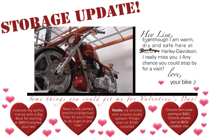
Valentine From Your Bike - We store bikes in the winter and the idea came up to send a card to the owner to get them to come into the store. So I went overboard with the whole Valentine's theme. It worked quite well

Ladies Event - The image is stock from H-D but I wanted to make a statement with the type. So I used ITC Machine and Univers in different strengths, sizes, colors to make it visually interesting even from afar.
gLike
Advertising
These are promotional/event advertisements that I made for Buckeye.