
IT'S LIKE GALLERY HOPPING, ONLY BETTER-TASTING : SAN FRANCISCO DINE ABOUT TOWN PUBLIC TRANSIT AD ///// This ad for San Francisco's popular Dine About Town consumer program is among 30+ print and digital deliverables I developed. The program is aimed at an affluent audience of foodies who view food as art, so the edibles are playfully arranged like pictures on a gallery wall. The program encourages people to dine at as many restaurants as possible -- hence the "gallery-hopping" concept. This ad is pictured in the Powell Street BART (Bay Area Rapid Transit) station. ///// ROLE: creative + art direction, design, copywriting, production design
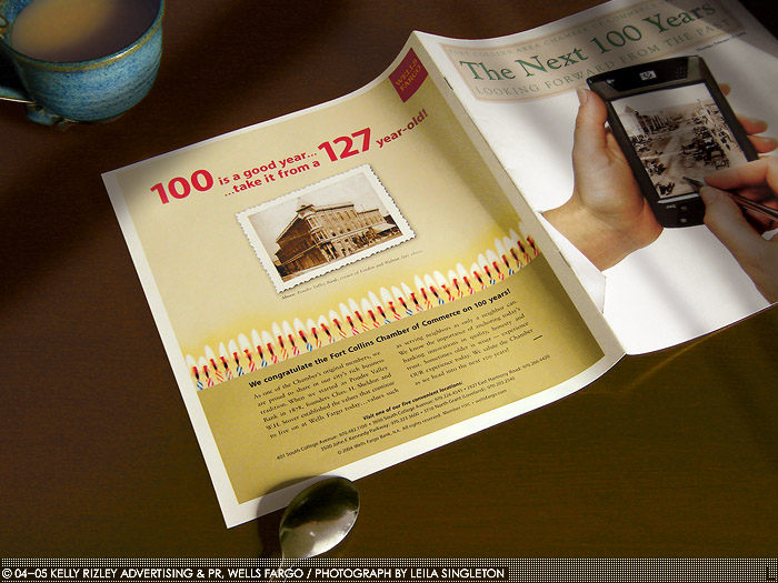
100 IS A GOOD YEAR : WELLS FARGO AD ///// This rush-job ad ran in two publications celebrating the Fort Collins Chamber of Commerce's 100th birthday. Given only some halftoned photos and Wells Fargo's graphic standards, the creative was up to me. I oversaw a crude photo shoot of the candles, and the central image is a flatbed scan of a halftone (moire pattern digitally removed). I wrote the headline; the body copy was a collaborative effort. ///// ROLE: creative direction, design, copywriting, research, photo editing and color correction
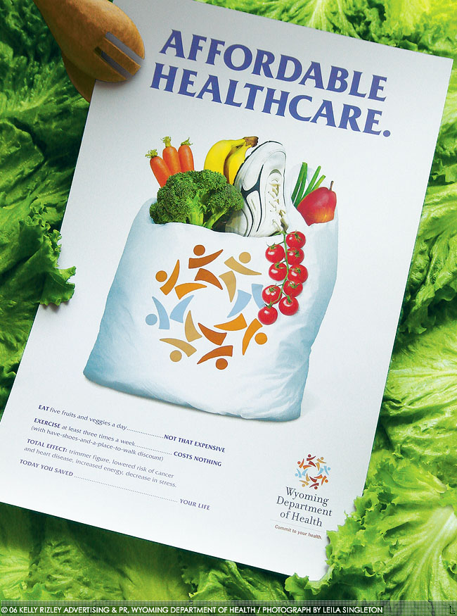
AFFORDABLE HEALTHCARE : WY DEPT OF HEALTH POSTER ///// The Wyoming Department of Health (WDH) sought a poster promoting their new logo,* and encouraging citizens to exercise and eat more produce. Our agency held a focus group; participants said exercise is complicated and produce is expensive. I aimed to show that healthy living is simple as a trip to the local supercenter and cheaper than being unhealthy. ///// ROLE: Creative direction, design, copywriting; photo compositing, editing and color correction
*Logo by Barnhart Communications
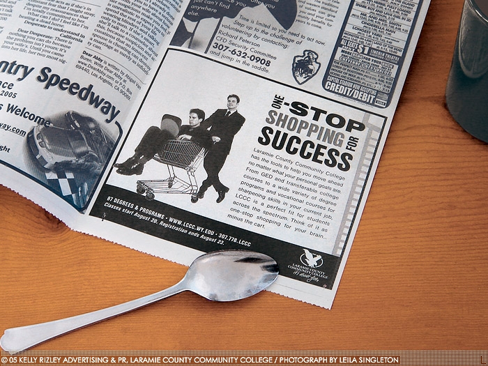
SHOPPING FOR SUCCESS : LCCC FALL NEWSPAPER CAMPAIGN (1/2) ///// A meeting with LCCC's Director of Public Relations identified three targets for their Fall '05 enrollment campaign: traditional students, those seeking a degree later in life, and trade/vocational students. On a tight budget, we were limited to stock photos, so I focused on writing stand-out copy to complement the images the client and I selected. ///// ROLE: creative direction, design, copywriting; photo selection, editing and value correction
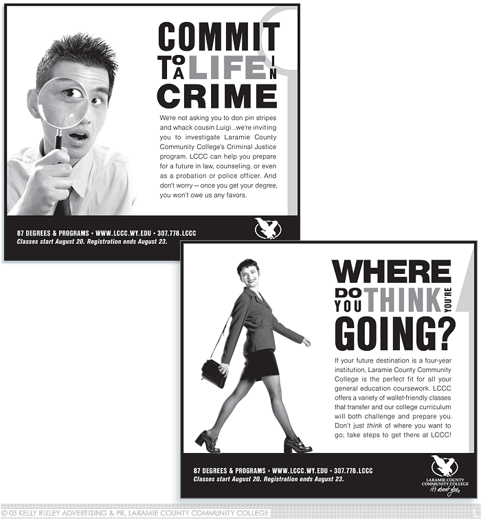
VARIOUS DESIGNS : LCCC FALL NEWSPAPER CAMPAIGN (2/2) ///// The aesthetic seen in the previous ad was used in all of the ads in the series (five total). Bold visuals -- heavy blacks and funky type -- help the ads pop. The look is edgy without alienating conservative prospects. All photos and grey tones were edited to ensure optimal reproduction on newsprint, regardless of dot gain or ink coverage, and ran successfully in a wide variety of Wyoming newspapers. ///// ROLE: creative direction, design, copywriting; photo selection, editing and value correction
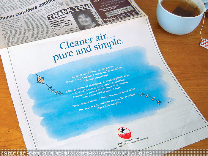
PURE AND SIMPLE : FRONTIER OIL NEWSPAPER AD ///// When Frontier Oil Refinery beat the EPA's June '06 deadline for ultra-low sulfur diesel fuel production, they wanted to share the achievement in a newspaper ad. The complexity of the fuel's production is mentioned only to amplify the simplicity of the outcome: cleaner air. A cyan sky, simple illustration and ample white space evoke cleanliness. To minimize misregistration, I capped color blends at two inks. ///// ROLE: creative direction, design, traditional illustration, copywriting, research

DEAR DESIGNERS, SUBMIT… : TYPETHURSDAY INSTAGRAM AD ///// TypeThursday is a monthly gathering of letterform lovers, the centerpiece of which is Type Crit, a moderated, group critique of type-centric works. I wrote and designed this ad ahead of a TypeThursday San Francisco event in order to solicit submissions, combat fears that critiques are unfriendly, and address a misconception that only typeface designs and lettering projects are welcome. A copy-driven design not only underscores the organization's focus on letterforms, but also serves to highlight a typeface by that month's featured type foundry. The gradient background is derived from preexisting branding elements. ///// ROLE: creative and art direction, design, copywriting
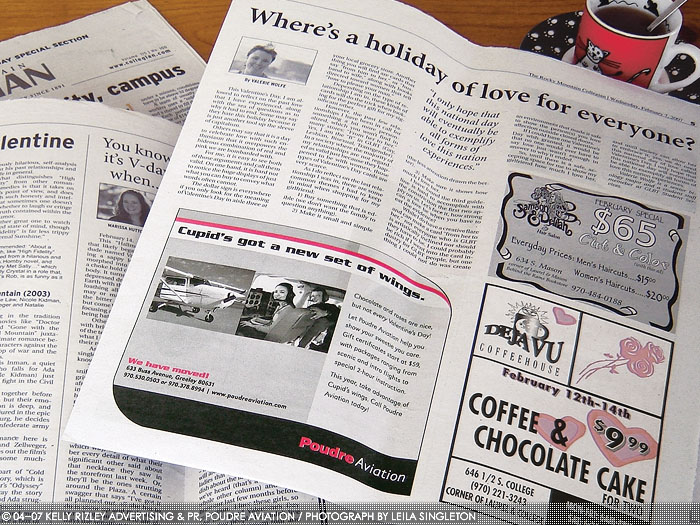
CUPID'S NEW WINGS : POUDRE AVIATION AD (1/2) ///// This Valentine's Day ad ran in newspapers with a largely college-age audience; a quirky, lightly humorous voice was adopted to appeal to this group. The copy emphasizes affordability and variety of services over long-term flight lessons. The ad incorporates the newspaper's bonus holiday spot ink. ///// ROLE: creative direction, design, copywriting, photo editing/value correction
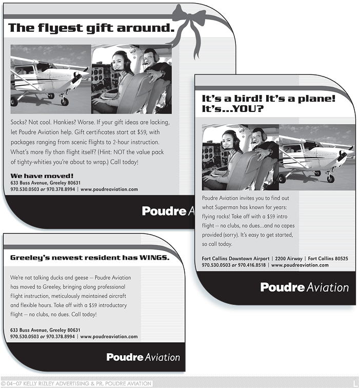
VARIOUS DESIGNS : POUDRE AVIATION ADS (2/2) ///// Produced on less than a shoestring budget, I infused Poudre Aviation's ads with variety via copy, not ever-changing graphics. Like the Valentine's Day ad (see previous), the above selection of ads ran mostly in newspapers with a college-age audience. Since each publication had its own design specs, flexibility was key -- my ad template had to adapt to any dimensions/aspect ratio. ///// ROLE: creative direction, design, copywriting; photo editing and value correction
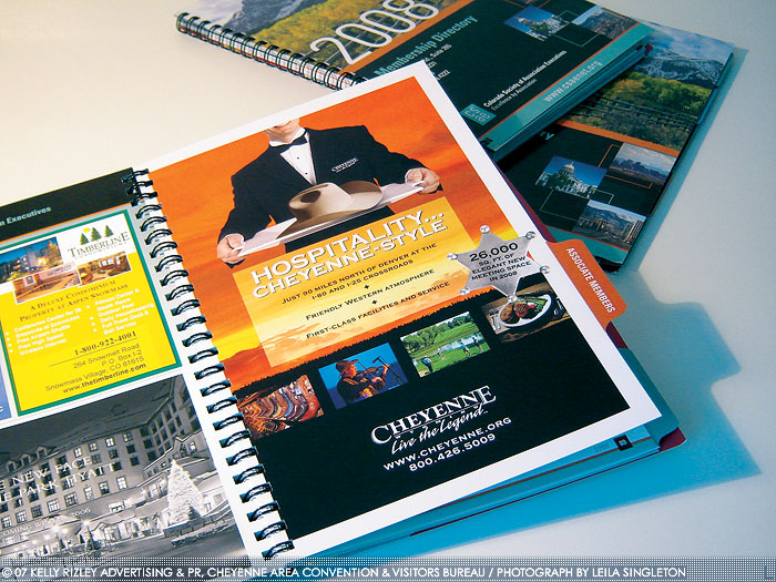
HOSPITALITY ... CHEYENNE-STYLE : CACVB FULL-PAGE AD ///// The Cheyenne Area Convention & Visitors Bureau (CACVB, now Visit Cheyenne) sought to promote their locale for meetings/conventions, along with the idea, "Western hospitality you expect, quality you deserve." A waiter with a stetson on a tray sprang to mind, conveying quality sans pretension. Consistency with old ads was key -- the sunset, screened copy area and badge come from an established graphics library. ///// ROLE: art direction, design, copywriting; photo selection, compositing, editing and color correction
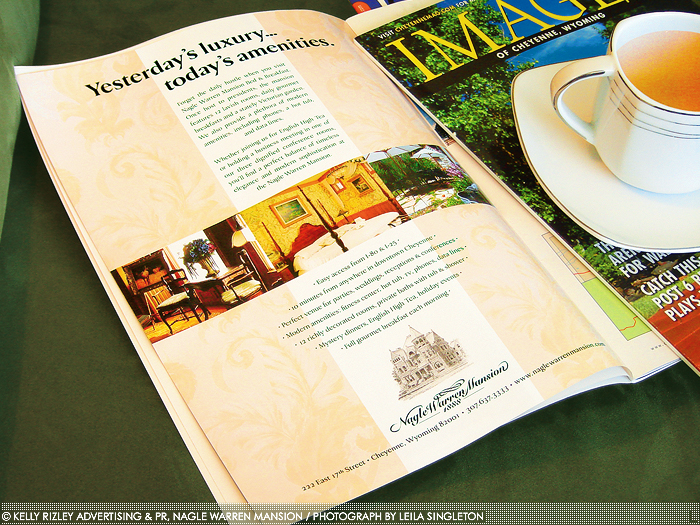
YESTERDAY'S LUXURY ... TODAY'S AMENITIES : NAGLE WARREN MANSION AD ///// This full-page ad for the Nagle Warren Mansion bed and breakfast ran in two issues of the annual "Images of Cheyenne" magazine. Rather than relegate the underlying three-column grid to invisibility, I highlighted it as a design element by turning it into an old-fashioned wallpaper background. All elements are centered to create a tone of formality befitting a stately Victorian mansion. ///// ROLE: creative direction, design, copywriting
gLike
Advertising Design