
RESPONSIVE WORDPRESS SITE : NAGLE WARREN MANSION (1/3, homepage)
I was approached to redesign the website of a high-end bed and breakfast. The goal was to make it responsive, and to move it from the Plone CMS to WordPress.
Confronted with sprawling, inconsistent navigation composed of 18 separate buttons scattered along the top, bottom and side of the site's pages, I first embarked upon consolidating navigation into a single list of six main categories, with vital content pages organized in dropdown menus.
After the client approved the restructured navigation, I created a bespoke look for the homepage that dispensed with the frou-frou pinks and stock graphics of the previous site. An in-person tour of the Mansion inspired the color palette, and the bespoke banner illustration is based on original 19th century design flourishes I photographed during my visit.
ROLE: Art direction, UI + visual design, illustration, copywriting

RESPONSIVE WORDPRESS SITE : NAGLE WARREN MANSION (2/3, rooms page/content page template)
I always like to choose an existing page of heavy, complex content from a website to create a content page template; it gives me a sense for actual hierarchical and styling needs, and additionally allows me to reconfigure a page that needs extra design TLC.
My content page of choice was "Rooms." Since the site was to be migrated from another CMS, room descriptions were left in list format as they previously appeared, minimizing manual page restructuring post-migration; green "sub-divs" were, however, introduced to corral text hyperlinks and make jumping through the room list more expedient. Subhead, caption and other text styles were also introduced.
A sidebar appears on nearly all the site's pages, prominently featuring the "Book Online" button and preventing the main content div from being too wide on a desktop screen.

RESPONSIVE WORDPRESS SITE : NAGLE WARREN MANSION (3/3, mobile homepage)
Aesthetic overhaul was not the only goal of this project; the Mansion's innkeeper urgently needed a mobile version of the site as well. Using Adobe's hi-fi prototyping tool, Edge Reflow (RIP), I created a responsive version of the design with multiple breakpoints.
Design at each breakpoint was crafted with extreme attention to detail. Rather than go with the typical hamburger menu at our narrowest breakpoint, I opted to reconfigure navigation vertically along the left of the screen (the developer ultimately chose to go with a more standard approach). Typefaces were made smaller -- sometimes even changed -- at key breakpoints, and I designed narrow versions of the banner art to maintain its readability no matter the width of a visitor's screen.
The use of a prototyping tool enabled me to pass HTML and CSS -- albeit very quirky -- to the developer, articulating my intentions far more clearly than a JPEG could.

PLONE WEBSITE : WATER WORKS SPORTS (1/3, homepage)
I was approached by a web developer to reimagine the look of a Plone CMS-based website for his client, a popular water sports equipment store in Maui, Hawaii.
I created a secondary color palette around the store's existing logo, taking into consideration the owners' color preferences. An illustration of local fauna crowns the page, hinting at what sights may await visitors once they hit the water. A gradient in the background progressively darkens from turquoise to black as visitors "dive" more deeply (i.e. scroll) down the page.
This Photoshop comp was handed off to the developer to interpret into HTML and CSS, for eventual integration into the CMS he built.
ROLE: Art direction, UI + visual design, illustration

PLONE WEBSITE : WATER WORKS SPORTS (2/3, content page template)
After receiving approval from the client on a homepage design (preceding image), I mocked up this template for content pages, based upon a particularly media- and text-heavy page on the existing site. This template, divided into a main content div and a sidebar, defines page architecture and addresses styling for various levels of text headers, the width of photos, and how content should wrap around left- and right-aligned images. Intended as the default "new page" template in the CMS, it could then be populated with new content while adhering to style guidelines.

PLONE WEBSITE : WATER WORKS SPORTS (3/3, rent page mockup)
The client and programmer felt that one page in particular, the Rent page, might need to deviate from our standard content page template (see previous image). In turn, I created a final, bespoke layout that expands upon the styles defined in the template -- it includes a fully-styled table, and delineates page architecture in the case that the sidebar is not desired. Additionally, this page includes styling guidance for dropdown menus and introduces a rust background, intended as a pop of color only for use in very small divs.
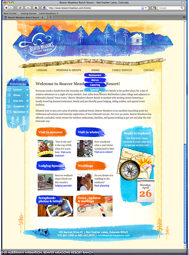
WEBSITE REDESIGN : BEAVER MEADOWS RESORT RANCH (homepage)
Web designer Robert Aukerman approached me to create a new look for Beaver Meadows Resort Ranch's website. He briefed me on the aesthetic he sought, and I set out to create a homey tone befitting a rustic family lodge in all seasons. The resulting Photoshop mockup was handed off to him for interpretation into HTML and CSS.
Navigation was a challenge: the old site featured 22 buttons (none dispensable) stacked vertically on the site's left edge. We split the navigation in two so that the most important menu lives along the top of the page, while less important items live in the left-hand "Sidetracks" menu. Additionally, on this homepage, the most popular links appear as features with headlines and synopses.
ROLE: Visual + UI design, illustration
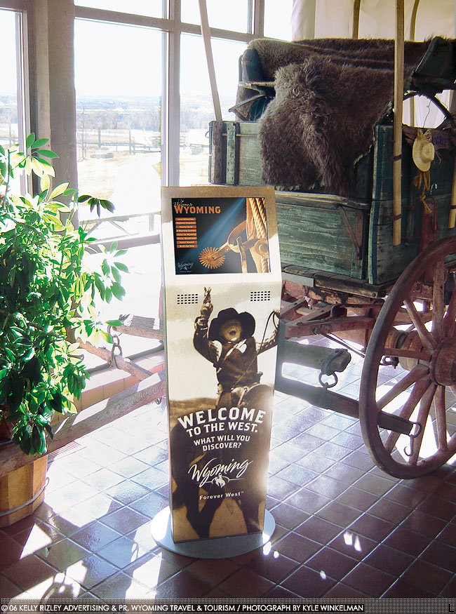
TOUCHSCREEN KIOSK : WYOMING TRAVEL & TOURISM (1/4, unit in visitor center)
Wyoming Travel & Tourism (WTT) put out an RFP for the fabrication of 30+ touchscreen kiosks configured with custom interactive and video content. Slated for installation in visitor centers in every county in the state, the kiosks would be a multimedia tour guide for vacationers.
The catch: since the visitor centers range from urban to remote, we had to serve and update content, plus track visitors' clicks…all without internet connection. I created a solution -- presenting all content as a website, but one that lives on each kiosk's hard drive vs. an external server -- and wrote and presented the proposal that won us the contract over two other finalists.
The units (above) were manufactured by Kiosk Information Systems; artwork for the body was created by Barnhart Communications, WTT's agency of record.
ROLE: Project lead, art direction, UI + visual design, script and proposal writing, research
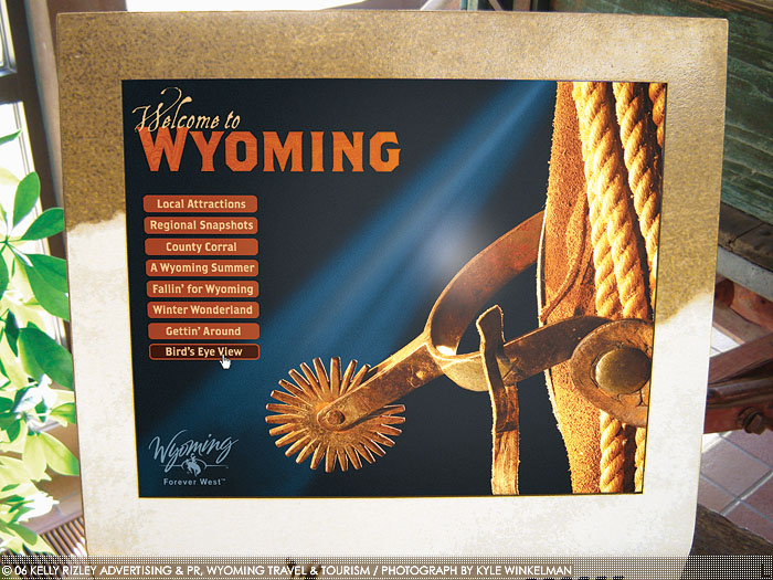
TOUCHSCREEN KIOSK : WYOMING TRAVEL & TOURISM (2/4, main menu)
Barnhart's choice of type for the kiosk body (see previous), along with a photograph of a spur and saddle selected by our agency's president, provided me with a starting point for the main menu screen (above). I oversaw the adaptation of all my layered Photoshop files into functional, interactive content, managing a talented team of Web developers, animators and programmers. As an easter egg, the spur on the main screen spins not only when the menu is loaded, but also if the spur is touched; this interactivity is the result of collaboration with a Flash developer and a 3D animator.
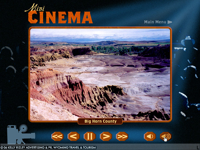
TOUCHSCREEN KIOSK : WYOMING TRAVEL & TOURISM (3/4, video player)
Among the highlights of the kiosks is their video content: one clip for every county in Wyoming, along with several other videos. I researched and wrote voiceover scripts for over 20 county videos, communicating with 25+ project contacts to obtain talking points and approval for each script.
Since we couldn't rely upon web hosted content (see explanation under first image in series), videos live on each of the kiosks' hard drives, a solution I formulated while writing our agency's proposal. Ironically, this limitation allows visitors to enjoy large, high-quality, uncompressed video files -- impossible had they been hosted elsewhere.
When videos require updates, edits are loaded onto a flash drive and mailed to the visitor centers. Through a collaboration with a back-end programmer the flash drive, when plugged in, automatically copies files to the correct location on a kiosk's hard drive, then safely ejects itself.
TOUCHSCREEN KIOSK : WYOMING TRAVEL & TOURISM (4/4, interactive map)
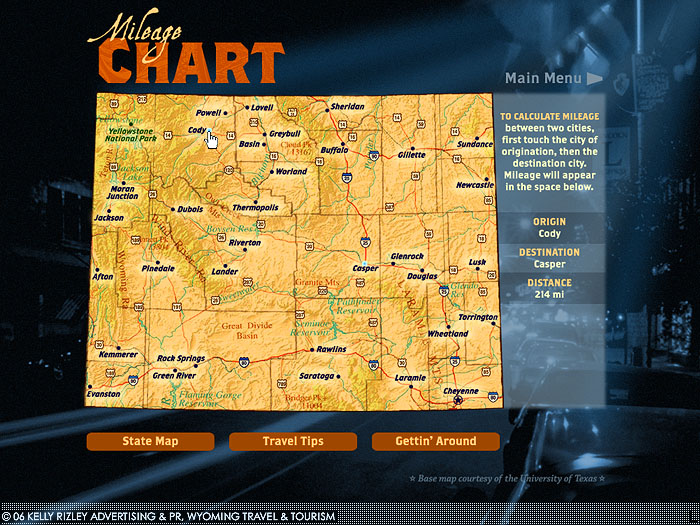
Interactive content is not limited to video; for example, the above map includes a mileage calculator. I worked with fellow team members to load the units with this and our other finished content, as well as install and configure software on the kiosks.
Due to the installation and use of the Apache web server on each unit, visitors' footsteps are automatically logged as they explore the kiosks, a requirement set forth by WTT. The log files revealed the project was a success: in less than six months, more than 25,000 visitors were reported to have used the kiosks.
INTERACTIVE MINI CD-ROM : LARAMIE COUNTY COMMUNITY COLLEGE (1/3, disc art)
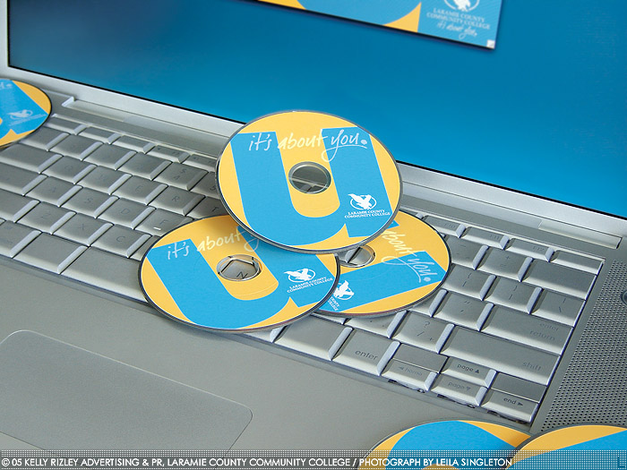
Sent to high school students, this CD uses various media to immerse prospects in the Laramie County Community College (LCCC) experience. One of the project's goals was to highlight LCCC's new tagline, "It's About You," and stray from their formal, royal blue and gold colors; the disc art prominently features the slogan and an updated, more youthful palette. At the client's request, the disc was packaged in a plain, plastic sleeve.
ROLE: Creative + art direction; copywriting (voiceover scripts); information architecture; UI, visual and interaction design; light programming (Lingo); print design (for disc face); video editing; simple motion graphics; creation of master disc for duplication
INTERACTIVE MINI CD-ROM : LARAMIE COUNTY COMMUNITY COLLEGE (2/3, main menu)
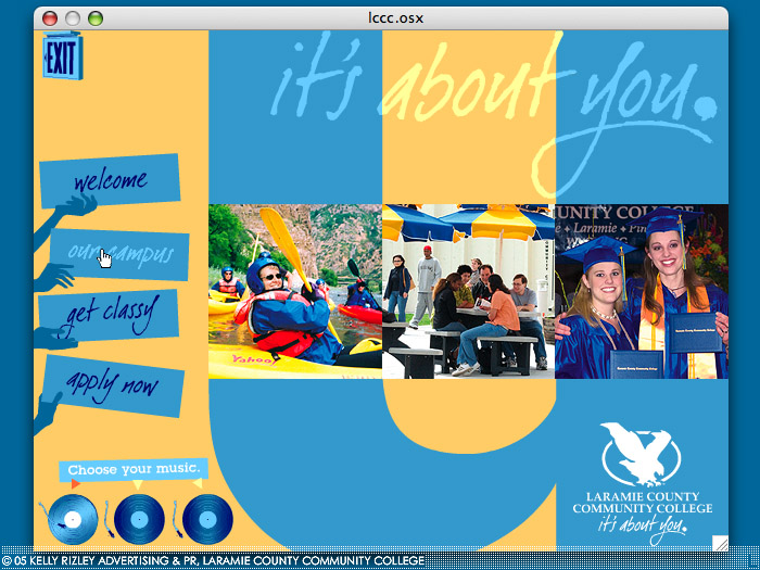
Like the disc art (see previous), the CD's main menu features LCCC's new tagline and palette. Mocked up in Photoshop and Illustrator, I exported the art in pieces and rebuilt it in Macromedia Director. When launched by the end user, the interface "builds" itself, complete with sound effects, on first load. A triple slideshow (center) enables us to share as many photos as possible with a high school audience accustomed to photo-packed yearbooks and lockers plastered with little pictures. A choice of three instrumental music tracks (indicated by records that spin when clicked) representing different musical genres (urban, country, pop) makes the experience truly about the user.
INTERACTIVE MINI CD-ROM : LARAMIE COUNTY COMMUNITY COLLEGE (3/3, video player)
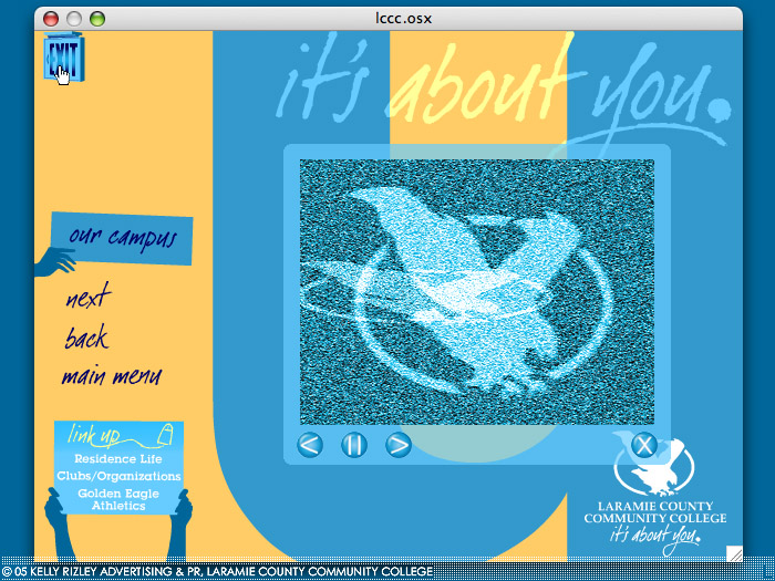
Delving into one of the CD's four sections (in this case, "Our Campus"), prospective students find video content and more. I wrote the voiceover scripts and created simple motion graphics (such as the flickering TV static above) for all videos. I also edited several videos. Other interface highlights include web links (bottom left) and a light-up exit sign that quits the application. The screenshots shown are from my Mac but, at the request of the client, the CD was Windows-only.
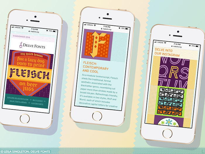
RESPONSIVE EMAIL NEWSLETTER : DELVE FONTS
Delve Fonts, an Alameda, California-based type foundry, commissioned both a template design and monthly content (written and graphical) for their email newsletter. Armed with their palette and a sense for their "geek chic" brand, I developed a responsive template that draws upon Delve Fonts' type library for graphical content. The HTML/CSS is based on a MailChimp template, which I heavily modified to yield a bespoke design.
Each email opens with a pangram (a sentence using the entire alphabet), set in a featured font of the month (left). A greeting (not pictured) is followed by a blurb about and drop cap set in the featured font (center). The email goes on to include educational content, then closes with a focus on Delve Fonts' social media (right).
ROLE: Art direction, visual design, HTML coding, copywriting
HONORS: GD USA American Web Design Award
American Graphic Design & Advertising 32: Award of Distinction
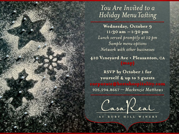
EMAIL INVITATION : CASA REAL
This invitation was sent as an HTML email to clients of Casa Real, an upscale events venue in Northern California that hosts, among other events, corporate winter holiday parties. The challenge: create a festive invitation to a menu tasting event without evoking religious holiday imagery. Inspired by the event's food theme, I created outlines of star- and snowflake-shaped cookies using a dusting of confectioner's sugar, then photographed them. Silver dragées and crimson accents add festive touches that reinforce a winter/hoilday look.
ROLE: Art direction, design, photography, HTML coding
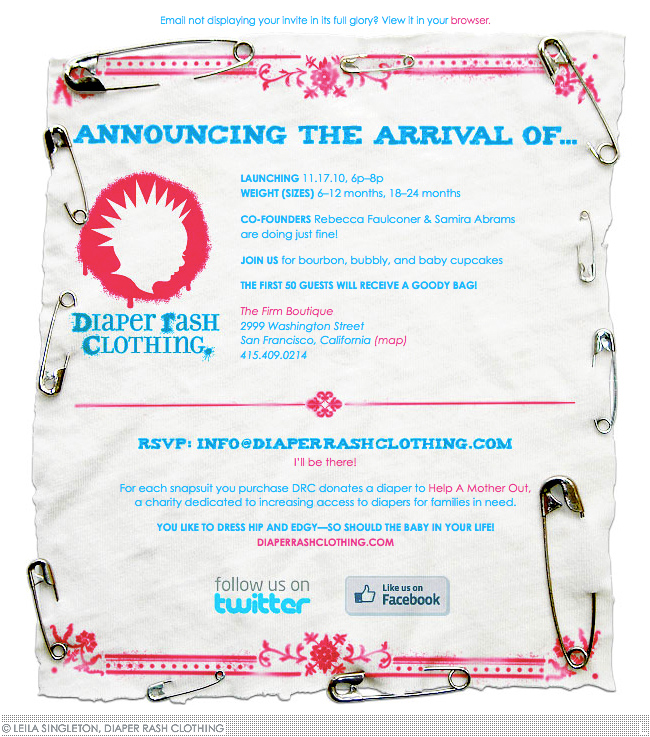
EMAIL INVITATION : DIAPER RASH CLOTHING
This invitation was sent as an HTML email announcing a launch party for Diaper Rash Clothing, an edgy line of baby clothing produced in San Francisco. Inspired by the look of cloth diapers, I substituted punky safety pins for diaper pins and photographed them affixed to a scrap of an old shirt. The "stenciled" ornamentation was added digitally. With the exception of the headline and RSVP email, all type was live.
ROLE: Art direction, design, photography, HTML coding
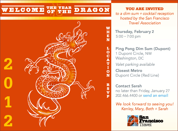
EMAIL INVITATION : SAN FRANCISCO TRAVEL ASSOCIATION (1/2)
This evite was blasted to clients of San Francisco Travel, who were invited to a Chinese New Year-themed happy hour. I drew inspiration from traditional drawings of dragons, as well as the vertical layout of Chinese characters, all the while incorporating SF Travel's corporate palette.
ROLE: Art direction, design, traditional + digital illustration, HTML coding
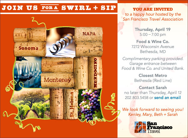
EMAIL INVITATION : SAN FRANCISCO TRAVEL ASSOCIATION (2/2)
This evite was blasted to clients of San Francisco Travel, who were invited to a wine-themed happy hour. The event was hosted out-of-state by SF Travel's Washington, D.C., office, so I brought a flavor of the Bay Area to the evite with imagery that celebrates Northern California's famed wine country. The grid of wine corks and photos is evocative of the organization's grid-style logomark.
ROLE: Art direction, design, HTML coding
gLike