
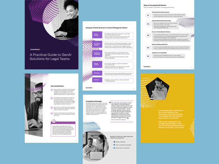
Saas Tech: I developed a language comprised of geometric shapes and adaptable dot patterns (a node to AI) to create energy and movement around the ebook's content.
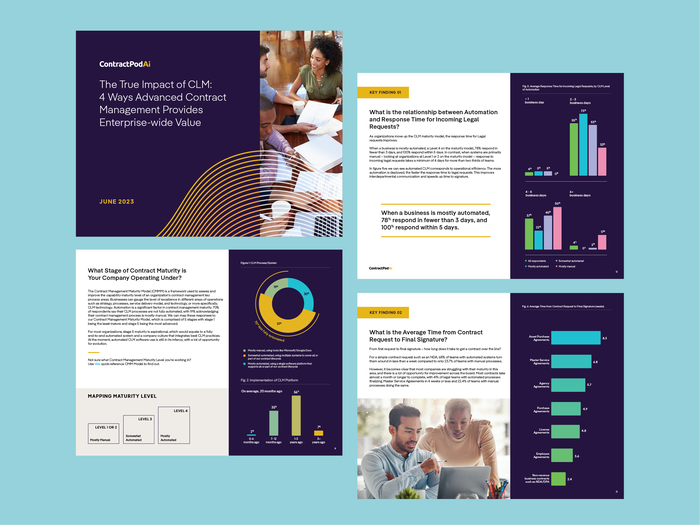
Saas/Tech: I utilized the brand's dynamic waves and color scheme as the engaging element for this information heavy document. The color and infographics become the anchor for the accompanying messaging.
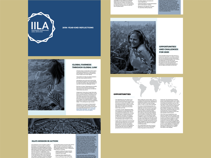
Nonprofit: Following the pre-established visual guidelines, I reinforced the information’s hierarchy and structure, and utilized images that were sure to evoke emotion, as to provide a tissue of empathy and importance to the document’s content.
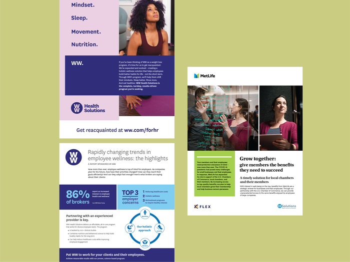
Agency: Layout design and production for WW and MetLife
gLike
White Papers
White paper design

Available
Freelance, Full-time, Moonlighting
Marisa Bairros
Senior Graphic Designer/Art Director
New York, NY