Austin office voting with red dots/green dots.
Red dots on images meant we did not want it to look/feel that way.
Placing green dots on images was a way to communicate that we want our product to look/feel that way.
The continuum taking form with a consensus from the group.
Evanston office coming up with a similar consensus after much group discussion.
Orlando office consensus.
After reaching out to teachers with a survey, and after the conducting the Experience Workshop, our multi-discipline group (lead by Design) came up with a word cloud for what our instructional pages should "feel/look like."
View PDF
Prior to the workshop, I worked with the Market Intel group to send out a survey to teachers to ask their opinion on design samples of the instructional pages we were developing.
Green dot/red dot collaboration exercise with stakeholders as part of a mid-point review workshop held in the Chicago office on the vision and strategy for the Student Edition design.
Found out that this design option was not very popular with stakeholders and we discussed why.
Early explorations for Student Edition Option C. Those part of the workshop voted with green dots and red dots, followed by a discussion on the pattern we saw.
Green dot/red dot excercise for early design options for the Teacher Edition. This was a collaboration exercise to gain concensus on what's working/not working on the design direction we were taking.
Key Takeways we noted for the design options presented during the Green dot/red dot collaboration exercise with the stakeholders.
Story-boarding with stakeholders on flow of screens.
Some of the action items from the Mid-point Review workshop in Chicago.
gLike
Experience Workshop

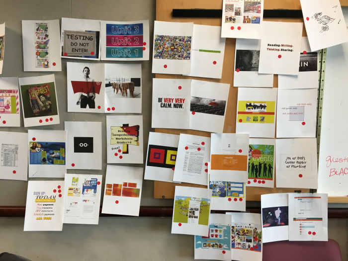
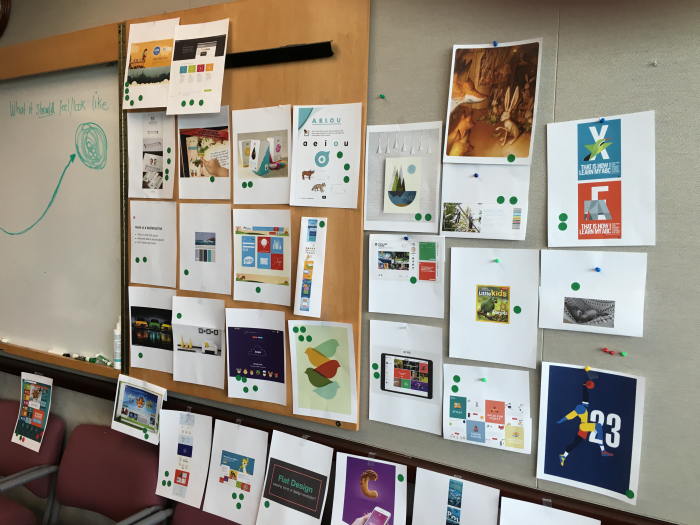
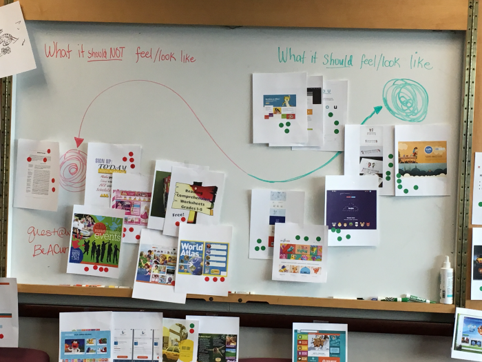
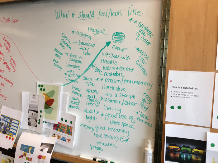
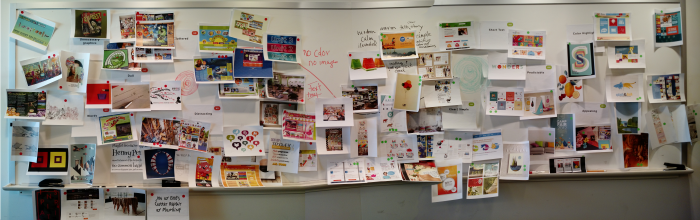
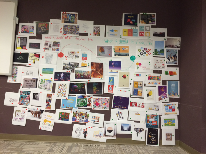
An Experience Workshop is a collaboration strategy meant for a multi-discipline group discussion to help the entire team reach a shared vision before the design process begins. This project was coming up with a vision and a direction to the design of instructional pages coupled with a selection ("before read/after read" pages). This was done remotely between the Austin, Chicago and Orlando offices. Each office placed emotion-enducing objects (words, images, products from a wide range of industries) in a shared space. We used these examples to foster a vote and discussion about the desired attributes of the user experience of the instructional pages we were developing. We then mapped the images on the continuum of "what it should feel/look like" and "what it should NOT feel/look like." Prior to the workshop, I worked with the Marketing Intelligence group to coordinate a survey to teachers to seek their feedback, and results were brought in to the workshop and was incorporated.

Mary Grace Francisco
Lead Design Architect, PMP, CSM Austin, TX