First Comp Presented. The following is the flow of the project from timeline to final presentation pages.
Every project starts with a timeline. Based on a go-live date based on either a hard or soft launch, we work backwards. The top portion of the timeline is what is expected by the creative team. The bottom what is expected by the client. Both parties agree before this is formalized so everyone is on the same page. Based on Scrum, an agile framework for completing complex projects.
View PDF
Their website at the time was 4 pages. I worked out how many pages were actually needed for the pages based on a series of strategy discussions and then presented three types of site maps—the first was the simplest, for ease of use, the second was if there were two portals to address the user experience and aesthetics of two different audiences, and the third to included team members. They chose the third option.
The site needed to be in both Chinese and English and they liked the two different portal idea so I hired a calligrapher to created the Chinese characters.
There is a section of all the places they have visited in China and this section was very heavy so we created a load section that incorporated their logo and the amount of seconds it would take to load.
The green is their corporate color and is used as the "fill" for the time elapse.
First comp presented. All the comps presented were based on comparative site analysis sessions I had with the client. All the elements seen in all 6 comps were the requirements for the landing pages. The idea behind this page was to showcase their 4 top offerings in China. Each bucket would be dimmed and upon rollover, the photos would brighten. One of constants was to make sure the UI and the way it moved was unusual, so if you see the site today you see how each page slides to the left. They also wanted a clean architectural feel.
The rollover colors were to be either Orange (something they commented they liked from my personal portfolio site, mgsquared.net) or green, their corporate color.
Upon click, the green bar would turn to orange and the page would slide to the left.
The UI here replicated that of the first presentation but the layout is different based on the comparative sites analysis. Played with the idea that the logo would be more as a signature than a mark. All photos are FPOs.
Showing more of an architectural feel here. Two photos would represent the two different yet equally important demographics. The orange box is a summation of what they do (visual cues and brief descriptions are paid more attention to buy the end-user than paragraphs of text). Starting to introduce more Chinese characters.
This comp was based on a site of an landscape architect they greatly admired.
A departure from the architectural approach and based more on a Chinese and techie look and feel.
Changing the idea of the nav bar into collapsible navigation menu.
Each of these sections would rotate according to roll over.
After the first presentation, the client chose the elements of each comp that they liked the most and then it was presented again as a hybrid of those pages.
Starting to introduce secondary pages. All photos are FPOs. Eventually hired a photographer, Cynthia Black, and art directed her remotely to take photos of NYC and the Hickey Freihofner Capital staff.
Showing how it would move.
The landing page for the "Team" section.
Enter Your Description Here
Another design for the "team" page, featuring the bio of each team member.
A comp for the "Services" landing page. FPO photo.
A comp in Chinese for the "Services" landing page.
Using original photography shot by Cynthia Black for the Services section.
Original photography by Cynthia Black.
The landing page coming together using elements from several comps. Client eventually requested the "home" bar on the left be deleted.
How the nav would move upon rollover. Eventually a second line was introduced and the nav moving to the left was changed.
Original calligraphy art directed by me.
After several rounds of suggestions for stock and custom photography for the landing page, the client was adamant that it had to be Chinese warriors and the NYSE.
How it moved—sliding to the left. See hfcap.com
Using original photography by Cynthia Black. The two principals of the company.
Team member page.
Microsite within the B-to-B site. The map of where they have visited in China. Upon rollover, each visited province turns to orange, as does the name of the province. Upon rollover of the thumbnails, a description and full photo pops up. The bar on the top is a slider. Slide it and the whole section except the map moves to the left to see the photos that were on their present site showing the sites visited. Captions and provinces now accompany each photo.
Pop Up
Full description and photo when slider is moved.
gLike
Hickey Freihofner Capital Website

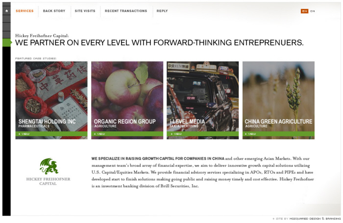
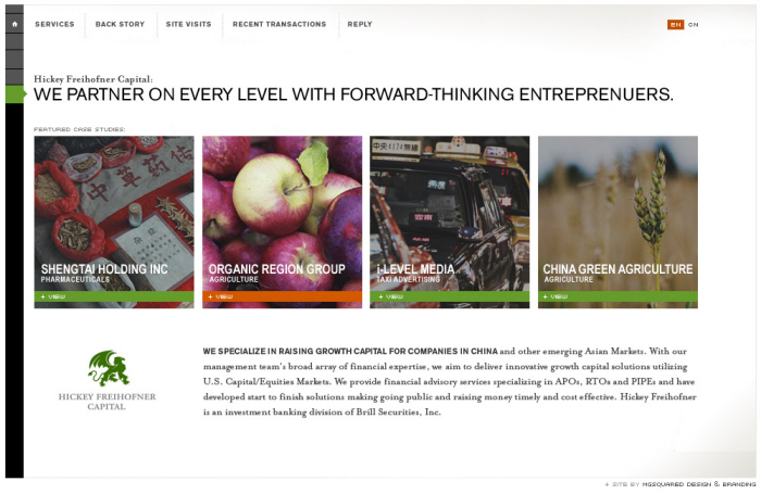
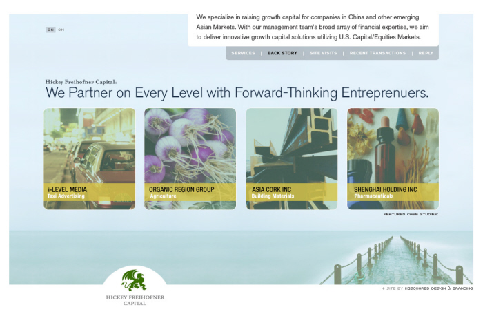
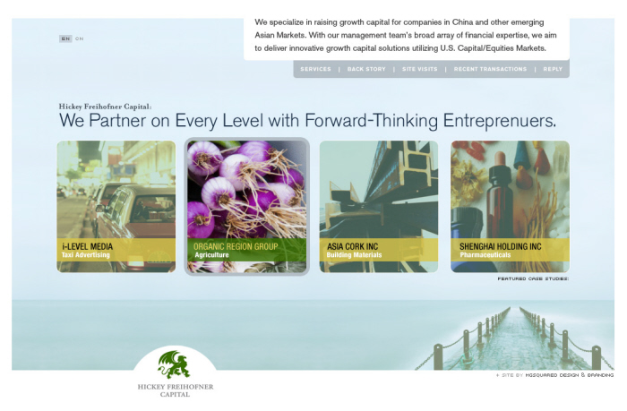
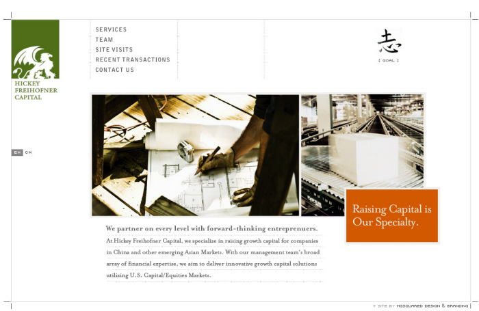
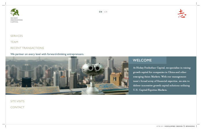
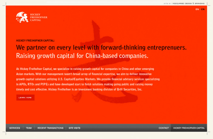
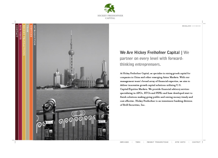
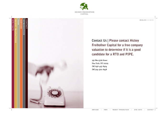
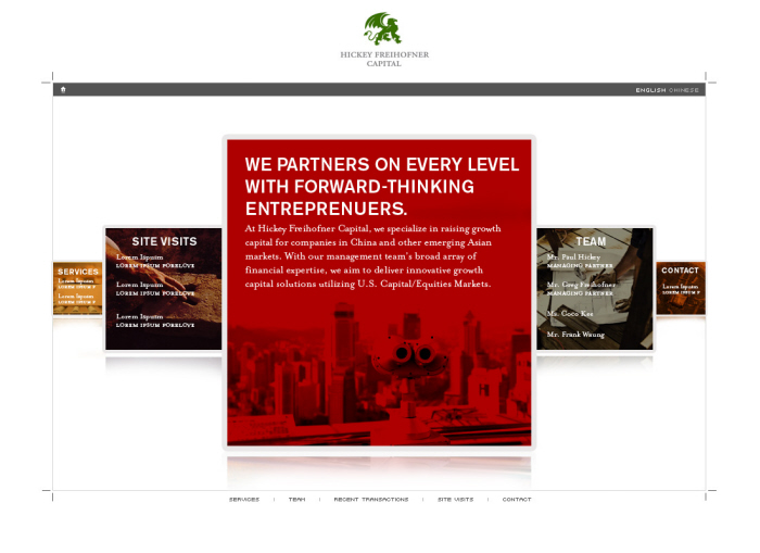
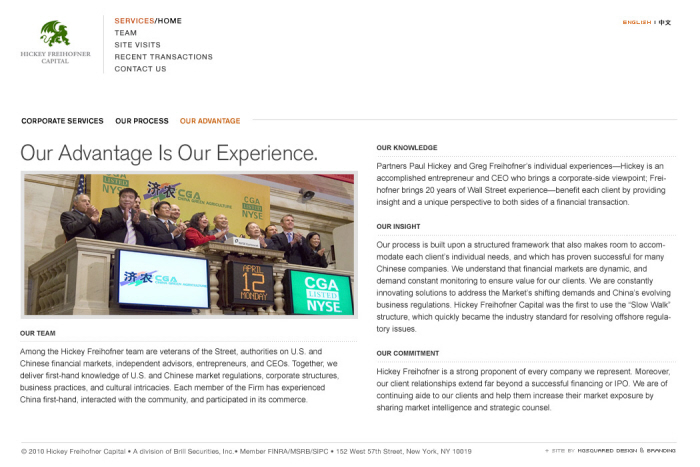
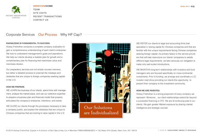
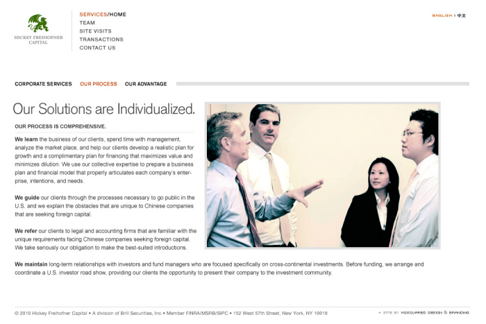
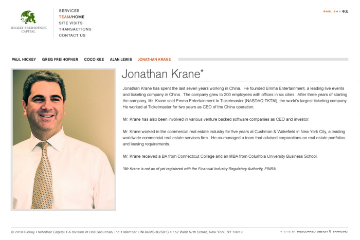
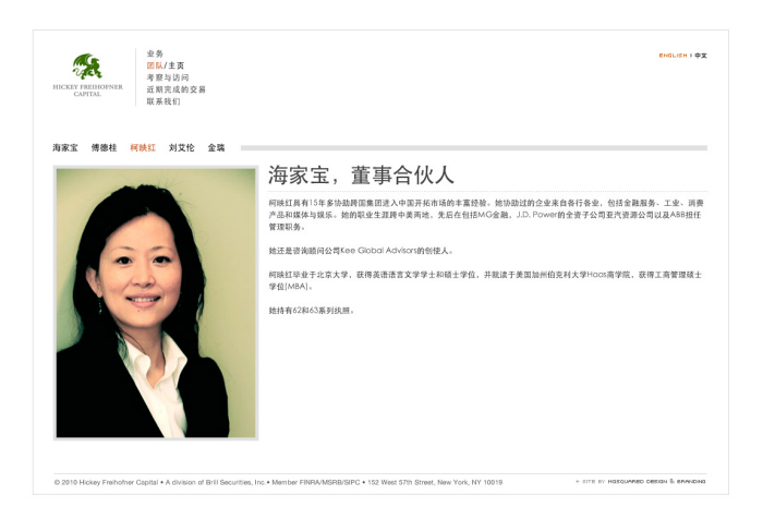
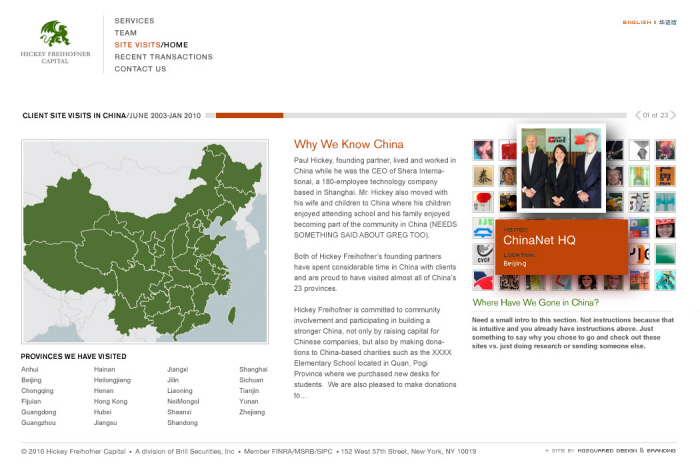
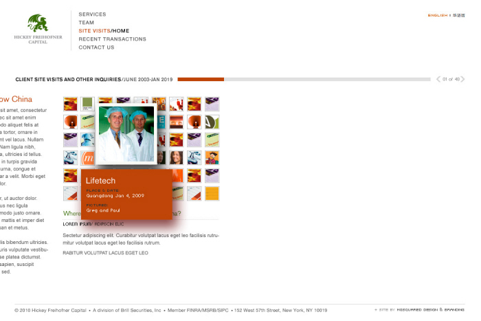
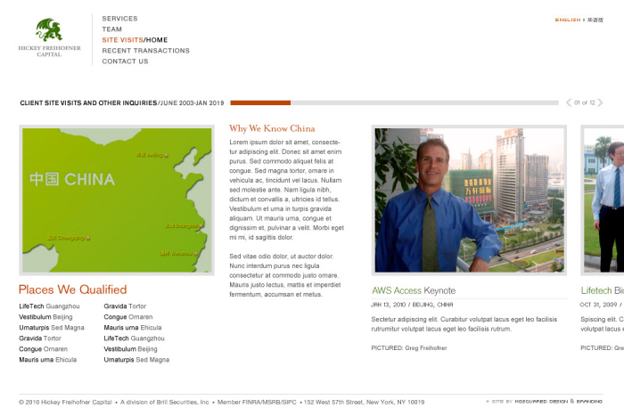
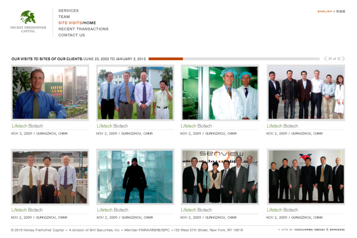
In 2009, I was contacted by a man named Greg Freihofner who owned a midsize brokerage firm in New York. They mainly matched Chinese companies with American investors. They had seen work I had for some colleagues in San Ramon—www.presidiumpartners.com—and wanted to know if I could fly to NYC to talk to them about redesigning their site. I was going to NYC the next week anyways so we set up an appointment. The site they had at the time was very basic with a page full of snapshots of Greg and his partner Paul at various offices and plants in China. There were no captions or explanations of what this page was but it was explained to me that it was very important to show that they had been to the places they were promoting. We spoke about strategy and user experience and then I went back to my office and submitted a proposal. After much negotiation, I was awarded the job. Click on link below to see what went live.

View Website
Mari Ettlinger
Creative Director/Designer—User Experience, Interaction & Visual Berkeley, CA