
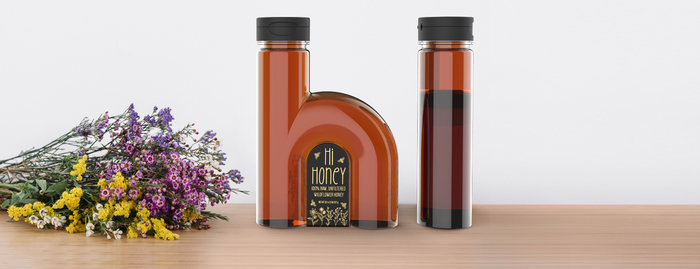
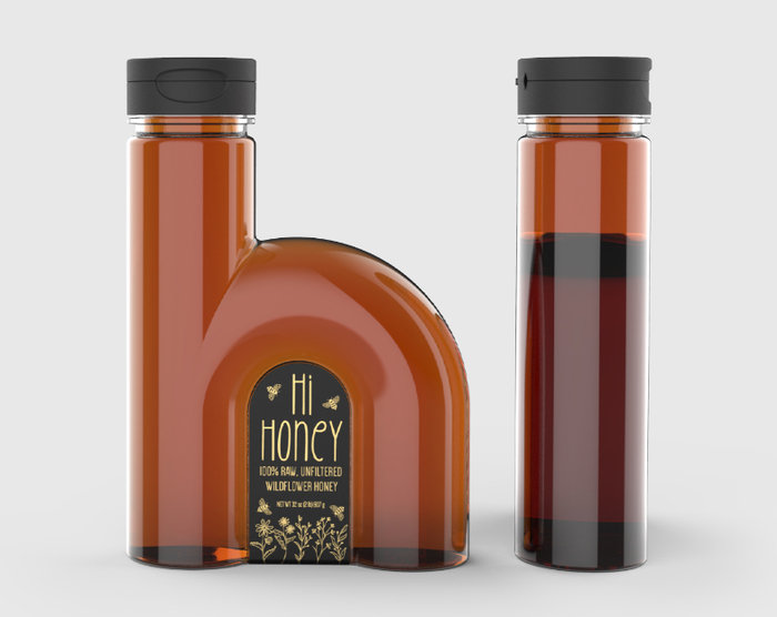
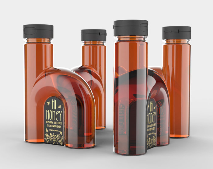
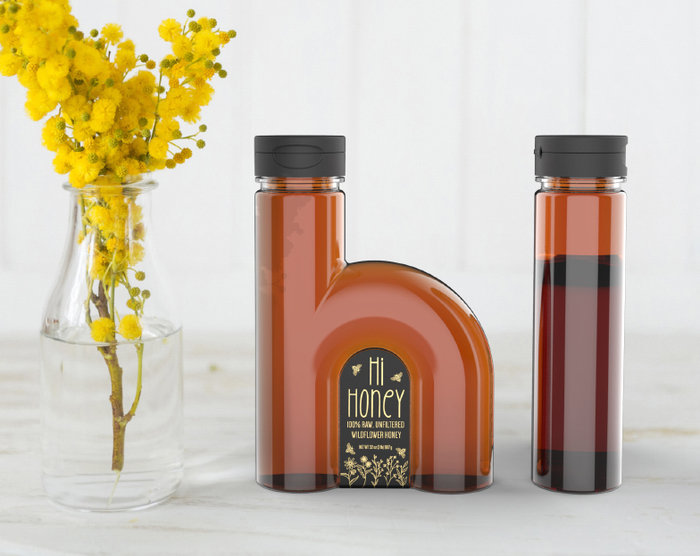
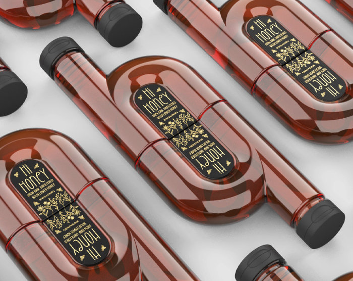
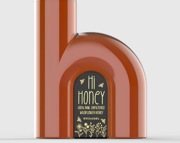
The Hi Honey packaging concept plays upon the familiar phrase and extrapolates it to the bottle itself, reimagining the plastic squeeze bottle into the shape of a bold and unmistakable lower case ‘h’. On shelf, when the bottle is turned 90 degrees it reads as an ‘i’, creating a fun shelf stocking opportunity with the bottles themselves. Talk about a shelf talker!
The label works in unison with the structure, highlighting the shape of the letter ‘h’ while the bottle generously hugs and protects the label. The artwork is delicately lightweight so as to not compete with the boldness of the bottle shape. Stylized in a slightly whimsical hand drawn line art aesthetic, the label adds a layer of opulence with a gold foil detail.
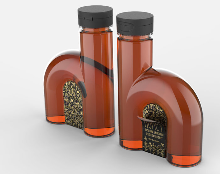
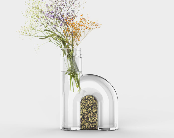
The storytelling of the brand is centered around the source of the pollen that the hardworking bees have selected: the wildflowers! The top label peels off after purchase to reveal a hidden label that is decorative only and bursts with gold foil botanicals.
