

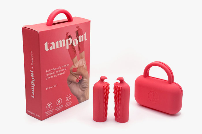
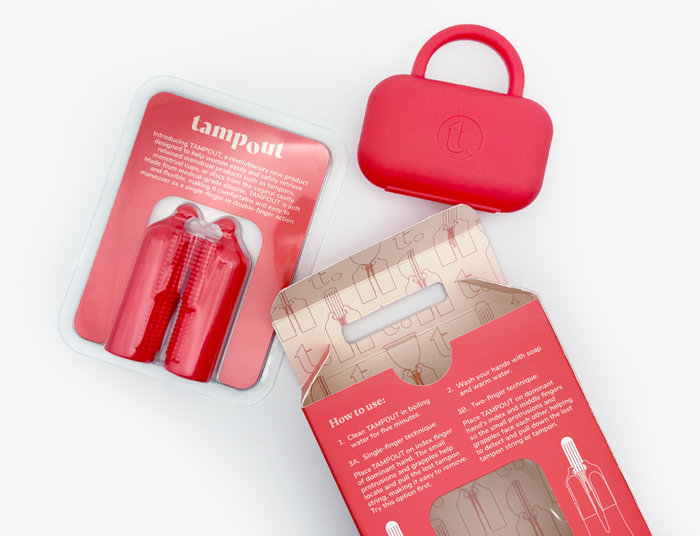

A case study in full service design, from branding, packaging, product, manufacturing and website creative direction.
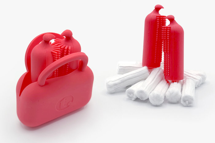
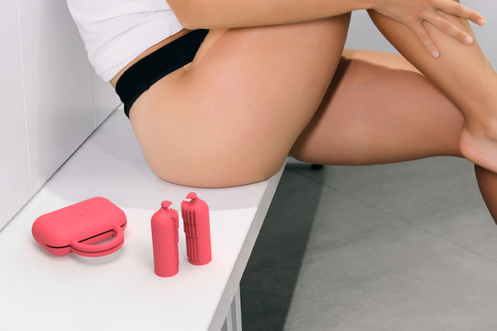
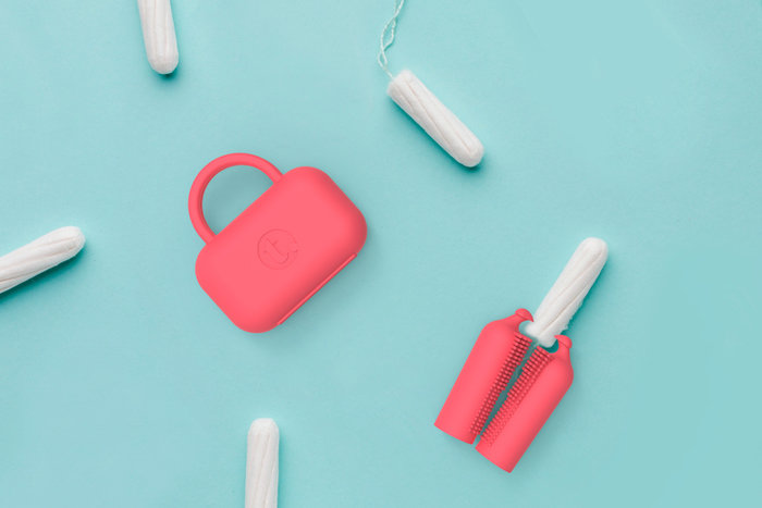
TAMPOUT is a cost-effective solution for women that is intended to help reduce the number of emergency room visits due to health concerns arising from inserted menstrual products. While in the feminine hygiene product category, this product stands apart from anything else on the market by being the first of its kind to address this problem.
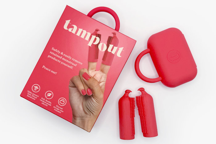
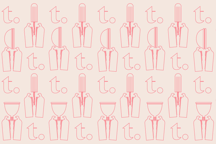
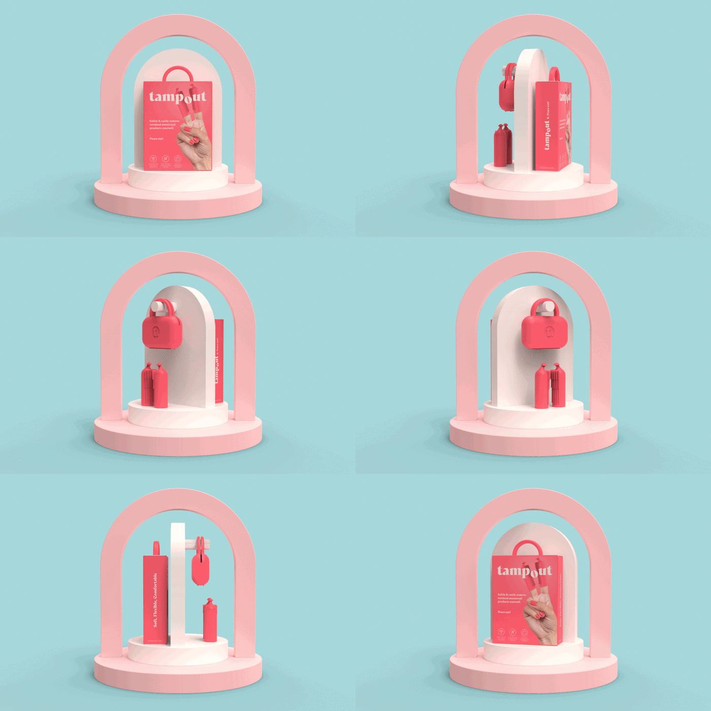
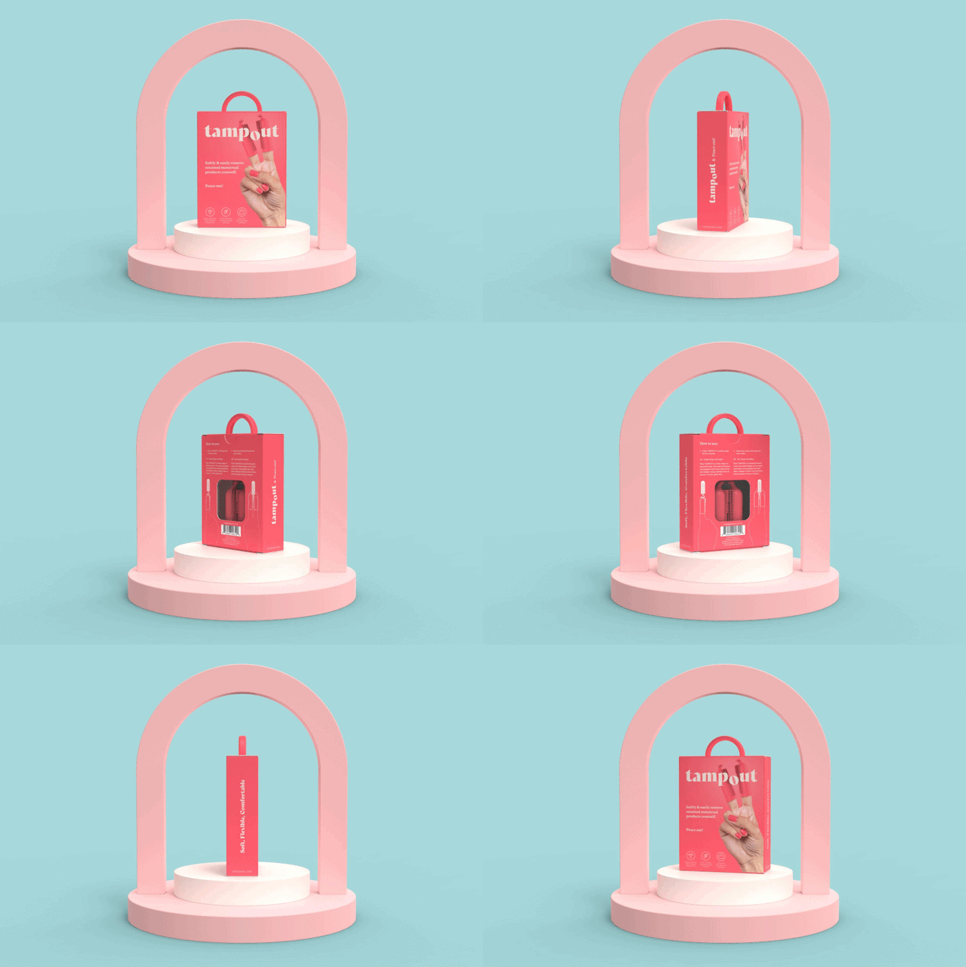
The brand’s visual strategy centers around the two-finger peace sign that shows the product as it’s intended to be used, while presenting a recognizable image to communicate peace of mind. The logo, with its subtle animation on the “o”, was designed to work well in composition with the peace sign image on the packaging, as well as in isolation for other applications.
The design goal was to present this innovative product in a way that is simple, approachable and to the point, but also vibrant, eye-catching and youthful.
